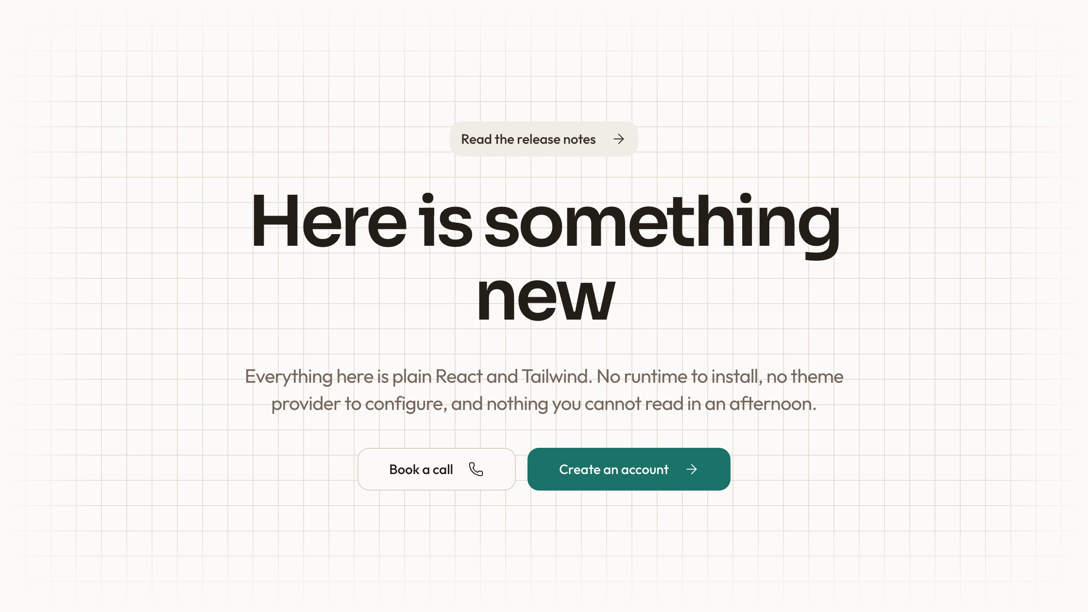
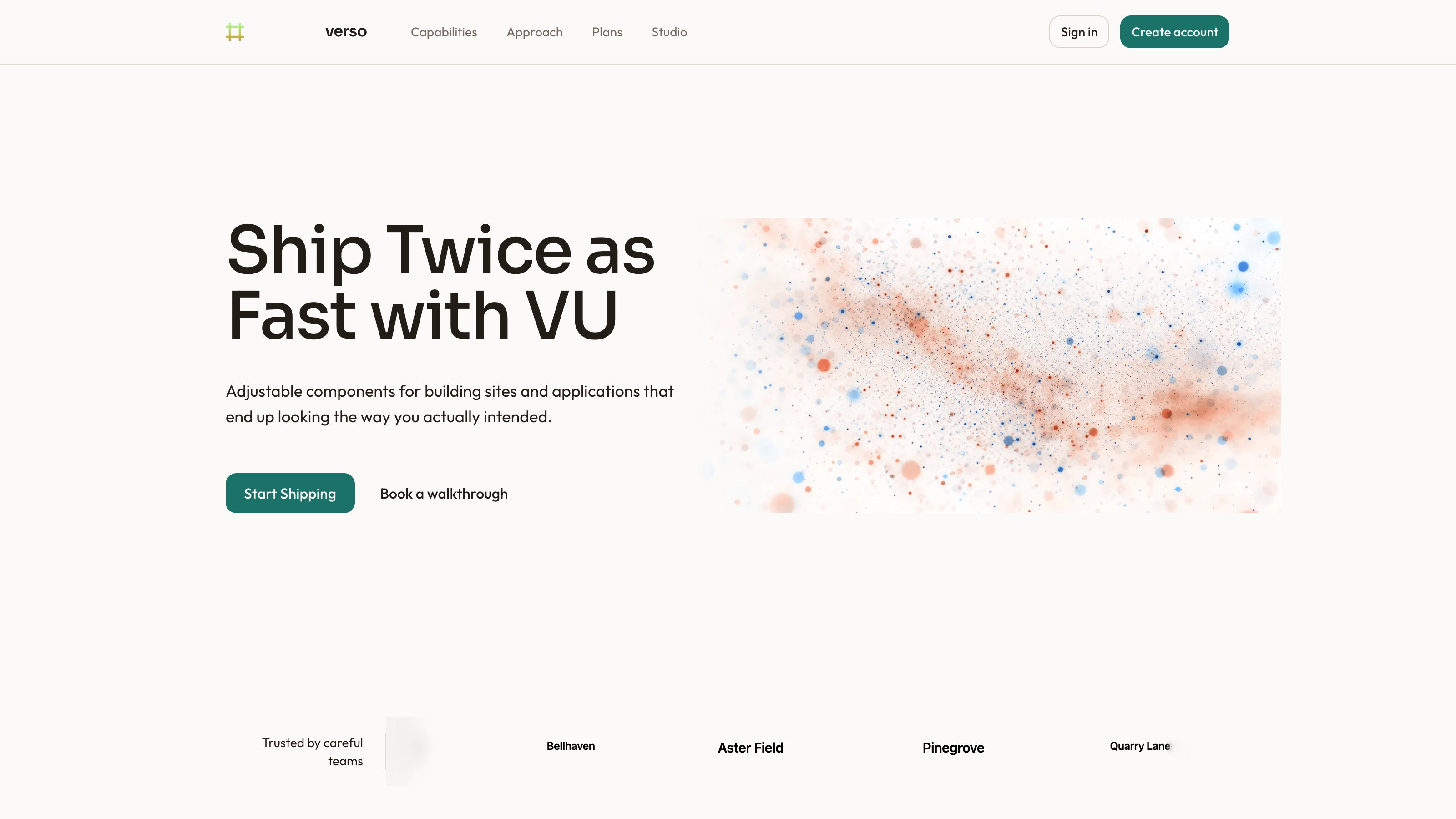
Combine a large studio headline with a translucent fact card and a continuously moving client strip on a dark photographic background. The supplied React example includes two action buttons, static metrics and a responsive large-screen split. Its counters and client names are illustrative content to replace; this is a visual hero composition, not a live analytics dashboard or verified proof of results.
What you get
React/TypeScript component source and a minimal usage example, including CSS entrance/marquee animations, a fact card, three small statistics and a repeated client-name strip. Maintain the copied source and its dependencies in your own project.
A single-column base layout that becomes a 7/5 split at the large breakpoint. Text and card elements use staggered 0.8-second CSS entrances; the client strip repeats continuously over 40 seconds. This is automatic animation, not the visitor-driven scroll/step interaction suggested by the old summary.
Written references define warm paper/teal light tokens, dark roles, Outfit body type, Sora headings, a 0.875rem base radius and short settling entrances. They also specify inline SVG icons with 1.5 px square-cap strokes, and visible labels beside real vendor marks. Apply the contract during integration: the supplied examples contain hardcoded styling that is not fully reconciled with those references.
Imagery/icon/third-party references and a source-check script. The mountain background is a local path, but no image or WOFF 2 font binaries ship in this archive. The example also needs the project’s React, lucide-react and utility-class styling.
Before you choose
Use the fact card only when you have facts worth featuring. Replace demonstrative trust signals first, then connect the two actions and check the moving strip; visual polish should support real proof rather than manufacture it.
Good fit
A studio or service page with real, supportable proof points suitable for a prominent fact card.
A first screen that needs a ready composition for headline, actions and trust material rather than a blank layout.
A team comfortable adapting readable source, maintaining dependencies and reconciling the dark example with its own visual system.
Not for
Live metrics, a verified client roster, analytics integration, a working reel player or connected business actions.
A dependency-free/versioned block or automatic compatibility with an established design system.
A complete site with navigation, forms, authentication or checkout, or production trust claims copied unchanged from the demo.
How to use
You say/hero-dark-stats Add the Dark Stat Hero section to the top of the landing page for [product name]. Use my supplied copy and assets, and follow the existing page framework and styling.
Inspect the target stack and copy the component/demo into its structure, adjusting imports and resolving React, lucide-react and Tailwind-style classes. A different framework requires a real port; an HTML adaptation is for a standalone request. The supplied source is a component example rather than a complete runnable application.
Replace the headline, description, all statistics, recognition/status language and client entries with factual material you can support. The 150+,98% and other values are hardcoded examples; there is no calculation, live feed or verification. Generic geometric Lucide icons simulate brand marks and should not be presented as real customer logos.
Supply the referenced local background and fonts. Follow the imagery guide’s slot rules and inspect the masked/gradient background for legibility; if retaining a literal photographic scene, reconcile its mask treatment deliberately with that guidance. Preserve accurate name/portrait pairings if adding people, and use local WebP files sized for delivery.
Wire See the work and Watch the reel to actual destinations or handlers; neither button has one in this source. Reconcile hardcoded zinc, white and gold styles with the written warm/teal contract instead of assuming one accent token controls everything. Apply the documented icon rules to real labeled vendor marks.
Run node scripts/check-blocks.mjs TARGET, then build and test the completed host page. Inspect phone layouts and the small statistics grid, whose dividers are separate grid children. Review the persistent marquee/ping animations and add appropriate pause/reduced-motion handling. The checker cannot establish responsive quality, asset presence, truthful claims or working actions.
Requirements and costs
You bring
Not collected yet
Dependencies
Not collected yet
Outside costs
Not collected yet
Publisher testing
v1.0.1 — Claude Code / Claude Desktop / Cowork / Codex / ChatGPT
FAQ
React/TypeScript with lucide-react and Tailwind-style utility classes. Motion here is written as CSS keyframes; there is no Motion-library dependency in this specific component. Other stacks need adaptation.
The inspected component makes no explicit service request and names a local background path. That file and fonts are absent from the ZIP; provide them and check actual network behavior in the integrated page.
Yes, the package provides a token contract, but this example also contains hardcoded colors and dimensions. Adapt those intentionally; changing one token will not retheme every layer automatically.
They are illustrative source values and mock icon/name combinations. Replace them with substantiated metrics and authorized customer material, or remove those elements.
No. It runs as an automatic 40-second repeating CSS marquee. Buttons likewise need their own action wiring before launch.
User reviews
—0 reviews
Select a star to share your experience.
No reviews yet. Ratings appear once readers share real experiences.