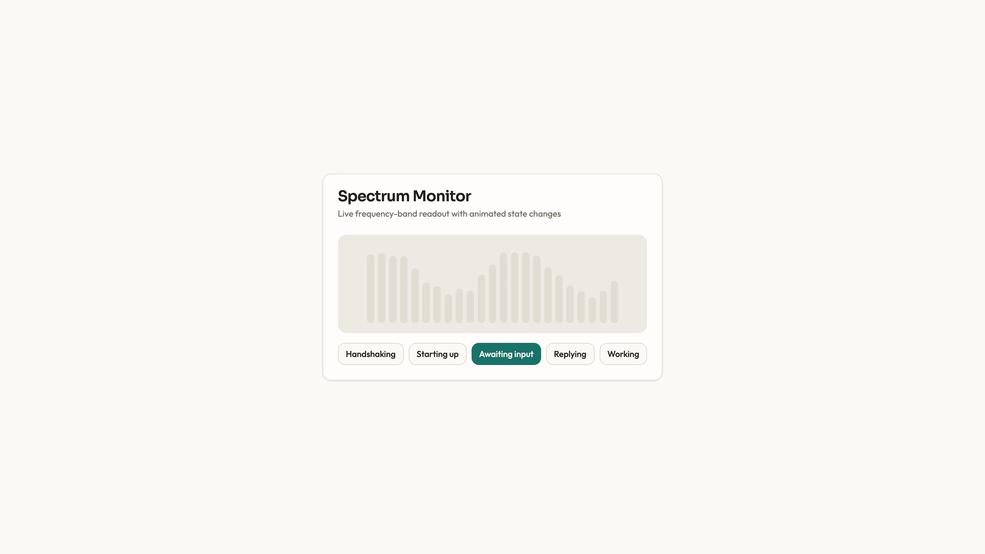
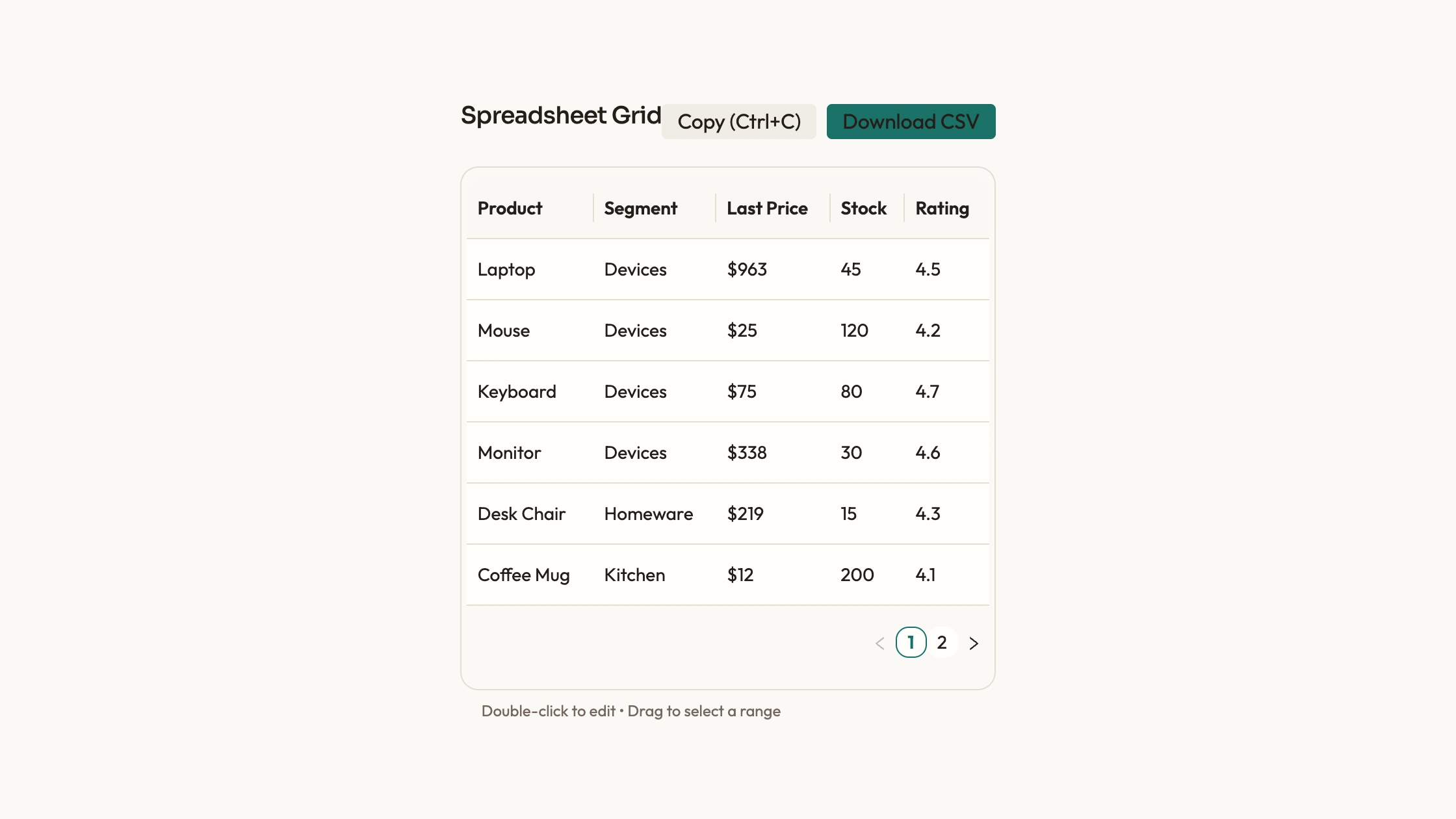
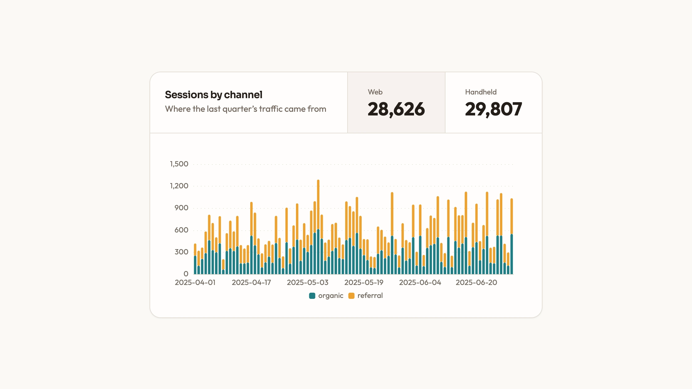
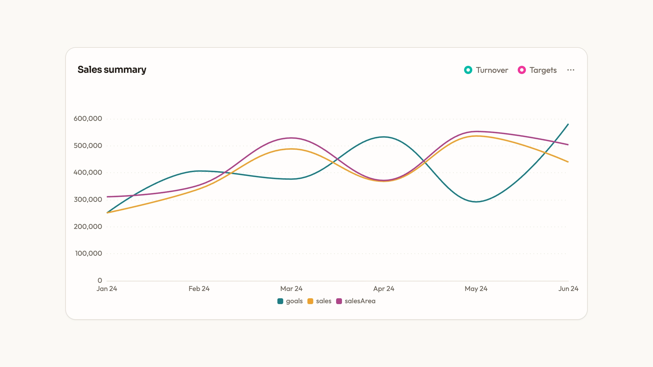
Give readers a structured view of individual records rather than hiding the detail behind a chart. Records Data Grid includes a React/Ant Design table with named columns, small-page pagination and horizontal scrolling. You own the column and row definitions, so the grid can be adapted to the fields your readers actually need to compare.
What you get
An Ant Design table component with sample name, email, location, status and balance columns, configured through plain column definitions and row objects with keys.
Pagination configured for six records per page and horizontal scrolling for wider content. The five-row sample does not demonstrate a second page; additional records are needed to check that interaction.
A ConfigProvider theme with warm card colors, teal accents, typography and corner settings, plus the shared visual guide for palette, type scale, radius, icons and motion.
A separate banded-table example with static rows and a displayed footer total. Its table helpers are project imports and its total is sample text, rather than a calculated summary of arbitrary replacement records.
Before you choose
Choose a records grid when the individual row matters more than a visual trend. Decide the smallest set of columns that supports the reader’s task, then verify ordering and totals with deliberately chosen records. Pagination and a scroll bar do not by themselves make the data correct or the page suitable for very large collections.
Good fit
A record-oriented page where names, state and numeric values need to remain individually readable rather than aggregated into a chart.
A developer who wants a table setup to adapt without starting its layout and pagination from scratch.
A project that can align the table theme with nearby content and maintain the copied source and Ant Design dependency.
Not for
A dependency-free or maintained npm product. Ant Design and React are part of the supplied table implementation.
Unreviewed use inside a mature design system; ConfigProvider values and shared theme roles need deliberate alignment.
A live-streaming or virtualized large-data explorer, a database administration backend or a grid with sorting and editing already implemented for every column.
How to use
You say/data-visualization-records-grid Add the Records Data Grid component to my dashboard using the data I provide. Inspect the existing page and framework before integrating it; ask for missing data rather than inventing values.
Identify the record list and its real page container, then have the agent inspect the repository’s framework, UI dependencies and styling. Integrate the Ant Design component or deliberately adapt the separate static-table example, resolving its imports.
Define the fields and their meaning before replacing the rows. Give each record a stable unique key and keep numeric amounts as numbers when they need sorting or calculation; format currency only for display.
Configure the column behavior explicitly. The supplied columns do not define sorters or filters, despite the broad source description. Add appropriate comparison rules and test numeric order rather than sorting formatted currency strings alphabetically.
Apply the table theme and surrounding text consistently with the page, keeping fonts and icons local. If retaining the banded example’s footer, calculate its total from the intended dataset and label whether it refers to the current page or all records.
Test more than six records, an empty list, long names and narrow screens. Check page navigation and horizontal scroll, sort behavior if added and the target project’s type/build checks. Connect real loading, server-side pagination or updates separately; the supplied table starts with local sample records.
Requirements and costs
You bring
Not collected yet
Dependencies
Ant Design — required
Outside costs
Not collected yet
Publisher testing
v1.0.3 — Claude Code / Claude Desktop / Cowork / Codex / ChatGPT
FAQ
React with Ant Design for the main table. A separate static example expects project table helpers. The agent should inspect your repository and adapt the selected implementation; a standalone HTML output is a requested adaptation rather than the supplied table’s default format.
No. It starts with local row objects and contains no data loader. Connect the actual source separately, and keep libraries, fonts and other assets local if the final page should avoid remote requests.
Yes. The Ant Design table has explicit ConfigProvider theme values and the package includes a shared visual guide. Update those values and surrounding styles together; it does not automatically inherit every token from an unrelated design system.
No column sorter is configured in the supplied table. Ant Design supports sorting when the required options are added, but the library’s capability is not the same as an implemented behavior in this component.
The footer in the separate banded-table example is fixed sample text. Replace it with a calculation if it should summarize your records, and specify which rows are included.
User reviews
—0 reviews
Select a star to share your experience.
No reviews yet. Ratings appear once readers share real experiences.