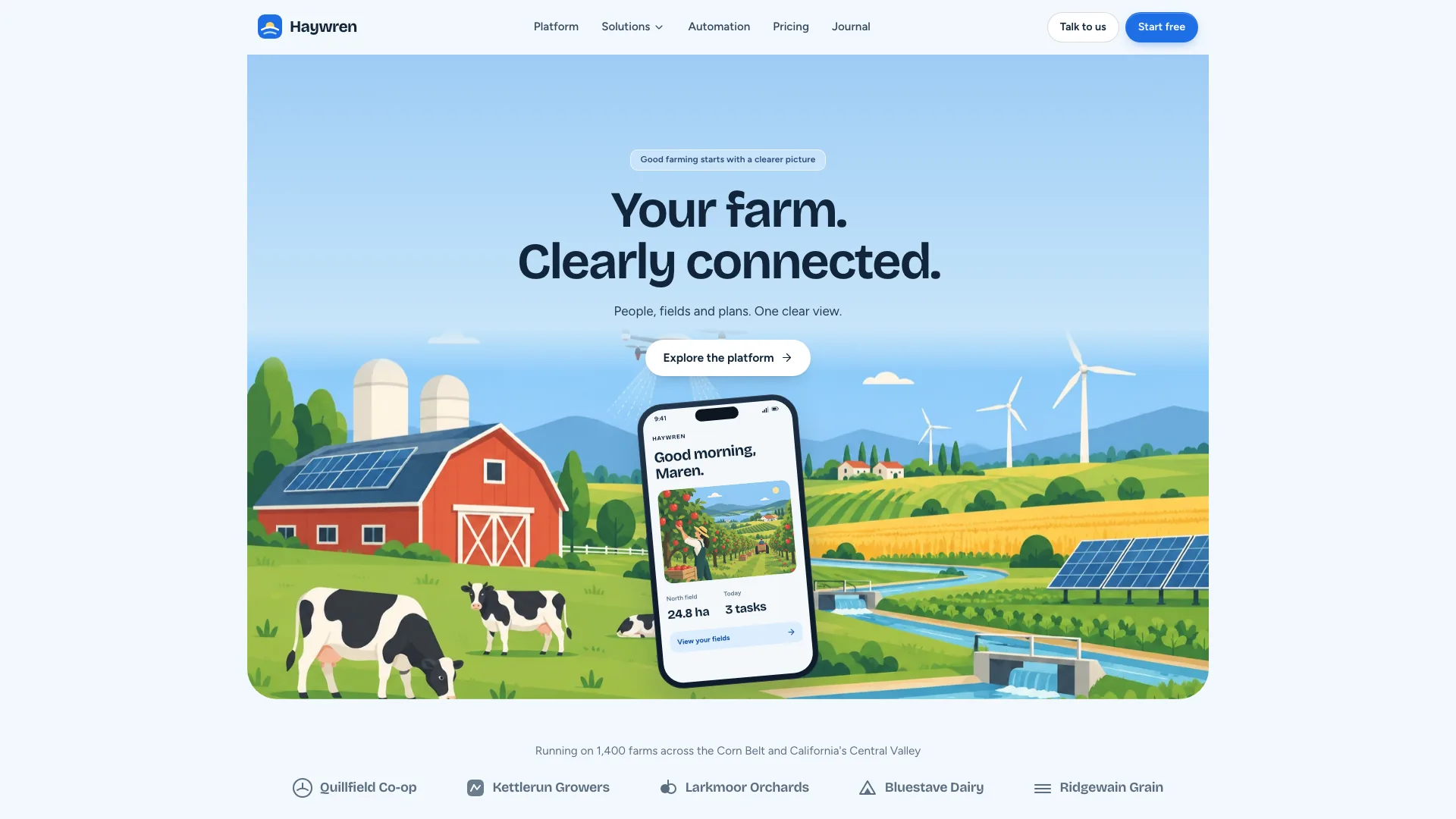
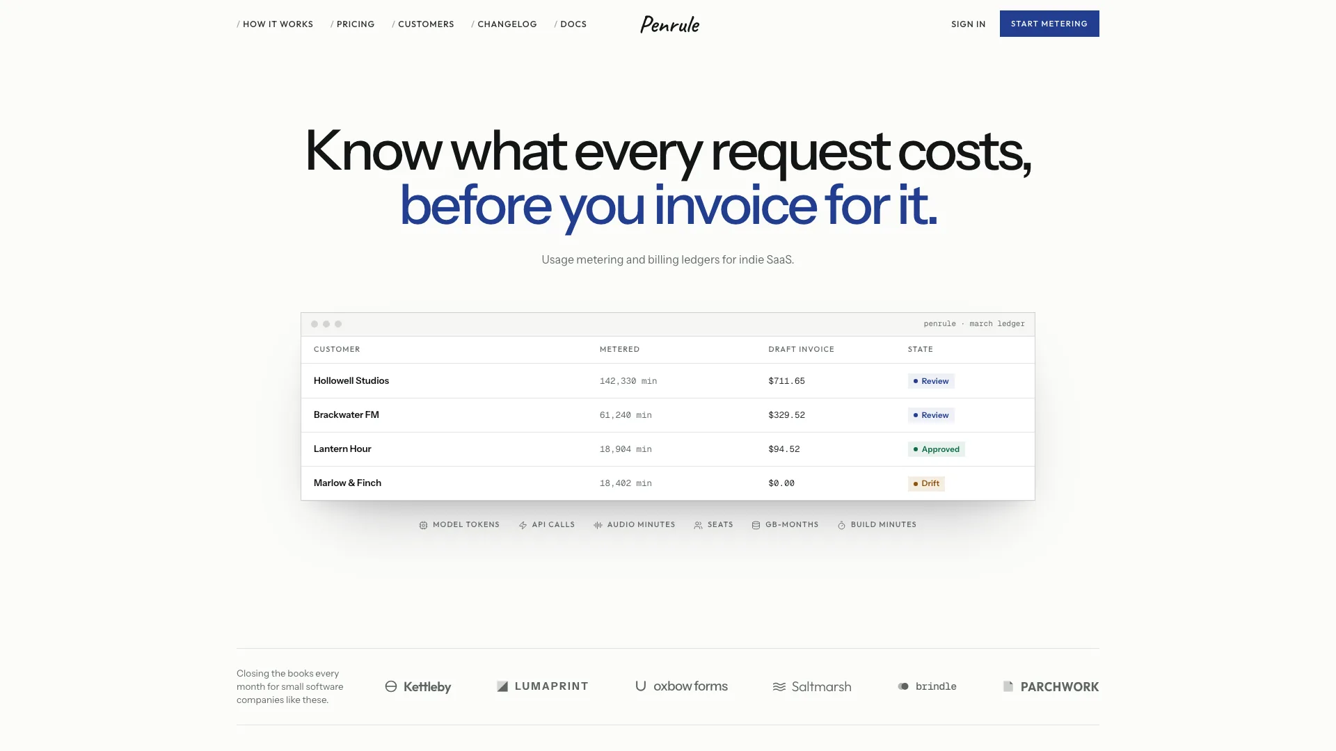
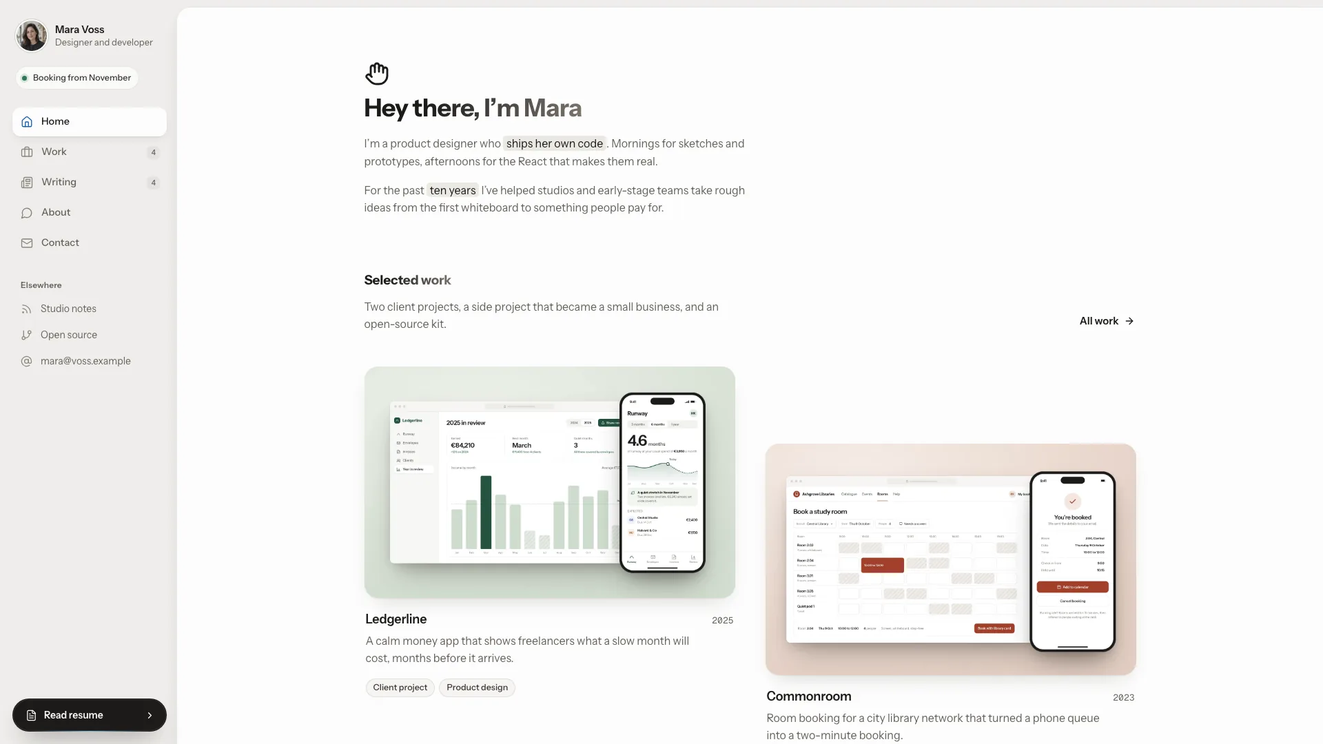
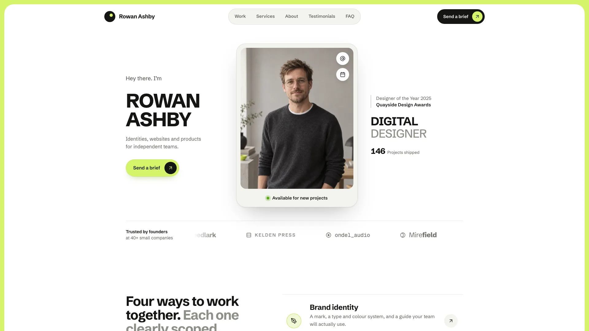
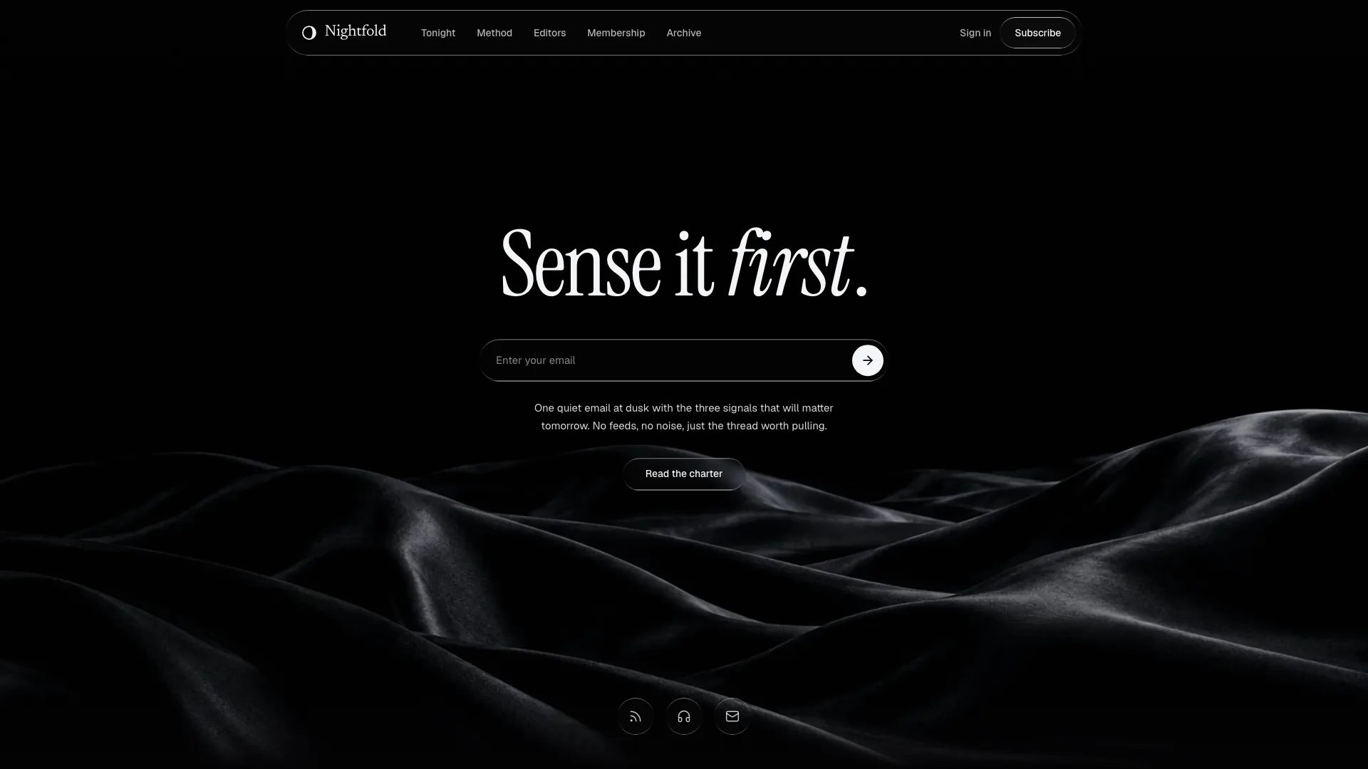
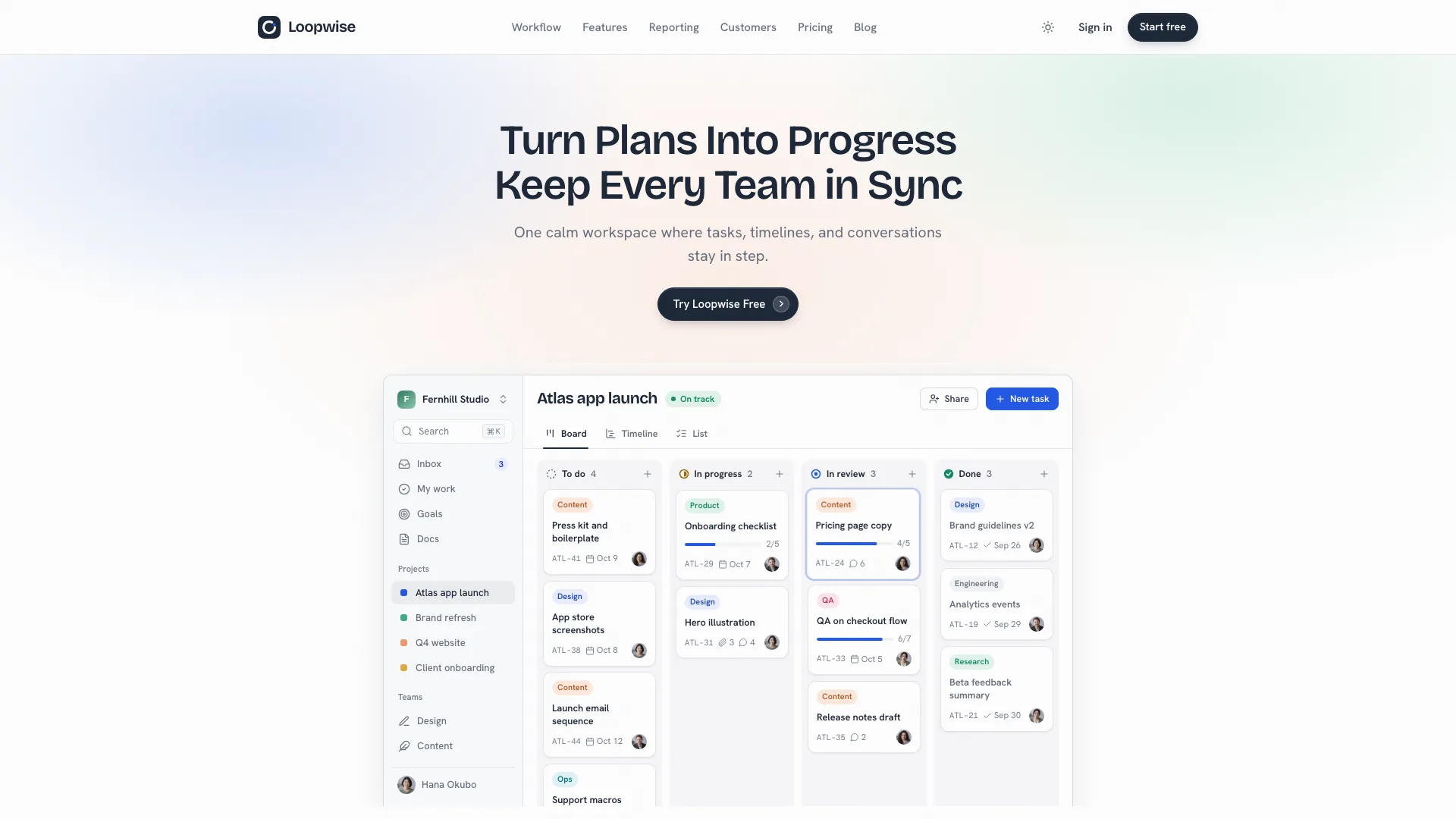
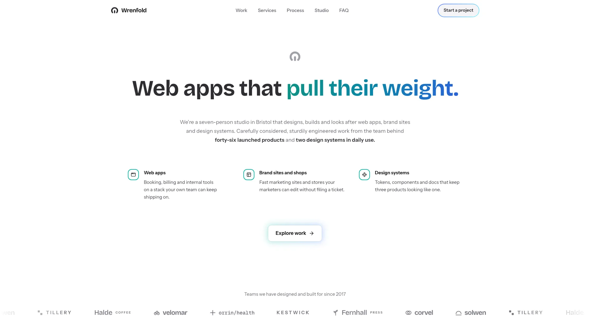
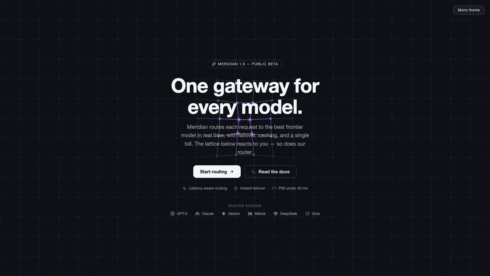
Build a layered product introduction with a central message, announcement link, two actions and a large framed visual beneath. The supplied React/Next.js example adds a mobile menu and a header that narrows after scrolling past 50 pixels. A partner grid completes the opening composition. Local source and motion helpers are provided; actual visuals, truthful claims and destination wiring remain your integration work.
What you get
HeroSection and usage example, plus Button, AnimatedGroup and TextEffect source. The displayed hero uses AnimatedGroup for staged entrances; TextEffect is an additional helper rather than an automatically applied word animation. Maintain the copied source in your project.
A responsive centered introduction with a fixed header, mobile menu-open state, announcement link and action group. Scroll state changes header width/treatment and its visible desktop account action. The visual frame switches image paths between light/dark modes, with a mountain backdrop shown in dark mode.
The written contract defines warm paper/teal light tokens, dark roles, Outfit body type, Sora headings and a 0.875rem base radius. It calls for restrained motion and inline SVG interface icons with 1.5 px square-cap strokes; real vendor marks should be monochrome and visibly named. Reconcile these references with fixed classes and demonstration assets during integration.
A four-column partner-mark grid with a hover-revealed teams link, local-path imagery examples, third-party notes and a source checker. The ZIP includes no referenced cover/wordmark or WOFF2 font binaries. React, Next Link, framer-motion, Lucide, Radix Slot, class-variance-authority, cn and host styling need integration.
Before you choose
Make the large visual demonstrate the product rather than decorate an unsupported promise. Finish both theme asset sets and the header’s real routes, then test the opening as one journey from announcement to action.
Good fit
A product introduction where a real screenshot or strong visual deserves a large framed presentation below the message.
A page needing an existing header/hero/partner composition with editable entrance motion and scroll-aware navigation styling.
A team willing to supply evidence-backed claims, real destinations and local assets while maintaining component source.
Not for
A verified partner roster, working sign-in/registration, product backend, forms or checkout just because corresponding labels are present.
A dependency-free/versioned package or guaranteed compatibility with a mature design system and all framework conventions.
Automatic theme/content adaptation, an authentic product screenshot supplied by the abstract demo images or completed mobile/accessibility acceptance without testing.
How to use
You say/hero-skyline Add the Skyline Hero section to the top of the landing page for [product name]. Use my supplied copy and assets, and follow the existing page framework and styling.
Read the existing framework, client boundaries and styles, then copy the component and helpers into its conventions. Resolve Next Link, React state/effects, framer-motion, Lucide, Button dependencies and cn. The hero contains hooks, so establish the appropriate client boundary; a different framework or standalone HTML requires deliberate adaptation.
Replace the announcement, headline, copy, product claims and fictitious partner marks. Connect #link/# targets and the teams link to intended destinations. Merge or remove the included fixed header if your page already has navigation; a local menu toggle is not an account authentication flow.
Supply local light/dark visual assets, backdrop and wordmarks. Use actual product screenshots if describing a product screen, rather than the demo’s unrelated cover paths. Follow portrait/abstract/photo slot rules, accurate name/image pairing and local WebP sizing; supply local fonts as well. Check both theme branches rather than replacing only the visible image.
Reconcile fixed logo/colors and spring entrances with the written restrained-motion contract; some example transitions explicitly use bounce. Keep the large visual understandable at phone width, where its wrapper deliberately extends to the right. The partner list remains four columns, and its teams link is revealed visually on hover; provide an equally usable focus/touch route.
Run node scripts/check-blocks.mjs TARGET, build and test before/on/after the 50 px header threshold, mobile menu disclosure, every destination, image loading, reduced-motion behavior and keyboard focus. The source checker cannot verify partner claims, runtime networking or responsive quality, and the supplied menu needs accessible expanded-state behavior reviewed.
Requirements and costs
You bring
Not collected yet
Dependencies
Not collected yet
Outside costs
Not collected yet
Publisher testing
v1.0.0 — Claude Code / Claude Desktop / Cowork / Codex / ChatGPT
FAQ
The example is React/TypeScript with Next Link and framer-motion helpers. Configure client boundaries and project aliases; the package’s adaptation instructions do not mean every framework port is already implemented.
No explicit service API appears in the inspected hero. It references local images/marks that are absent from this ZIP. Supply local files and inspect requests in the completed host application.
Yes. Replace both light/dark visual paths and any backdrop/partner assets with suitable local material. Use real screenshots for product evidence, follow the slot guide and review every crop and theme state.
After scrollY exceeds 50 pixels, header styling narrows and desktop account actions change to a Get started treatment. The main artwork is not a scroll-scrubbed scene; its motion is entrance animation.
It opens local navigation content, but account links are placeholder destinations. Real authentication, navigation targets and keyboard/touch disclosure acceptance still need implementation and testing.
User reviews
—0 reviews
Select a star to share your experience.
No reviews yet. Ratings appear once readers share real experiences.