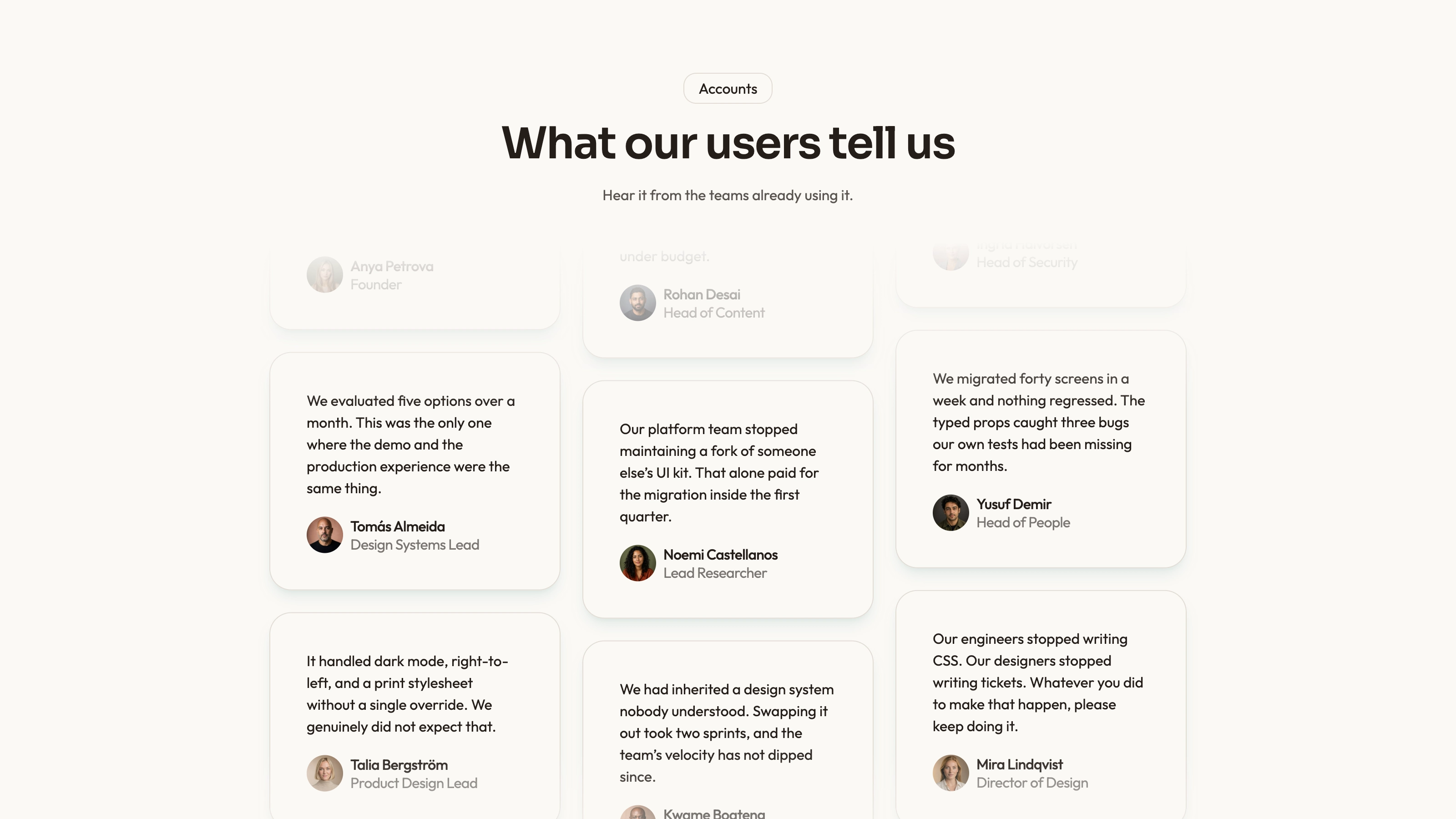
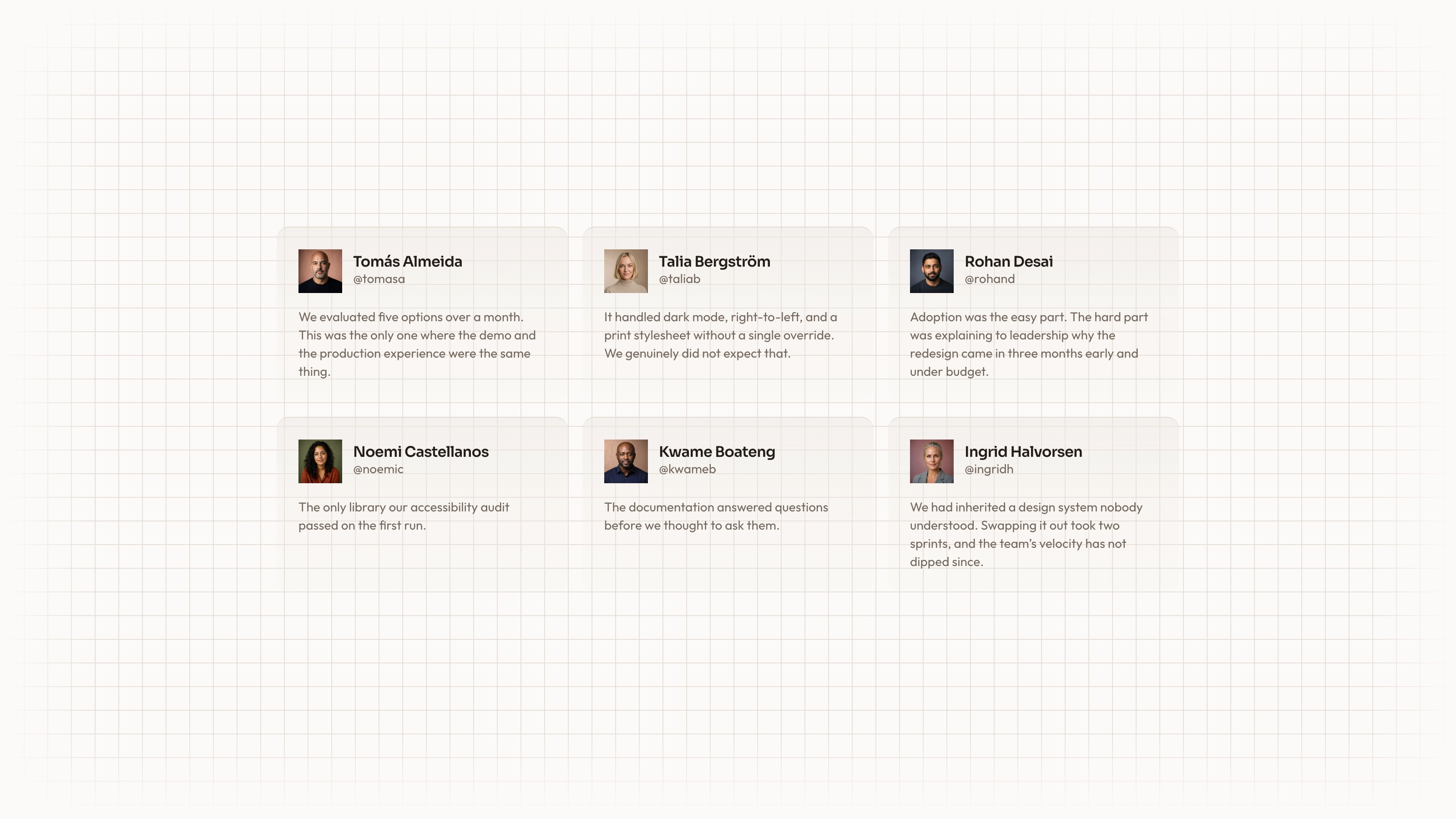
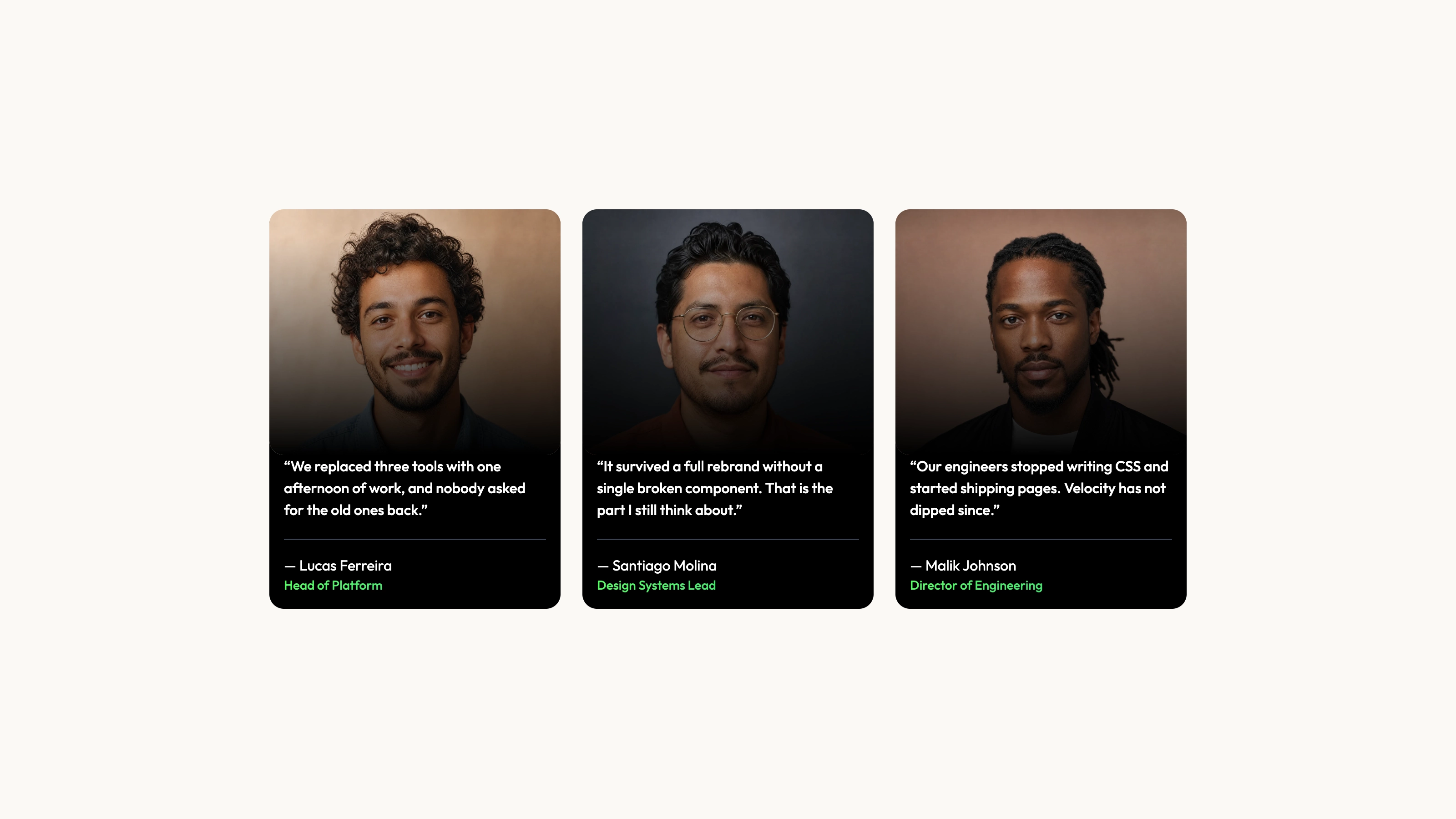
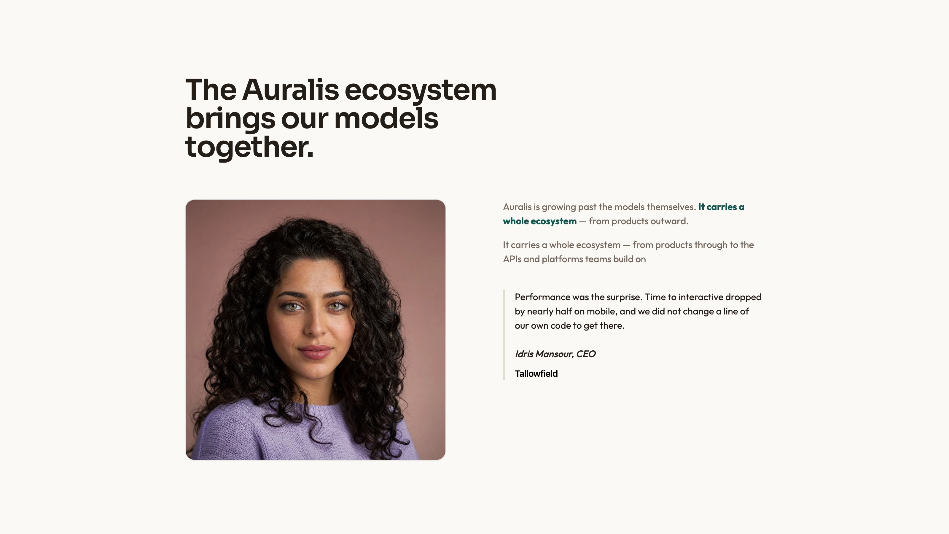
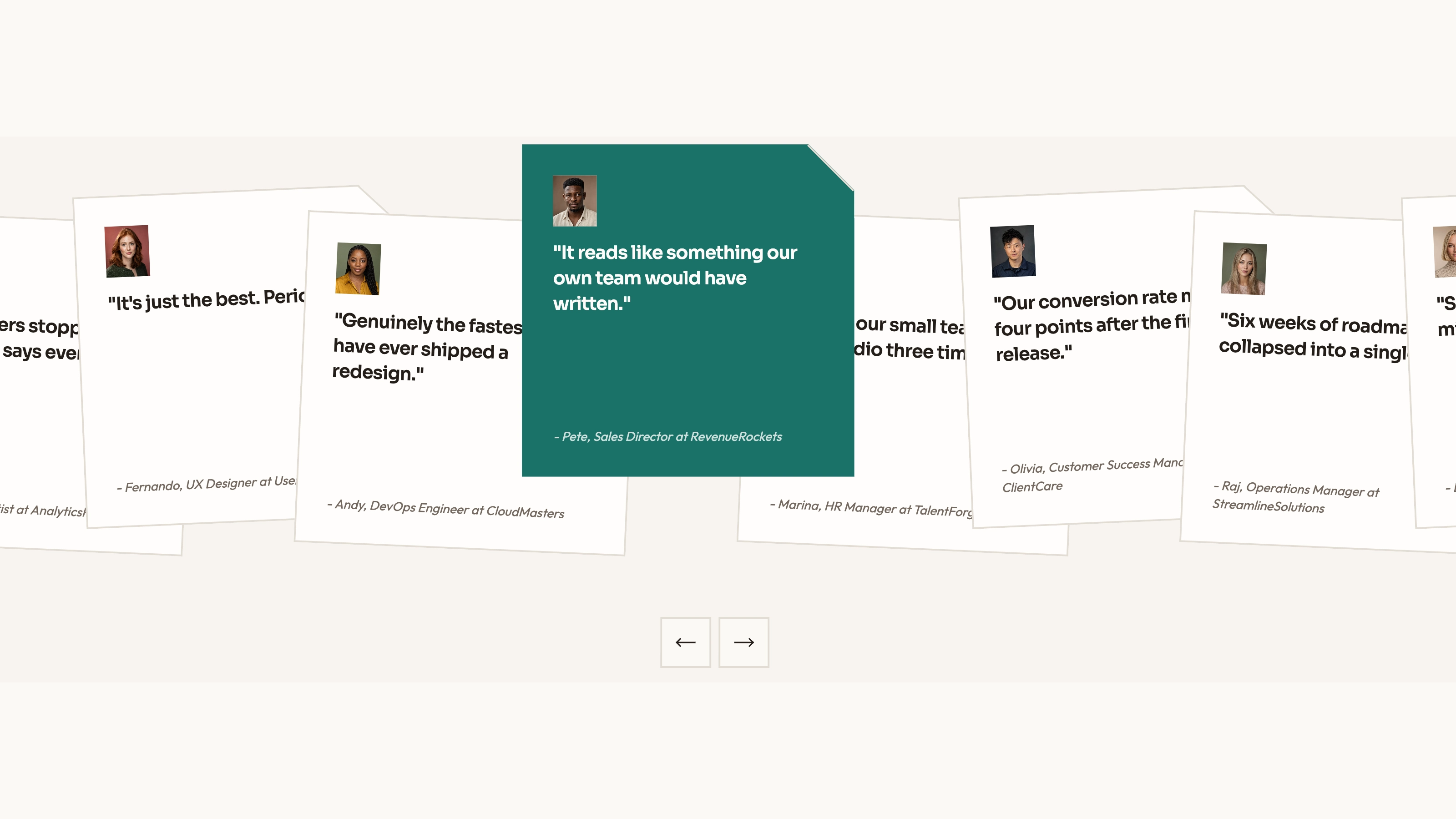
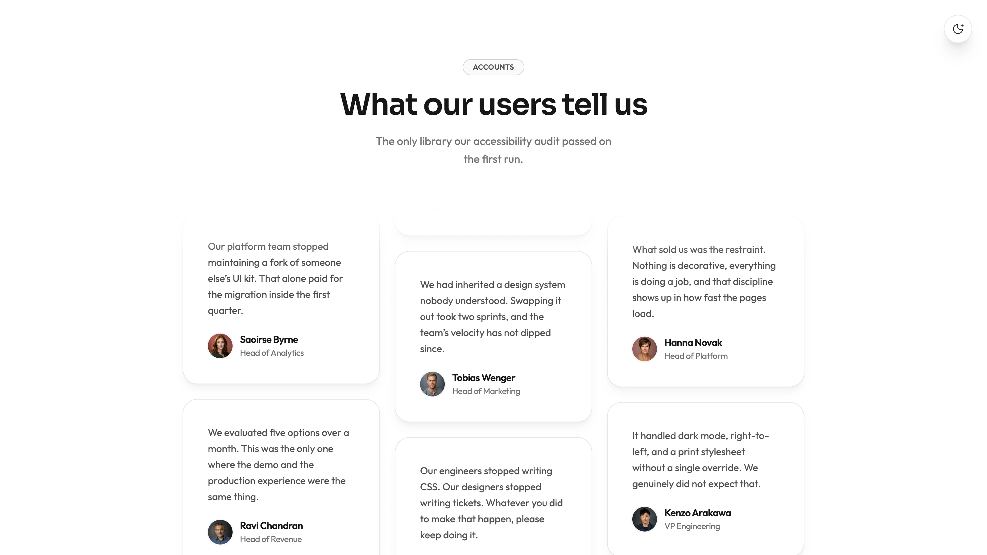
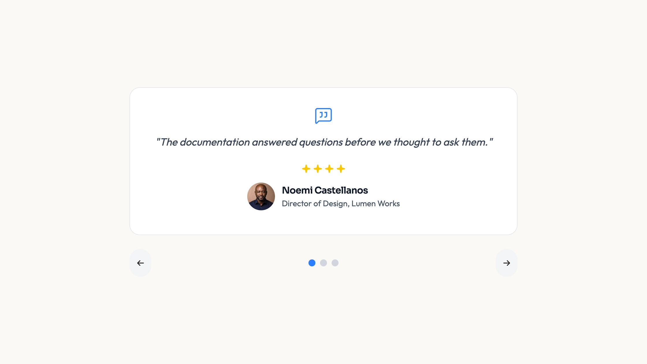
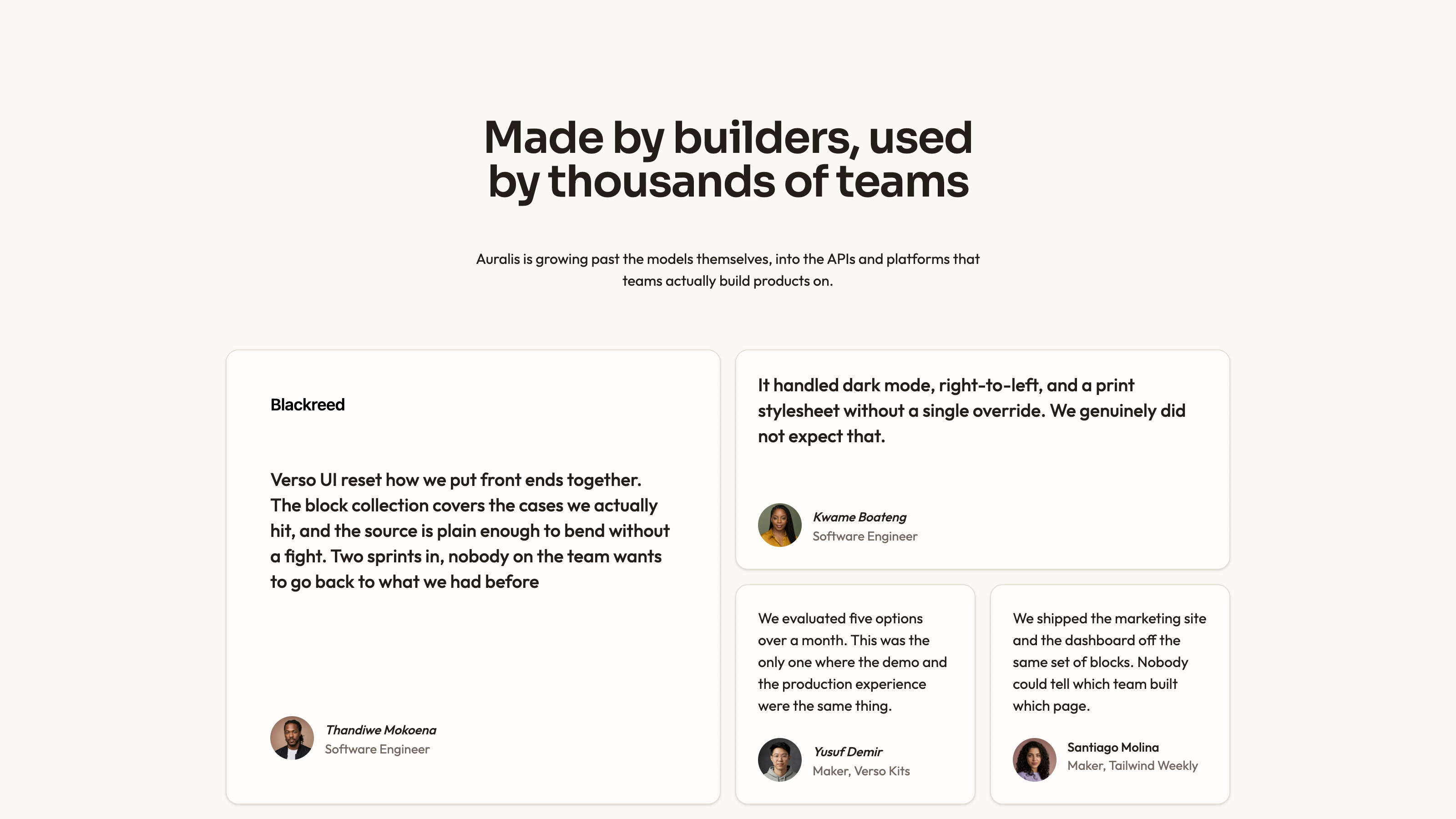
Arrange seven short customer quotations as a varied wall of large accent cards, blue panels and compact dark cards. Author and role sit beside portrait slots, while a responsive grouping changes the balance of cards across screen sizes. The package supplies React markup and reveal variants, but its referenced TimelineContent animation helper is absent and must be implemented or adapted before the example can run.
What you get
A ClientFeedback React/TypeScript component and usage example, with seven hardcoded quote/name/role/image groups. Copy and edit the source in your project; it is not a separately versioned npm block or a review-management service.
A large-screen three-column composition with a two-card left group, three compact middle cards and a two-card right group. Smaller widths change the grouping through flex layouts. Reveal variants specify blur/vertical entrance with 0.4-second index delays and 0.5-second transitions; the actual trigger implementation is not included.
The written visual contract defines warm paper/teal light tokens, dark roles, Outfit body type, Sora headings and a 0.875rem base radius. It specifies restrained entrances and inline SVG icons with 1.5 px square-cap strokes; real vendor marks should be monochrome and visibly named. Reconcile the source’s fixed styles with those references rather than assuming every color or dimension already follows one token.
Imagery/icon guidance, third-party notes and a source-check script. No portrait or WOFF2 font binaries are bundled. The code requires React, Next Image and a compatible TimelineContent implementation, plus host utility/theme styling including the nonstandard primaryColor token.
Before you choose
Use varied card sizes to give concise, specific testimonials a readable hierarchy. Finish the missing helper and correct every attribution first; color and animation should organize real customer evidence rather than disguise placeholder content.
Good fit
A product or service with several concise approved testimonials that can support a varied editorial card wall.
A page needing an existing relationship among quote, attribution and portrait rather than starting with an empty grid.
A team prepared to finish the missing animation dependency, maintain source and supply accurate testimonial assets.
Not for
A canvas-rendered backdrop or procedural graphics engine; the inspected background is CSS geometry, despite the older canvas claim.
A fully runnable dependency-complete package, a versioned npm block or an automatic fit with a mature design system.
Review collection, verified customer identities, navigation, forms, authentication or checkout, or proof that demonstration praise describes your product.
How to use
You say/testimonial-colour-blocks Add the Colour Block Testimonials section to the landing page for [product name]. Use the quotes, names and portraits I provide; do not invent testimonials. Follow the existing page framework and styling.
Inspect the host framework and styles before copying ClientFeedback/demo. Resolve React and Next Image, then supply or replace the missing @/components/ui/timeline-animation import and its TimelineContent API. The package contains no definition of that helper, so its reveal variants alone do not make the example runnable. Other stacks require a real port; standalone HTML is an optional explicit adaptation.
Replace all seven quotes, names, roles, business names and section claims with accurate approved content. Some displayed names differ from the names embedded in the sample avatar paths; do not treat those placeholders as real person/photo pairings. Review repeated names and generic praise before publishing.
Supply local portraits and fonts, preserving each real attribution. Follow the image-slot rules: portraits for people, abstract plates in special blend/invert/contain slots and photographs elsewhere. Use appropriate local WebP sizes, meaningful alternative text instead of the sample logo alt, and avoid accidental image repetition.
Reconcile blue/black/primaryColor treatments with the written warm/teal contract and define any custom utilities. The grid background is CSS, not a canvas loop with tunable rendering constants. Adjust the section heading level when embedding it, and keep actual quote lengths balanced across the differently sized cards.
Run node scripts/check-blocks.mjs TARGET, build and inspect all breakpoint groupings after the missing helper is resolved. Verify portrait loading, complete text, contrast and reduced-motion behavior in the chosen reveal implementation. The scanner cannot prove dependency completeness, claim authenticity or responsive visual quality.
Requirements and costs
You bring
Not collected yet
Dependencies
Not collected yet
Outside costs
Not collected yet
Publisher testing
v1.0.3 — Claude Code / Claude Desktop / Cowork / Codex / ChatGPT
FAQ
React/TypeScript with Next Image and utility classes. It also imports TimelineContent from a project-local animation module that is absent from this ZIP; implement a compatible helper or adapt the markup before expecting a successful build.
The inspected component contains hardcoded quotes and local portrait paths, not a review-service API. Those image/font files are not bundled. Verify actual requests after integration, including any replacement animation helper.
Yes. Supply accurate local portraits and keep name/role/quote/image pairings together. The example paths are placeholders, and several do not match the displayed names. Follow the guide’s other slot rules only where those treatments are used.
No canvas drawing or WebGL appears in this component. The grids, masks and card fills are CSS; the previous canvas-rendered description overstated what is provided.
Their variants are present, but the TimelineContent component that consumes them is missing. Triggering and reduced-motion behavior depend on the compatible implementation you supply.
User reviews
—0 reviews
Select a star to share your experience.
No reviews yet. Ratings appear once readers share real experiences.