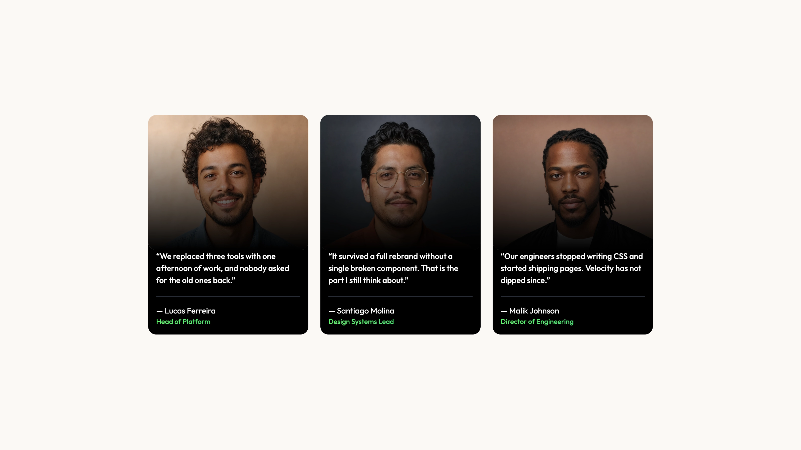
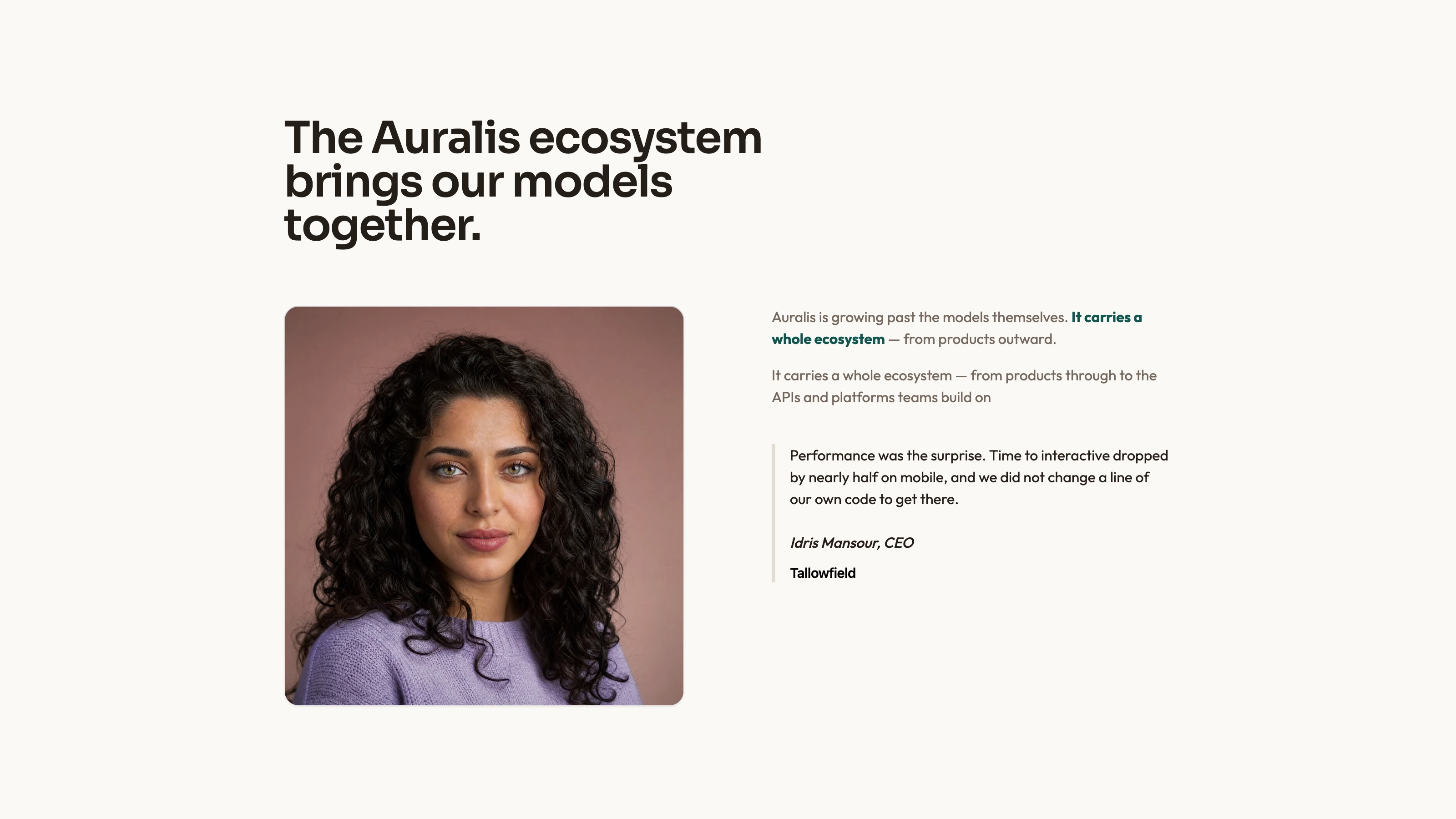
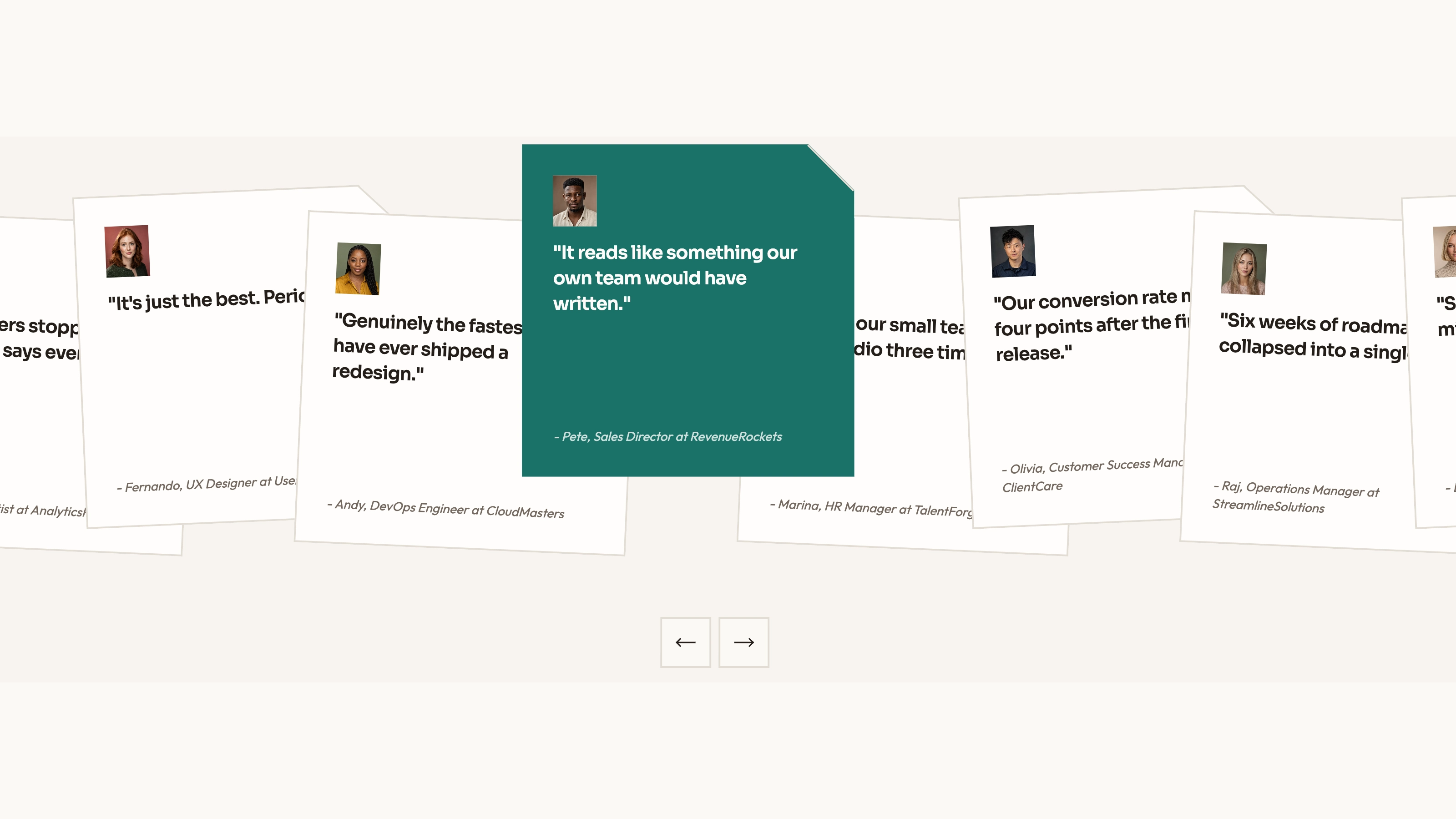
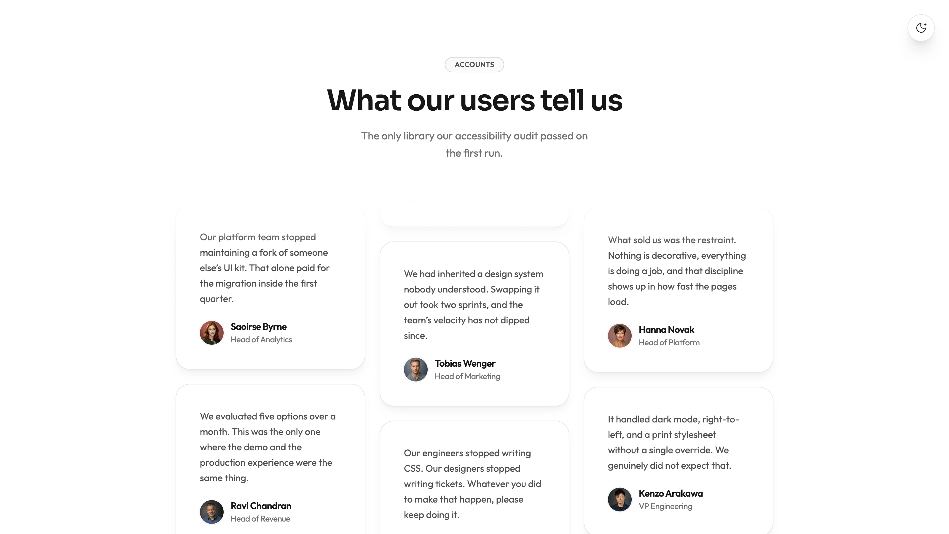
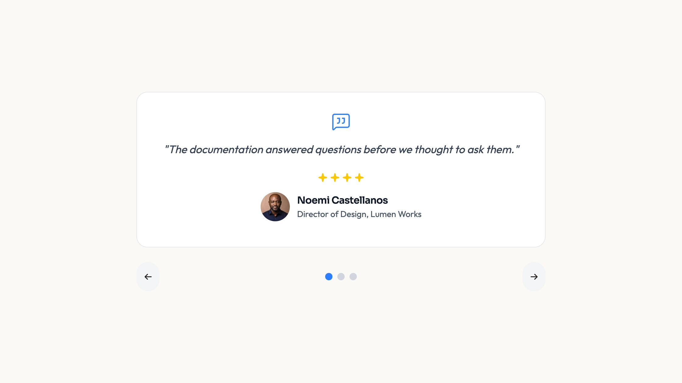
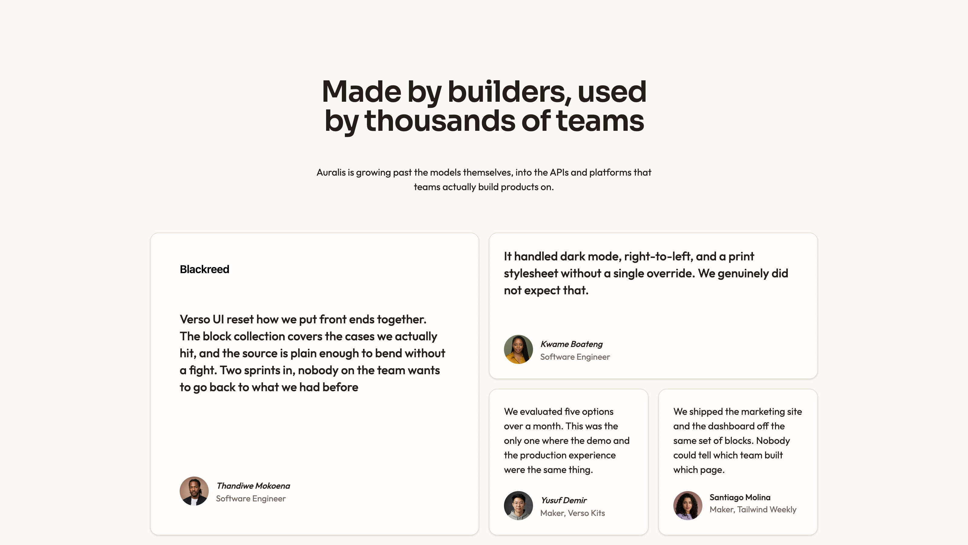
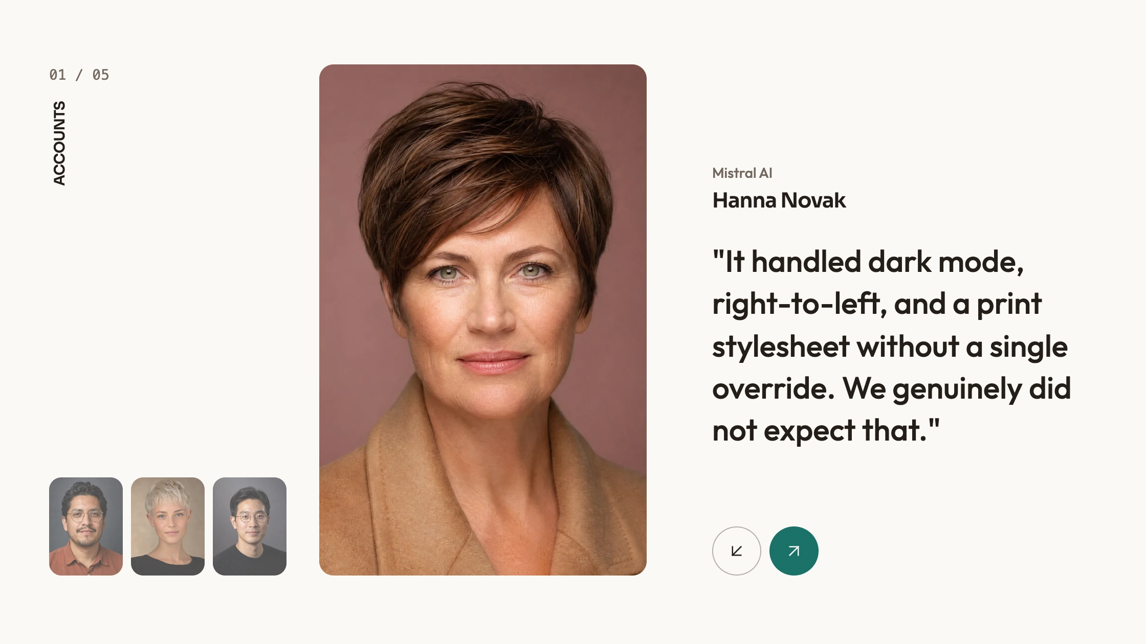
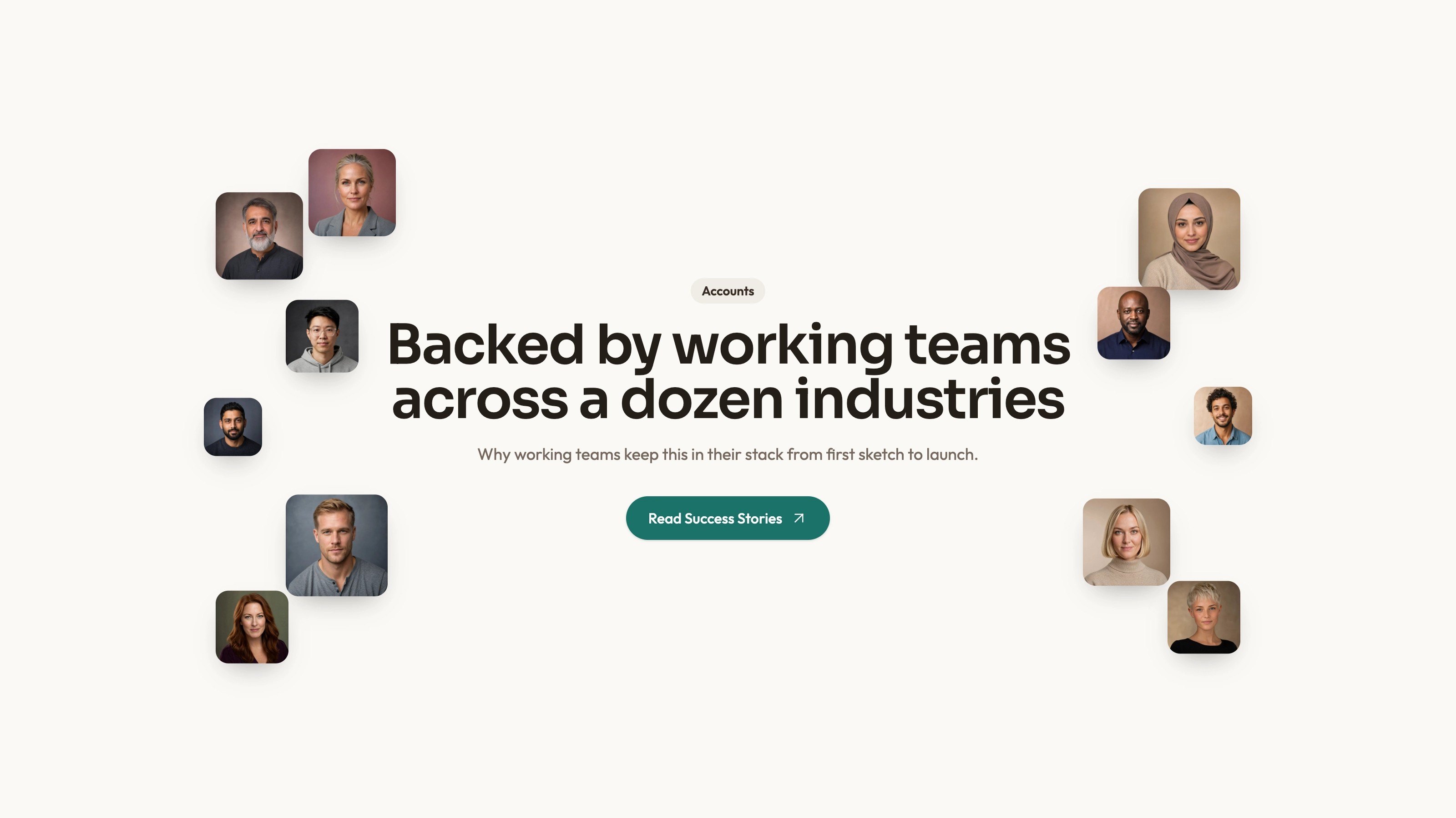
Present short customer statements in a compact grid without making readers operate a slider. Compact Grid keeps each portrait, author name, handle and quote inside a small card; a record can optionally link to its source. You receive editable component source and a usage composition, rather than a hosted review widget.
What you get
A reusable React/TypeScript TestimonialCard and local Radix-based Avatar source, with author name/handle/avatar, quote, optional href and className. The six-record demo uses one column, then two at the small breakpoint and three at large width; each card stays at a320 px maximum width.
A compact visual treatment with a fine upper border, subtle background shading, avatar-led attribution and hover color changes. The package’s theme reference describes palette, typography, radius and motion rules for integration; inspect the actual classes as well as the documented tokens.
Editable source, local-path portrait examples, theme/icon/imagery references and a source checker. The ZIP contains no actual portrait or WOFF2 font files. React, @radix-ui/react-avatar, cn and host utility/theme styling need integration; example destinations are demonstration content, not verified source matches.
The written visual contract defines warm paper/teal light tokens, dark roles, Outfit body type, Sora headings and a 0.875rem base radius. It specifies restrained motion and inline SVG icons with 1.5 px square-cap strokes; actual vendor marks should be monochrome and visibly named. Reconcile the copied source with those references, including fixed classes and dimensions.
Before you choose
Choose this over a moving testimonial layout when readers should compare several statements at their own pace. A compact quote should still answer a distinct question; several short versions of the same generic praise add less information than a smaller set with specific context.
Good fit
You have several brief approved quotes and want their identities and source context visible at the same time, without waiting for carousel transitions.
A product page needs a modest evidence section that fits around other content rather than a full-screen testimonial feature.
You want to own readable source, adapt it to your application and maintain its dependencies yourself.
Not for
Automatically importing or verifying social reviews, moderating submissions or managing a customer-feedback account.
A versioned, managed npm service. The delivered source and example need integration and ongoing ownership.
An entire page system with navigation, forms, authentication or checkout. Those capabilities are outside the card.
Dropping the authored palette and type into a mature design system without checking compatibility. Map the visual rules deliberately instead of assuming they match every host.
How to use
You say/testimonial-compact-grid Add the Compact Testimonial Grid section to the landing page for [product name]. Use the quotes, names and portraits I provide; do not invent testimonials. Follow the existing page framework and styling.
Inspect the framework, aliases, styling and Avatar integration before copying the React card/demo and supplied Avatar source. Resolve @radix-ui/react-avatar and cn; copying the local file does not remove those dependencies. Adapt to the host conventions, with a real port for another stack and standalone HTML only when specifically requested.
Supply approved quote records and replace author name, handle, avatar, text and optional source URL together. Keep the wording faithful to its context and verify each destination: the sample’s handle and URL should not be treated as an already validated match.
The written visual contract defines warm paper/teal light tokens, dark roles, Outfit body type, Sora headings and a 0.875rem base radius. It specifies restrained motion and inline SVG icons with 1.5 px square-cap strokes; actual vendor marks should be monochrome and visibly named. Reconcile the copied source with those references, including fixed classes and dimensions. Supply local portraits and fonts: the package only references them. Use accurate person/name/handle pairings and apply the abstract-image rule only for adapted invert/blend/contain slots; otherwise use suitable photography. Review WebP sizing for final display.
Lay out the cards using the actual quote lengths. The example changes column count at breakpoints, but the card’s maximum width and author wrapping still need checking in the surrounding container. Add a meaningful focus treatment when href makes the whole card a link.
Run the supplied block checks and inspect the final section on a phone and desktop. Check reading order, long names and handles, source destinations, image alternatives and contrast; a static pass does not verify the testimony itself or guarantee every replacement will fit. The card uses AvatarImage without rendering AvatarFallback, even though that helper is exported; provide deliberate image-failure behavior if needed. This is a static DOM grid, not the canvas backdrop promised by the generic summary.
Requirements and costs
You bring
Not collected yet
Dependencies
Not collected yet
Outside costs
Not collected yet
Publisher testing
v1.0.3 — Claude Code / Claude Desktop / Cowork / Codex / ChatGPT
FAQ
The supplied card and example are React-oriented. The package asks the assistant to inspect an existing repository and port imports, component structure and styling into its conventions. A standalone HTML rendition is appropriate for a separately requested standalone page; it does not mean the React source runs unchanged in another framework.
It does not fetch reviews from a hosted service. Local asset delivery is the intended contract, but the ZIP lacks actual portraits and fonts. Some sample href values navigate to external profiles and do not match their displayed handles; verify or replace them. Inspect actual requests in the completed host page.
Yes. Update attribution and source links along with the quote and portrait. Follow the imagery guide for portrait and special blend-mode slots, and test actual long text rather than relying on the short example’s proportions.
The inspected card renders as an anchor instead of a div. The whole card can therefore navigate to the supplied URL. Verify that the destination belongs to the statement and remains usable with a keyboard.
User reviews
—0 reviews
Select a star to share your experience.
No reviews yet. Ratings appear once readers share real experiences.