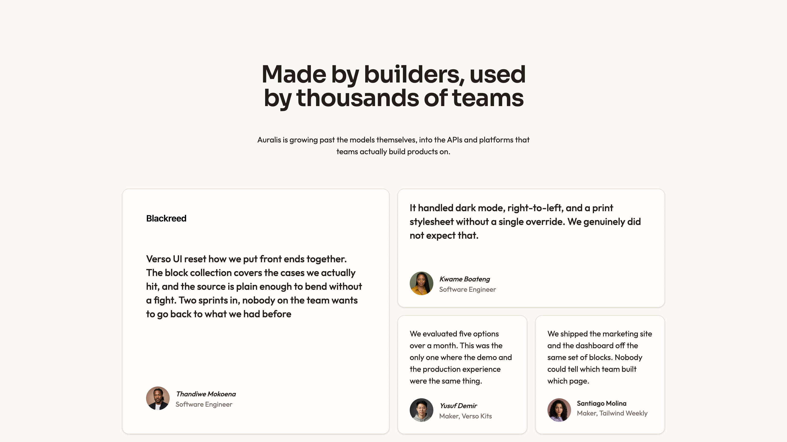
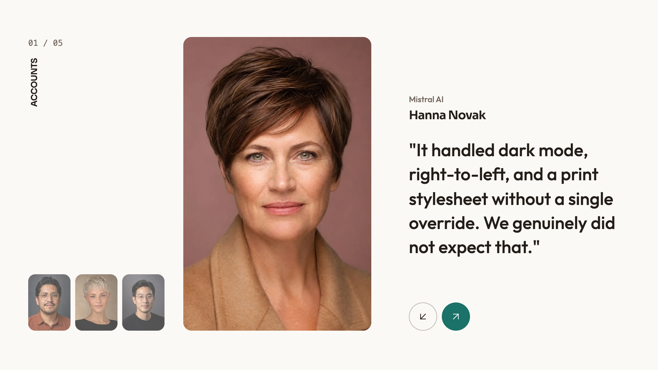
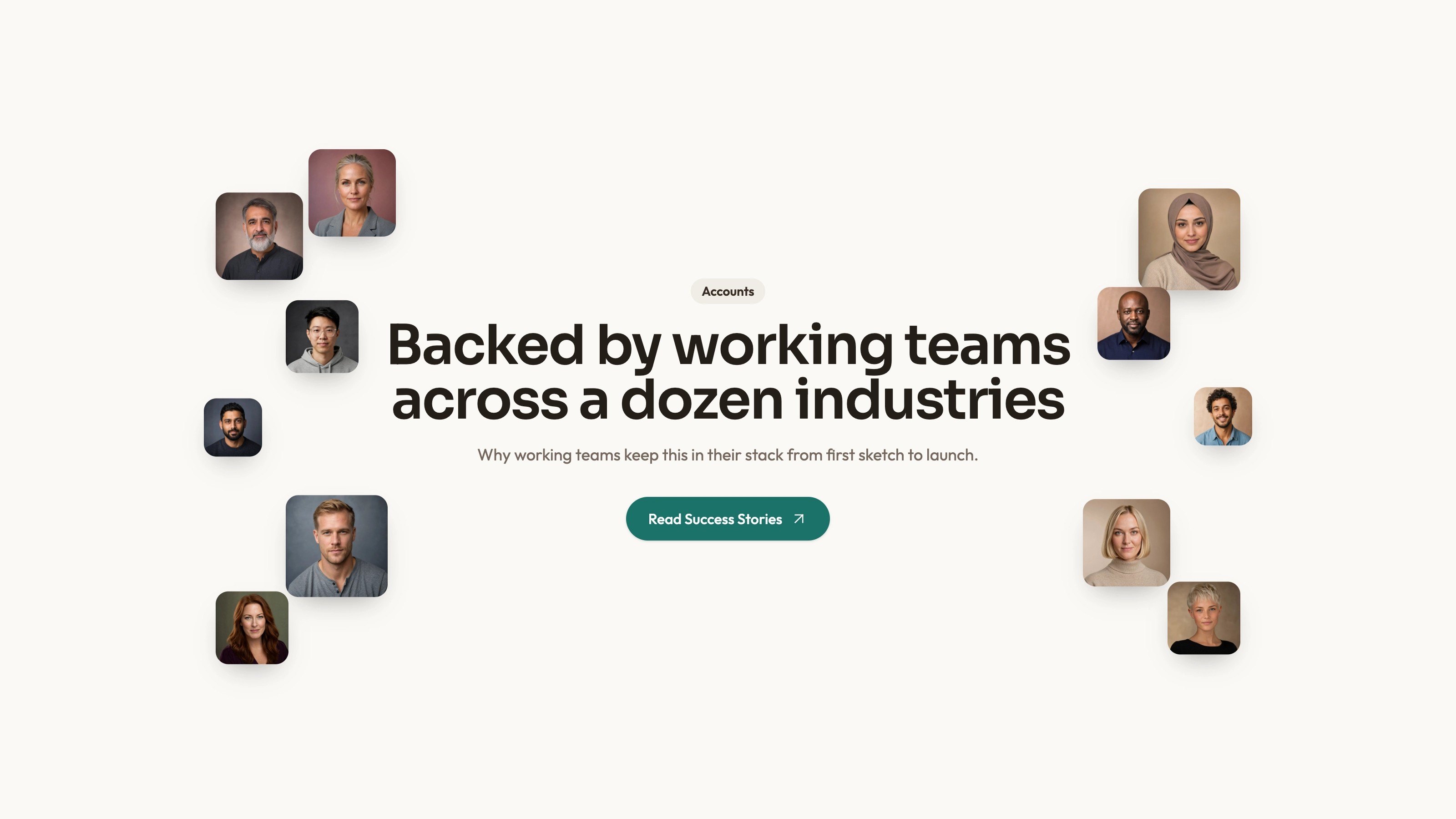
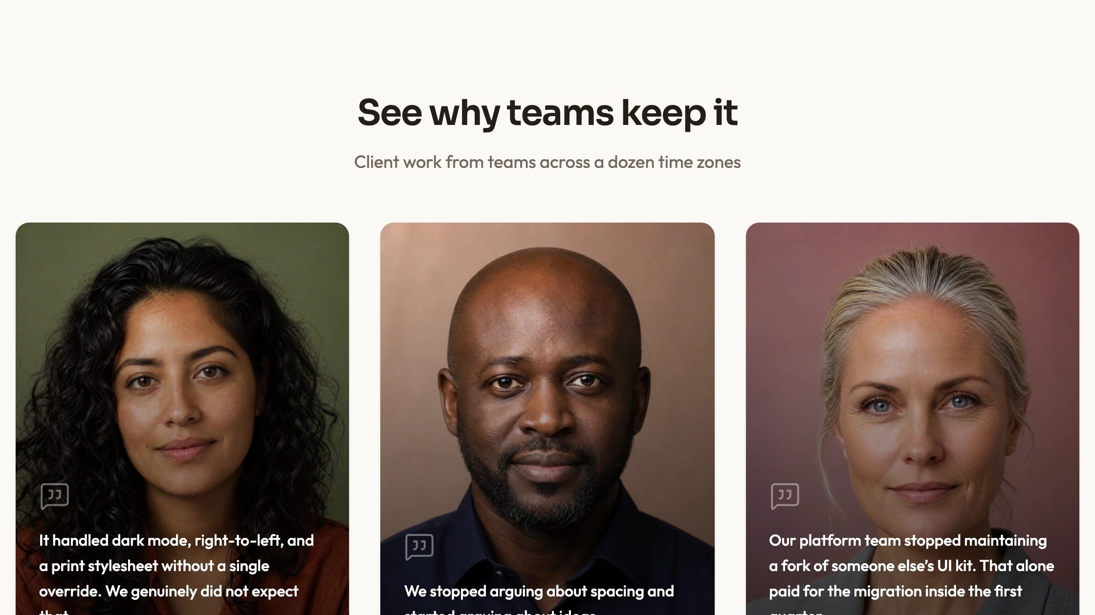
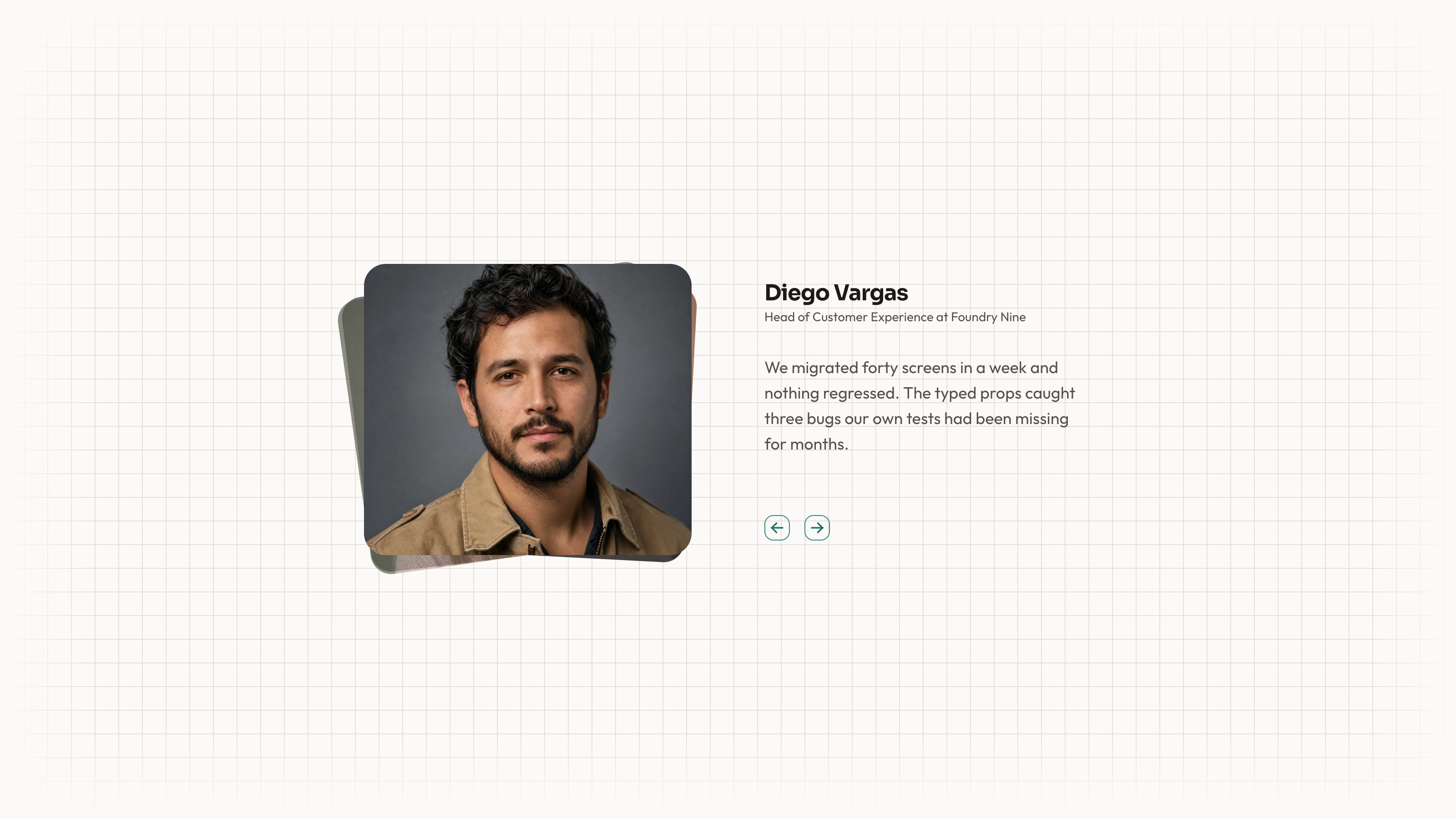
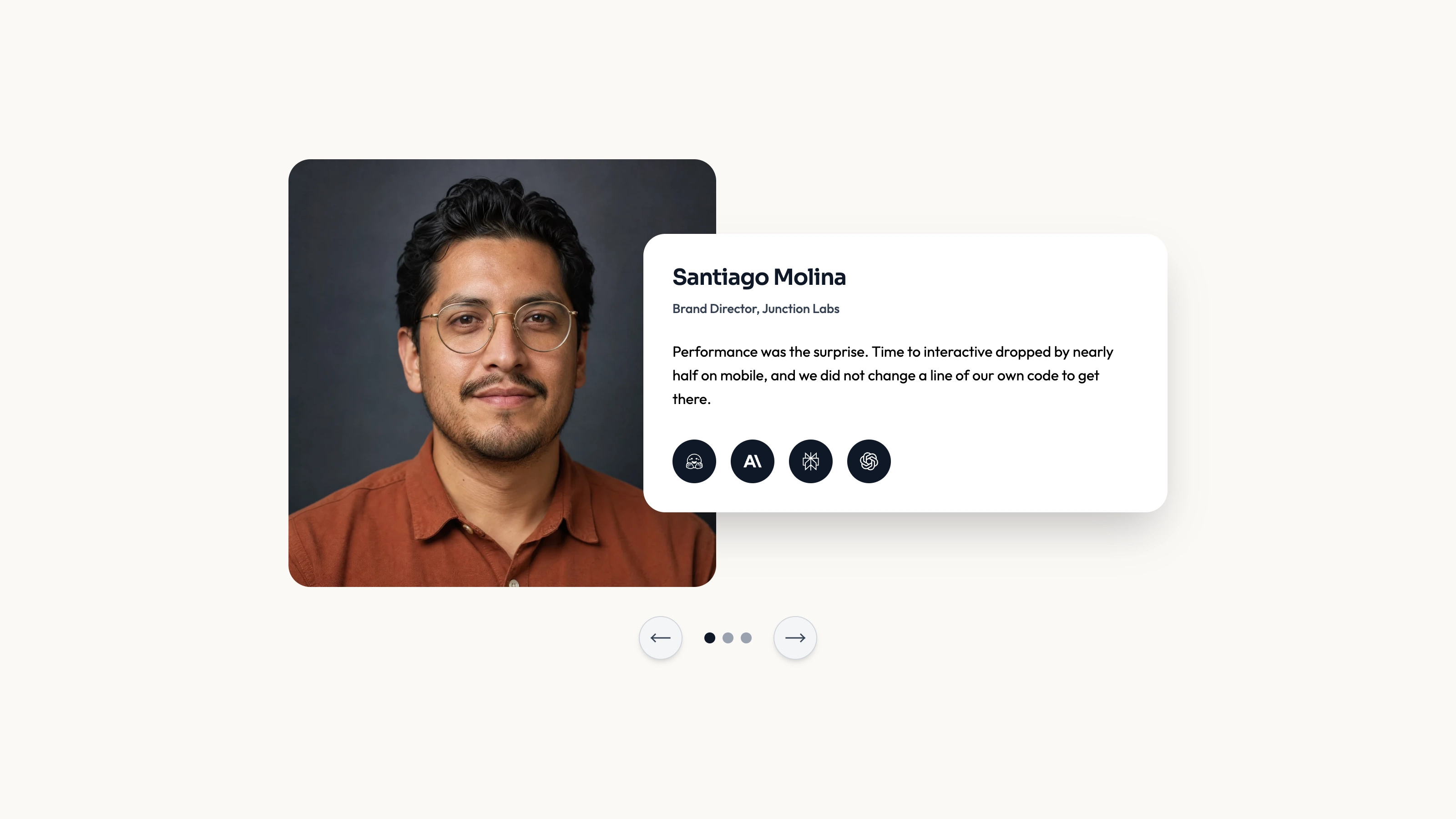
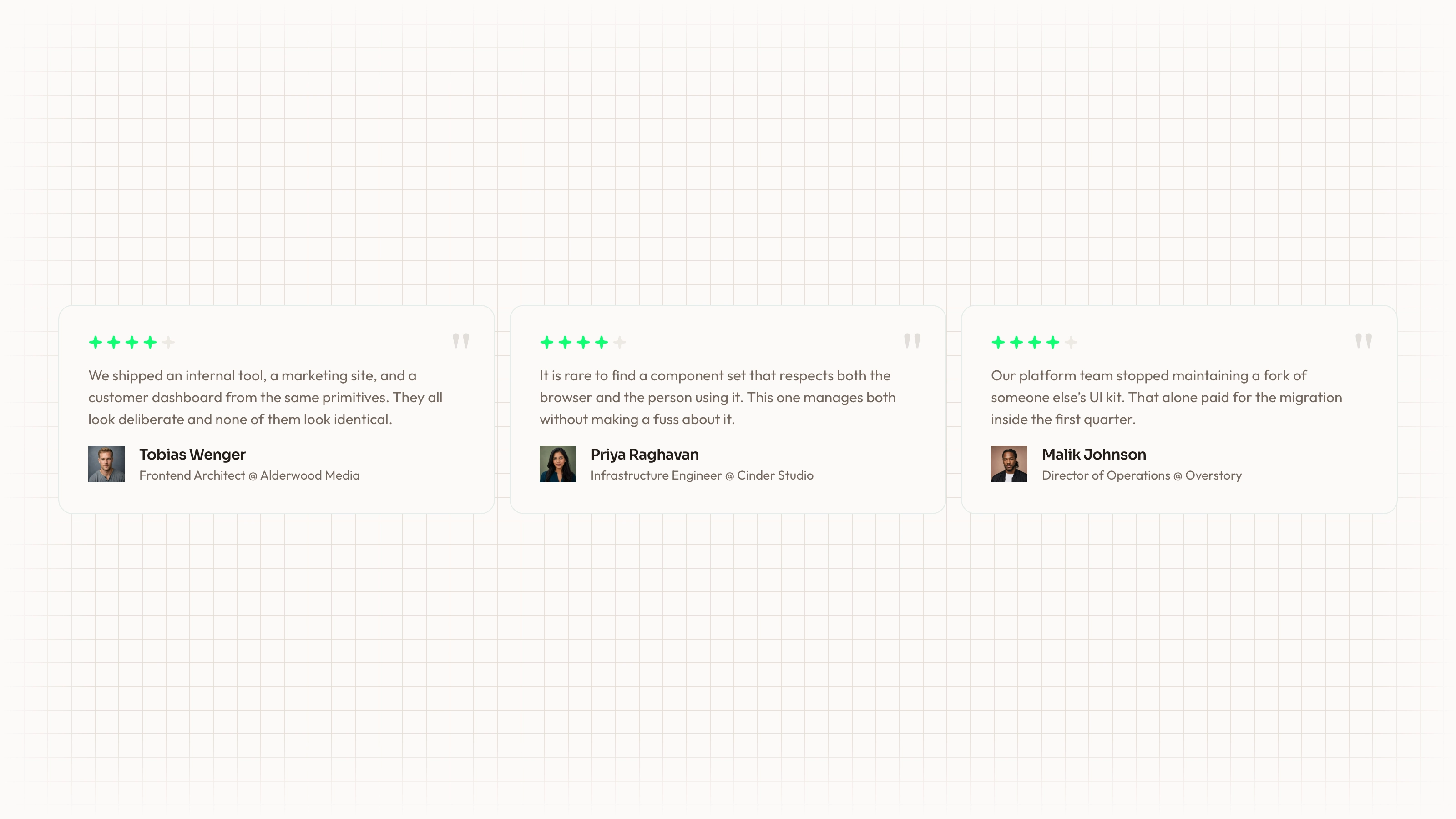
Let visitors read one short testimonial at a time with previous/next controls and direct page indicators. The supplied demo combines a quote, star count and author portrait/role inside an Ark UI carousel. A separate component shows the same library used for images. This is editable React presentation code; its ratings and quotes are illustrative, and no canvas backdrop is implemented despite the older description.
What you get
A three-testimonial demo and a separate BasicCarousel image example using @ark-ui/react/carousel. The testimonial composition lives in demo.tsx rather than being imported from the supplied carousel-1 component. Copy the appropriate source into your project and maintain it there.
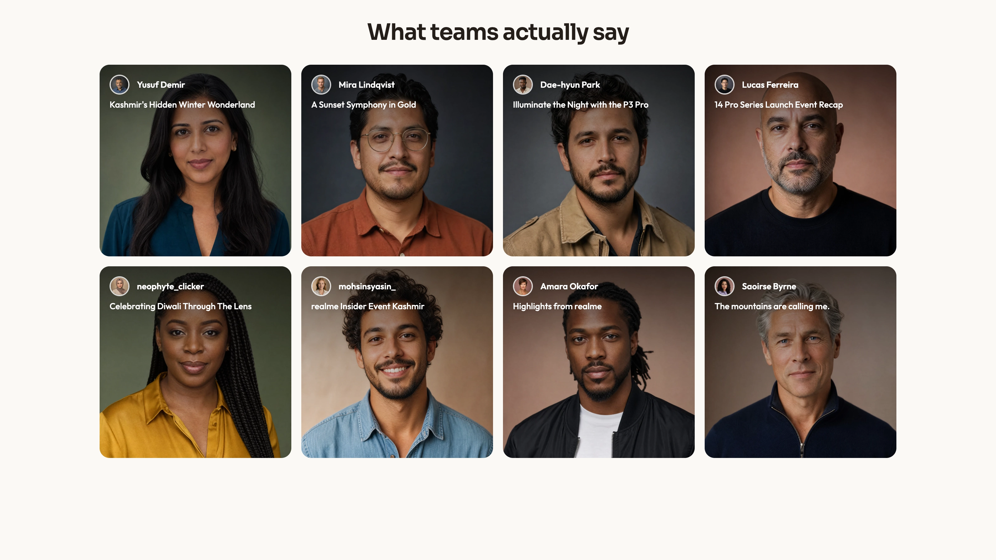
Previous/next triggers, page indicators and default first-page selection. The testimonial demo displays a supplied number of star icons, avatar, name and role; the separate image example has five local cover paths. Neither source configures a canvas backdrop or an automatic rotation timer.
The written visual contract defines warm paper/teal light tokens, dark roles, Outfit body type, Sora headings and a 0.875rem base radius. It specifies restrained motion and inline SVG interface icons with 1.5 px square-cap strokes, plus monochrome visibly named vendor marks. Reconcile fixed example styles with those references during integration; one token does not control every literal class or animation.
Imagery/icon guidance, third-party notes and a source-check script. Portraits, covers and WOFF2 fonts are referenced or specified but not bundled. React, Ark UI, Lucide and host theme/utility styling remain integration requirements.
Before you choose
Give readers control over a few concise, accurately attributed quotes. Explain any rating scale and test the actual controls; a headless carousel composition still needs host styling and accessible names to become a usable finished section.
Good fit
A page with a small set of concise approved quotes that readers should browse deliberately.
A team wanting an existing quote/portrait/role composition with manual carousel controls instead of a long testimonial wall.
A project willing to maintain source and test the carousel library, content and visual contract in its own environment.
Not for
A verified rating service, review collection, quote generation or automatic substantiation of the demo’s four-star entries.
A canvas graphic, dependency-free/versioned package or automatic match with a mature design system.
Complete navigation, forms, authentication, checkout or a preconfigured auto-advancing testimonial feed.
How to use
You say/testimonial-minimal-carousel Add the Minimal Testimonial Carousel section to the landing page for [product name]. Use the quotes, names and portraits I provide; do not invent testimonials. Follow the existing page framework and styling.
Inspect the host repository, install/resolve React and @ark-ui/react/carousel, and use the testimonial code from demo.tsx when quotes are the goal. carousel-1.tsx is an image-only example. Resolve Lucide and styling in the host conventions; other stacks need an actual port, with standalone HTML only for a specifically standalone output.
Replace testimonials with approved quote/name/role/rating data. Stars simply repeat rating times rather than calculating an average or normalizing a score. Validate the range and provide an accessible textual rating; the example has no rating scale label explaining what the icons mean.
Supply local portraits and keep them accurately paired with the named people. The sample avatar filenames differ from the displayed names. If using the image example, supply its covers too. Follow portrait/abstract/photo slot guidance, appropriate local WebP sizing, no accidental duplicate assets and local font delivery.
Apply the written palette/type/radius and icon contract. The demo’s arrow characters should become named inline SVG controls, and its blue/gray styling needs reconciliation with the warm/teal reference. Keep quotes short enough for the card and test real content rather than assuming a minimum height guarantees equal readable slides.
Run node scripts/check-blocks.mjs TARGET, build and test previous/next, direct indicators, keyboard focus, screen-reader naming and small-screen fit with the installed Ark UI version. The checker flags source patterns but cannot verify carousel behavior, asset resolution, ratings or network isolation.
Requirements and costs
You bring
Not collected yet
Dependencies
Not collected yet
Outside costs
Not collected yet
Publisher testing
v1.0.3 — Claude Code / Claude Desktop / Cowork / Codex / ChatGPT
FAQ
React/TypeScript with Ark UI’s carousel and utility styling; the testimonial demo also uses Lucide. The Skill calls for adaptation to the host repository, not a prebuilt port to every framework.
The inspected examples use local arrays and media paths without a review-service API. The media/font files are absent from this ZIP. Supply local assets and check requests in the completed page.
Yes. Use accurate portraits for the quote authors and suitable local cover images for the separate image carousel. Follow special blend/invert/contain rules only for slots using those treatments; the demo’s author/photo associations are placeholders.
demo.tsx contains the quote/rating/author cards. The supplied carousel-1 component renders cover images instead, so importing it alone does not produce the testimonial demo.
Neither behavior is configured in the inspected source. Navigation uses carousel triggers and indicators; the old canvas-backdrop wording is not supported by this package.
User reviews
—0 reviews
Select a star to share your experience.
No reviews yet. Ratings appear once readers share real experiences.