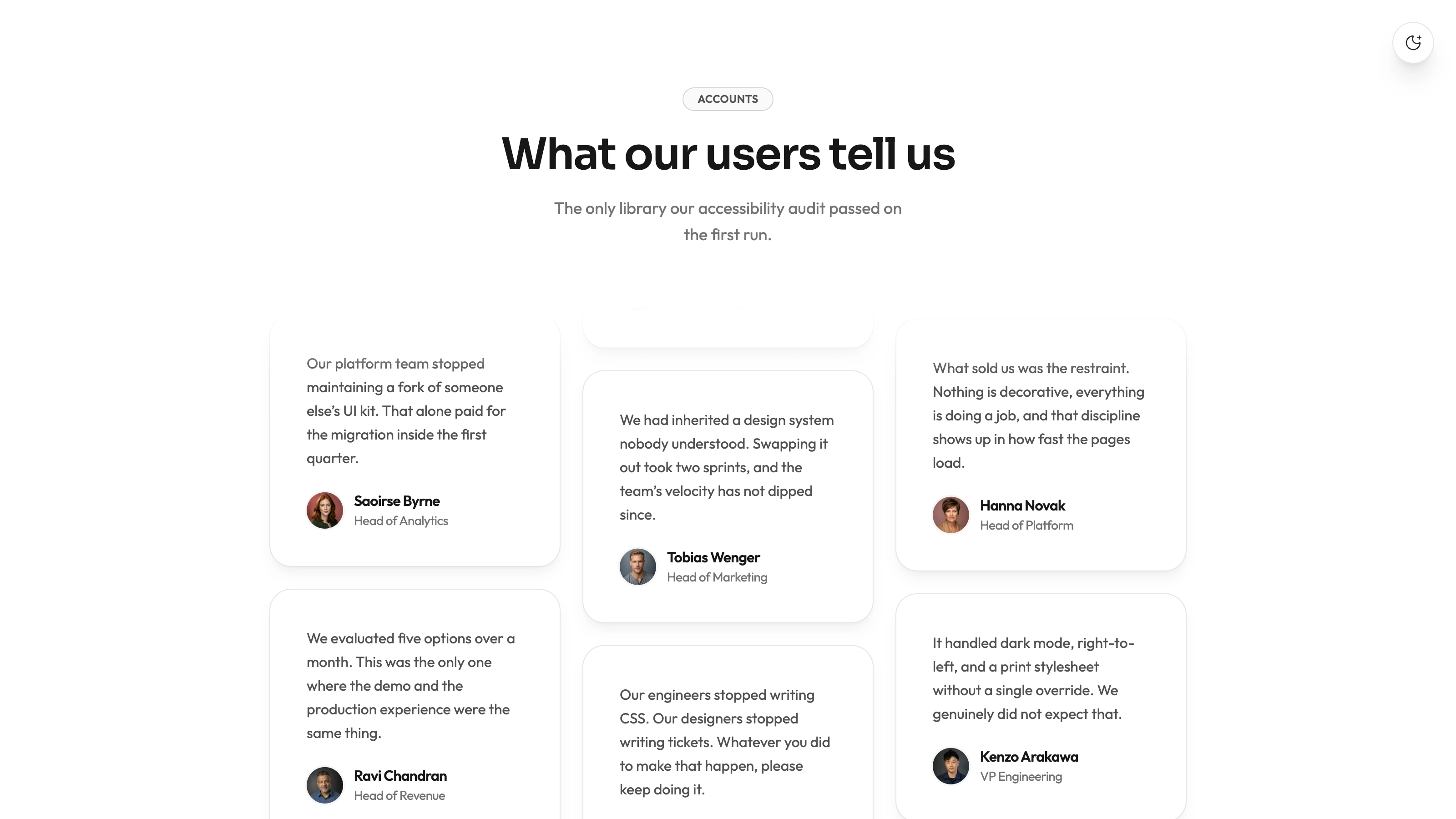
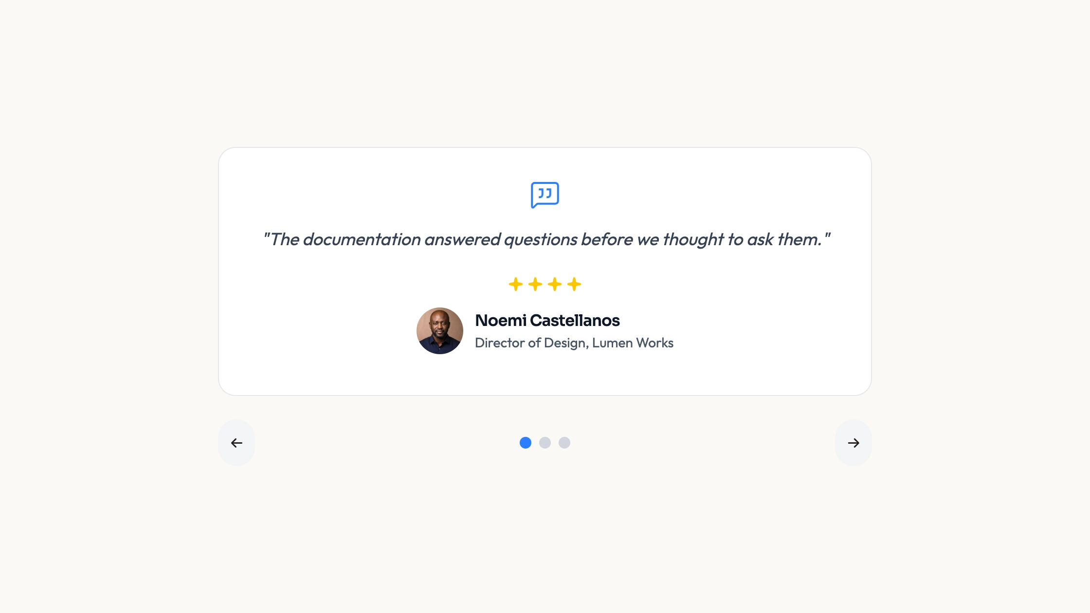
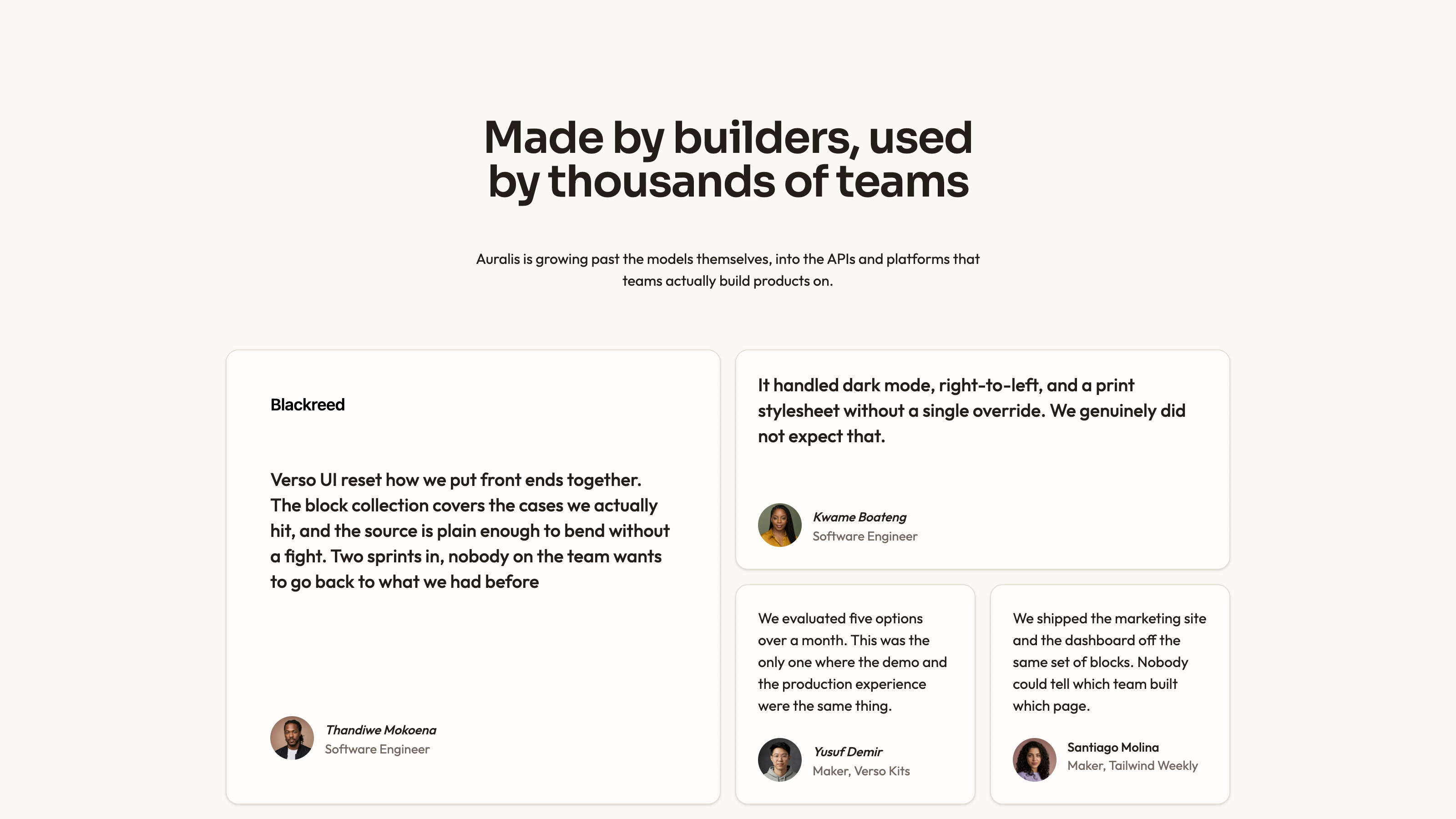
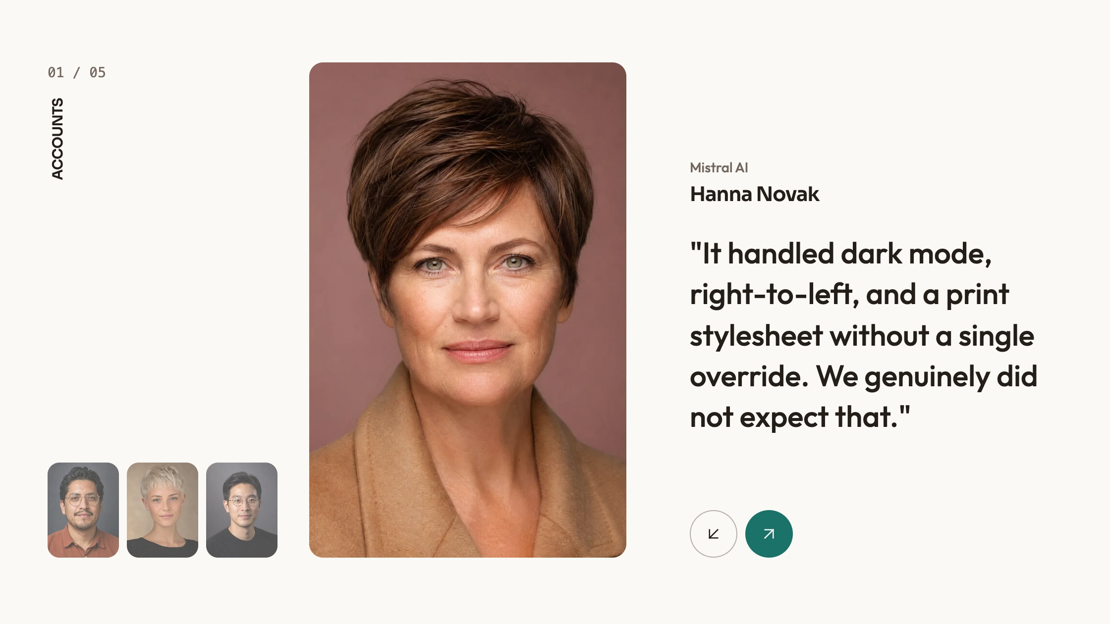
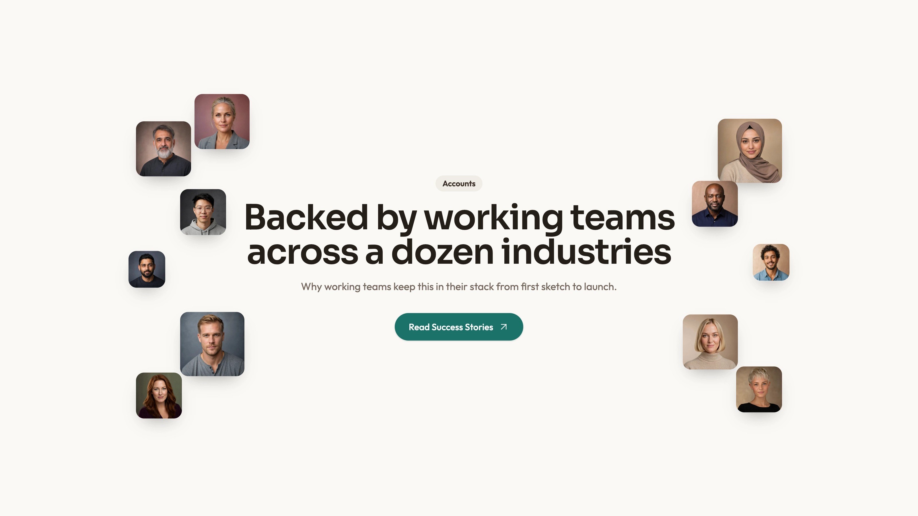
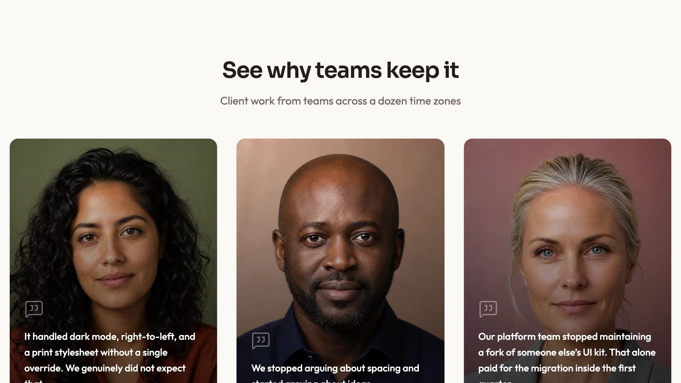
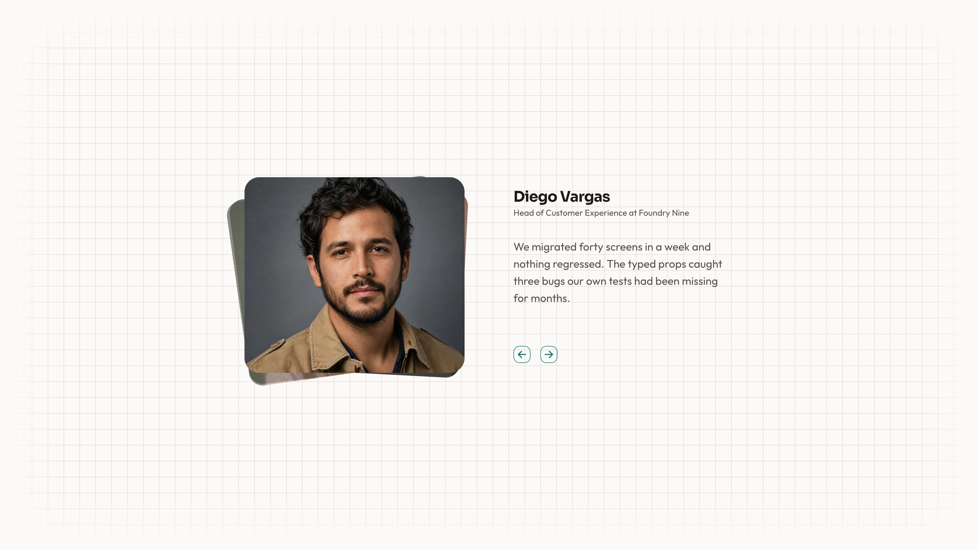
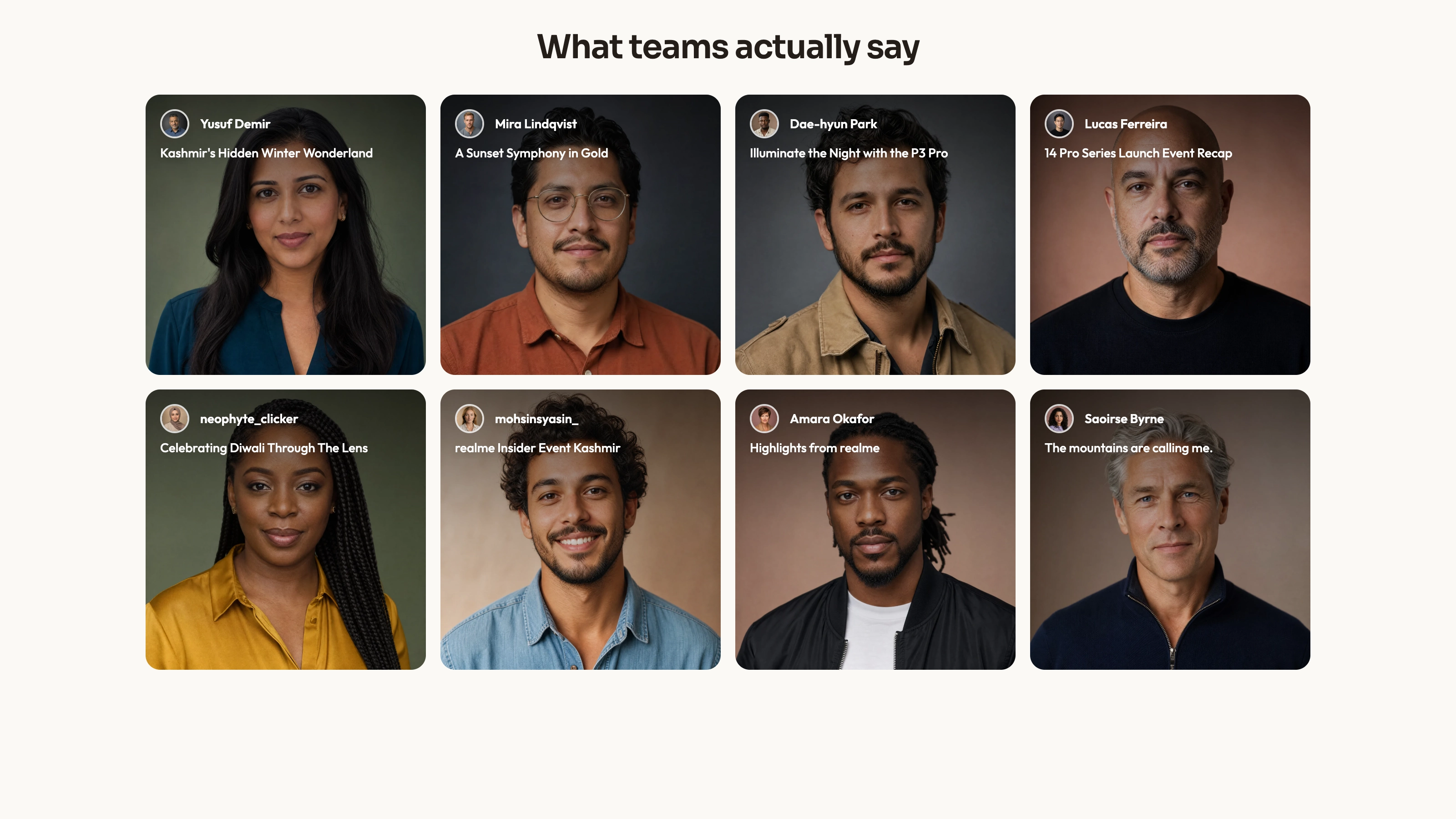
Let readers bring a selected statement to the front of an overlapping card fan. Fanned Deck uses local list state, angled card positioning and directional controls to emphasize a central quote while suggesting the remaining records around it. It is a manually browsed source component, not a passive animated review feed.
What you get
A React/TypeScript StaggerTestimonials component and usage example with twenty illustrative quotes, speaker labels and portrait paths. Source data and local selection state are inside the component. Copy and maintain it in your project rather than installing a separately versioned block.
Side-card click selection and previous/next buttons rotate the local list. Cards are 365 px squares from 640 px window width and 290 px below it, inside a 600 px-high clipped view. Angles, offset positions and center emphasis use CSS transforms/transitions, not a canvas backdrop or autoplay timer.
Editable source, theme/icon/imagery references and a source-check script. No actual portraits or WOFF 2 fonts ship in the ZIP. React, Lucide, cn and host utility/theme styling need integration; the names, company labels and outcomes are illustrative, not verified endorsements.
The written visual contract defines warm paper/teal light tokens, dark roles, Outfit body type, Sora headings and a 0.875rem base radius. Icons are specified as inline SVG with 1.5 px square-cap strokes and visible names beside real monochrome vendor marks. Reconcile fixed source styles with those references rather than assuming one theme token controls every dimension or effect.
Before you choose
Choose the fan when there are few enough statements to browse intentionally. Give the centered record enough space to be read and do not rely on heavily tilted peripheral text to carry facts that matter to a decision.
Good fit
A bounded set of short approved statements works best as a deliberate one-at-a-time reading experience.
You want a more expressive alternative to a plain grid while preserving a clear link between the active portrait, speaker and words.
Your team can own source changes, host integration and keyboard/touch behavior instead of expecting a fully managed widget.
Not for
A large searchable archive or a layout that needs every statement readable at once.
A full app with navigation, forms, access control and checkout, or a promise of an automatically matching mature design system.
Assuming every side-card div is keyboard-operable merely because it responds to a mouse click.
A claim that duplicate sample identifiers or mismatched example portraits represent approved customer identities.
How to use
You say/testimonial-fanned-deck Add the Fanned Testimonial Deck section to the landing page for [product name]. Use the quotes, names and portraits I provide; do not invent testimonials. Follow the existing page framework and styling.
Inspect the host React/framework conventions, client boundaries, Lucide/cn imports and surrounding container before copying the component/demo. Port source into the existing application; use standalone HTML only when explicitly requested as the deliverable.
Prepare concise approved quotes and replace speaker labels, portraits and record identifiers as one consistent set. Check the sample IDs when introducing real records; do not assume demonstration keys or names have already been validated. Several initial tempId values are duplicated and moved records receive random IDs; use deliberate unique identifiers and verify selection/render identity instead of inheriting the sample key policy.
The written visual contract defines warm paper/teal light tokens, dark roles, Outfit body type, Sora headings and a 0.875rem base radius. Icons are specified as inline SVG with 1.5 px square-cap strokes and visible names beside real monochrome vendor marks. Reconcile fixed source styles with those references rather than assuming one theme token controls every dimension or effect. Supply local portrait and font files because only paths are present. Keep person/role/quote/photo pairings accurate, use suitable delivery-sized WebP assets, and apply abstract plates only to deliberate blend/invert/contain slots rather than ordinary portrait positions.
Fit actual text to the square cards without shrinking essential attribution. Exercise side-card and arrow navigation and decide how keyboard and touch users select the same content; decorative rotation is not a substitute for usable controls. Attribution is absolutely anchored near the bottom of each fixed square, so long text can collide with it. The twenty-card sample also clips most off-center material; do not make side text the only access to important qualifications.
Run the supplied output check and inspect the fan at phone and desktop widths, including resizing while a noninitial record is selected. Review clipping, overlap, active identity and focus so a visually centered card is also the understandable reading target.
Requirements and costs
You bring
Not collected yet
Dependencies
Not collected yet
Outside costs
Not collected yet
Publisher testing
v1.0.3 — Claude Code / Claude Desktop / Cowork / Codex / ChatGPT
FAQ
The distributed implementation is React with local state and effect hooks. The Skill asks the assistant to inspect the host and port component shape and styles into its conventions. An HTML standalone rendition is appropriate when requested separately, not proof of unchanged compatibility across stacks.
No review service is implemented. It moves through source records and references local portrait paths, but actual portrait/font files are absent from this archive. Supply them locally and inspect the completed host page’s requests separately.
Yes. Replace the speaker identity, image, text and record key together. Follow the imagery guide’s portrait and blend-mode rules and review the longest real statement in the fixed card area before publishing.
The inspected code updates the local testimonial list when a side card or a directional control is clicked. This changes which record occupies the focal position; it does not fetch a new review.
Not automatically. The inspected side-card interaction is a click handler on a div. Review focusable semantics and keyboard behavior alongside the arrow controls in the actual integration.
User reviews
—0 reviews
Select a star to share your experience.
No reviews yet. Ratings appear once readers share real experiences.