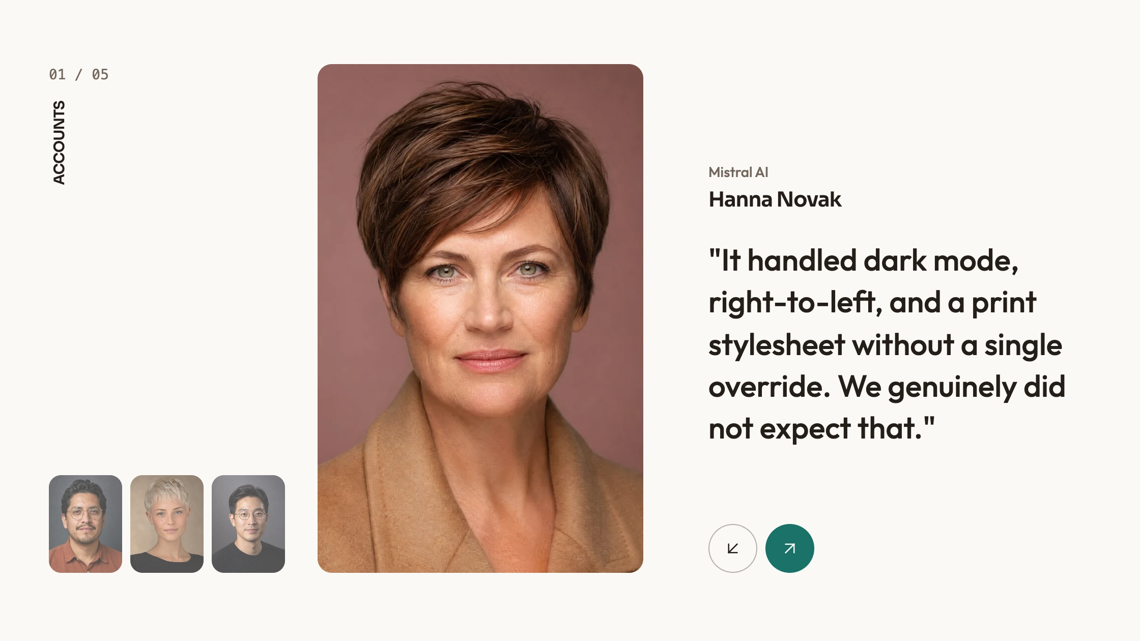
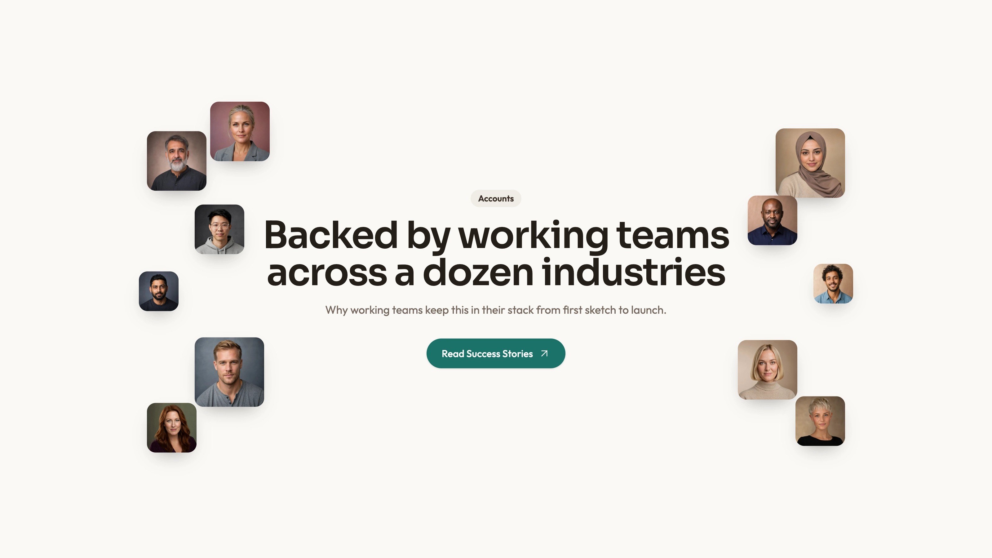
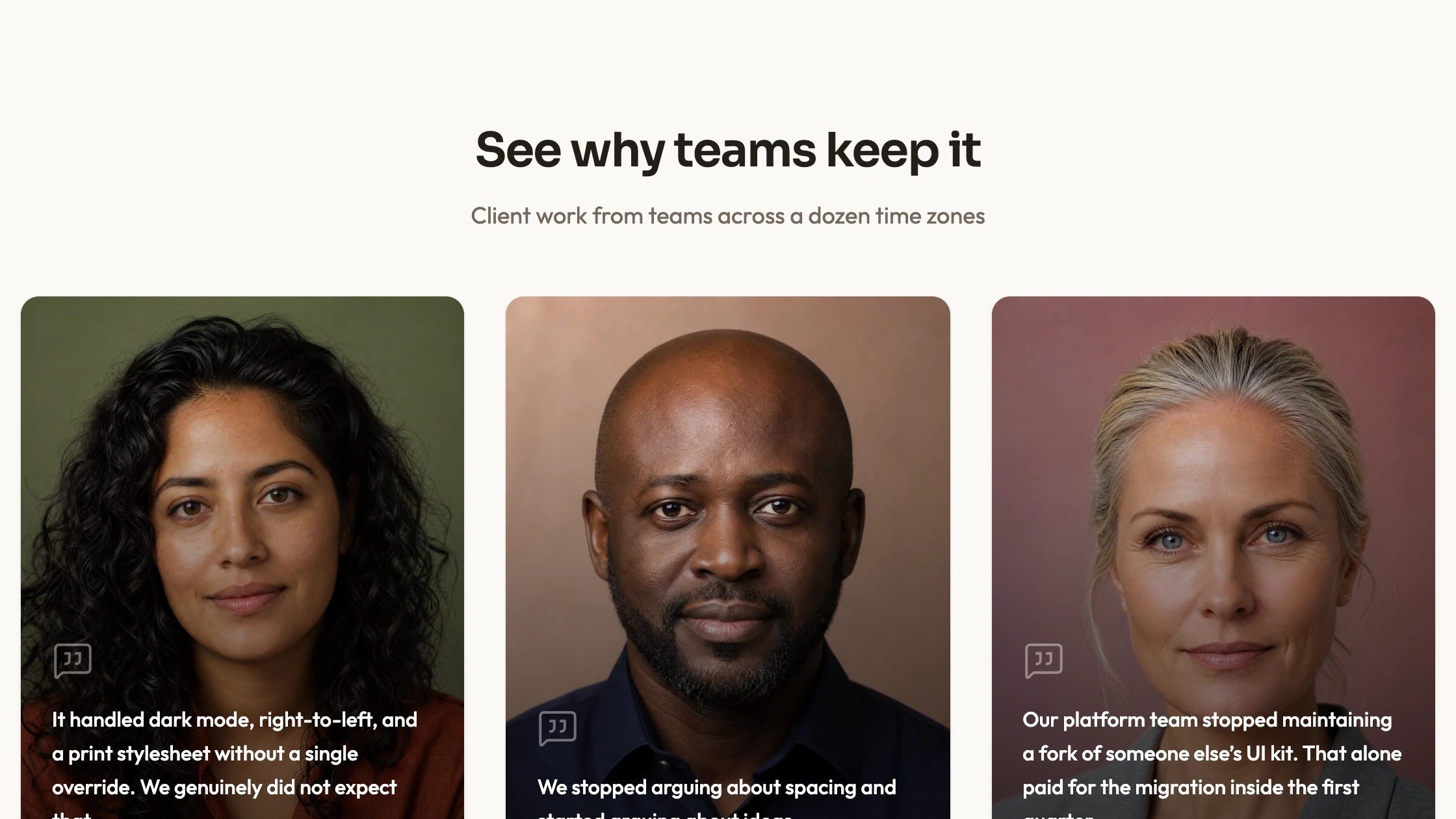
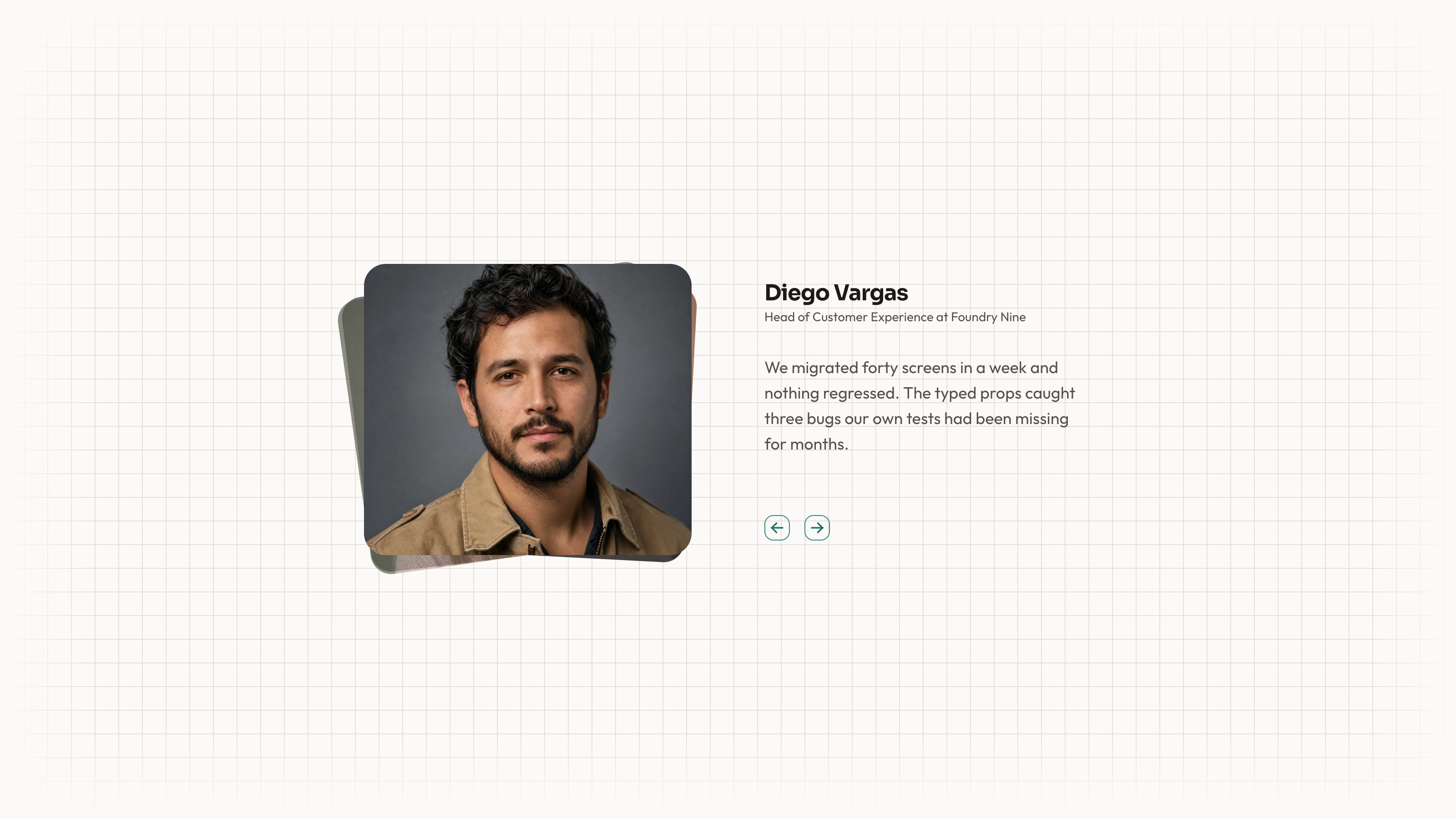
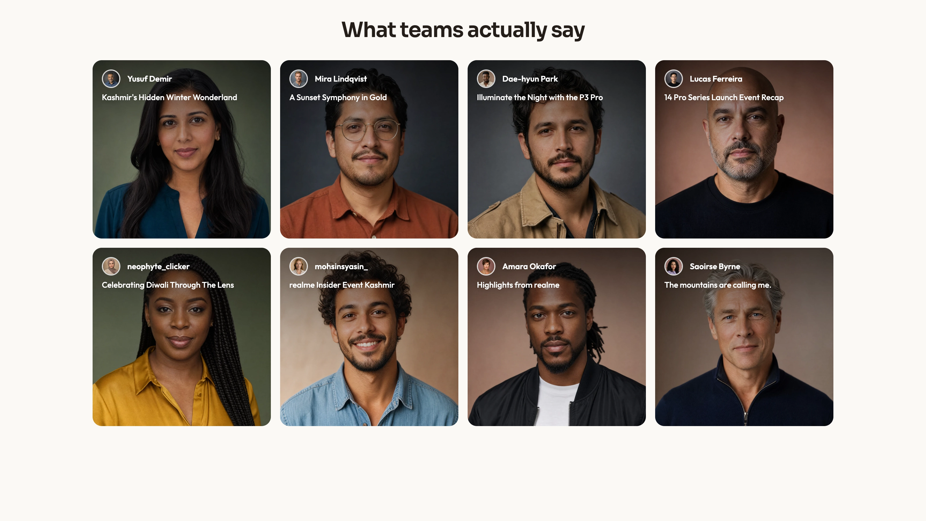
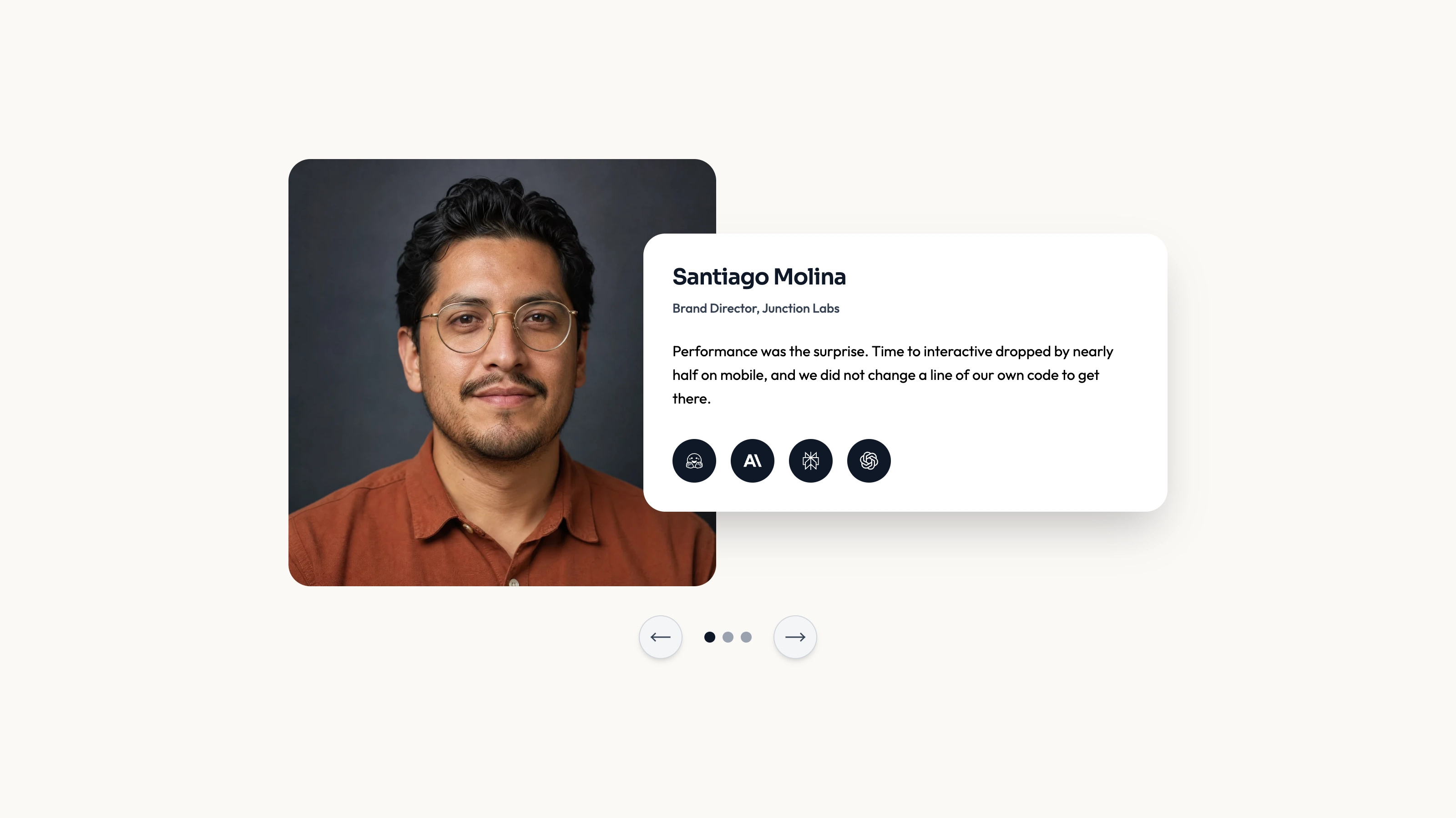
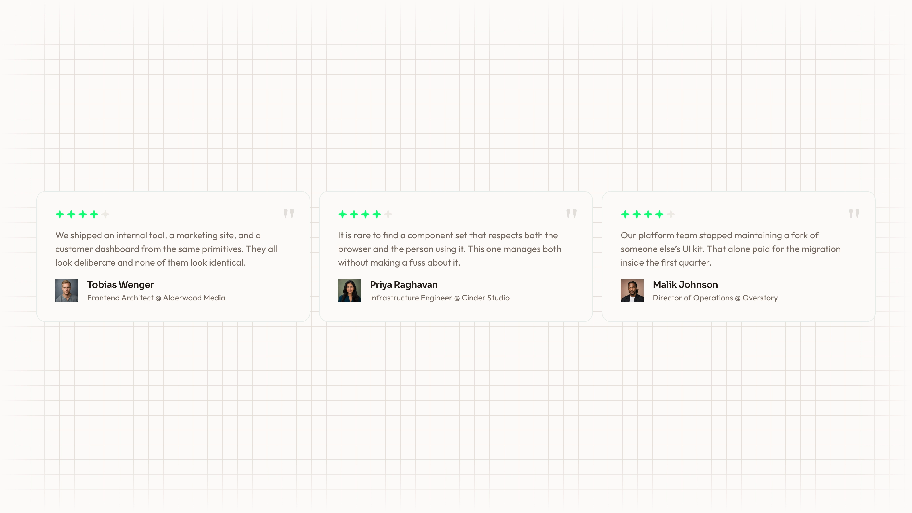
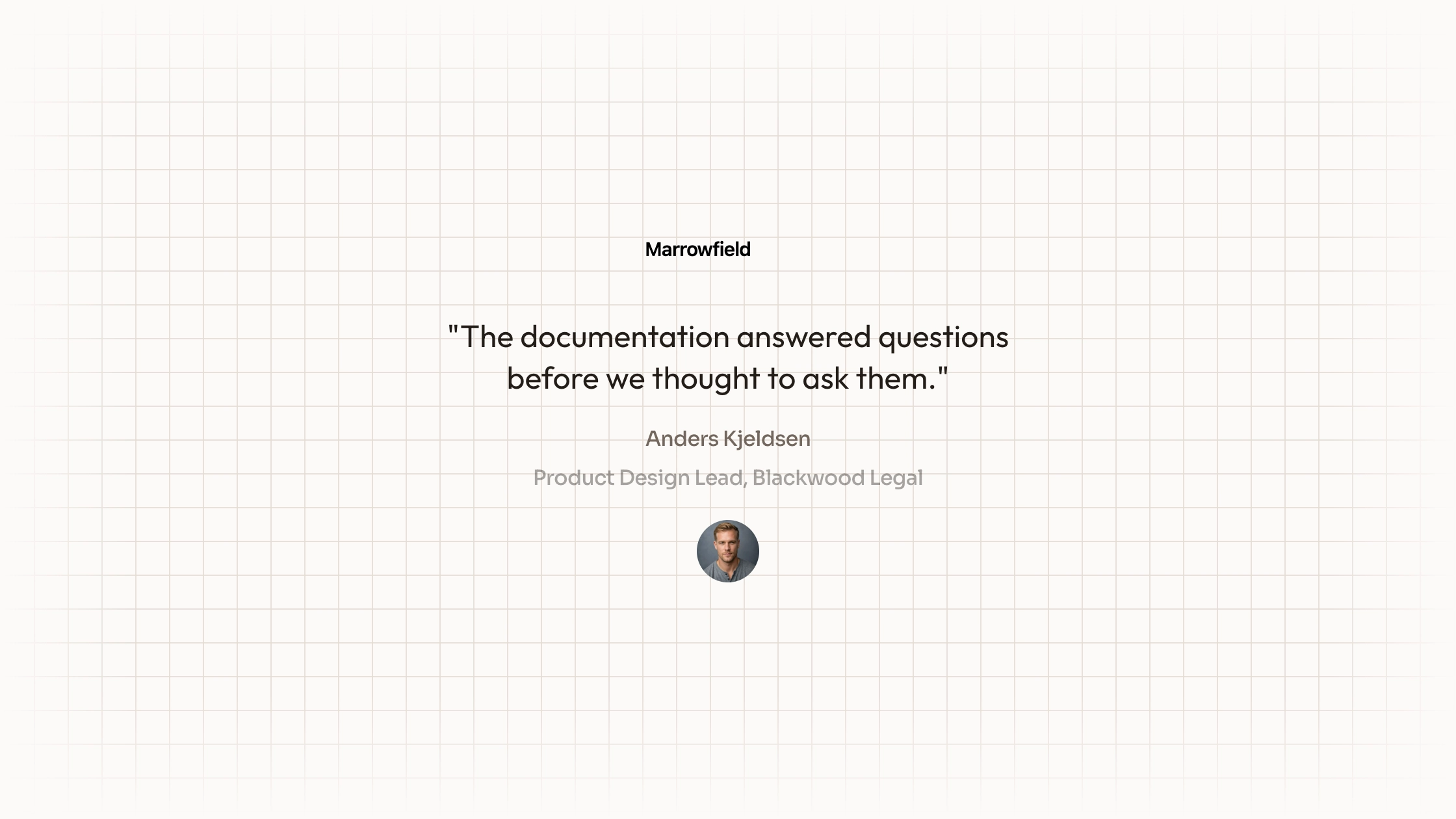
Give one detailed customer quote the lead, then surround it with three shorter statements in a responsive mosaic. The featured card has an organization-mark slot and a larger quotation; the remaining cards keep author attribution beneath the words. The supplied React source is static layout code that depends on project Card and Avatar components, not a self-contained review platform.
What you get
A Testimonials React/TypeScript component and usage example containing four hardcoded quotes. The first card is featured, a second spans two medium-screen columns, and the others provide compact supporting statements. Copy and maintain the source within your project.
A stacked base layout, two columns from the small breakpoint and four from medium width. The feature card spans two columns and, on large screens, both rows. Card and Avatar APIs structure the visuals, attribution and fallback initials; their implementations are not included.
The written visual contract defines warm paper/teal light tokens, dark roles, Outfit body type, Sora headings and a 0.875rem base radius. It specifies restrained motion and inline SVG interface icons with 1.5 px square-cap strokes, plus monochrome visibly named vendor marks. Reconcile fixed example styles with those references during integration; one token does not control every literal class or animation.
Imagery/icon guidance, third-party notes and a source-check script. The required local Card/Avatar modules, portrait/wordmark files and WOFF2 fonts are absent from this archive. React, compatible host components, aliases and utility/theme styling must be supplied or adapted.
Before you choose
Feature the story with the clearest specific experience, not simply the longest quotation. Keep every attribution and fallback accurate, and review the mosaic as a reading order rather than only as an attractive desktop shape.
Good fit
A product or service with one substantial approved customer story and several shorter supporting quotes.
A page needing an existing hierarchy between featured and secondary testimonial content rather than a uniform list.
A team ready to integrate its own UI primitives, maintain source and supply accurate names, roles and local media.
Not for
Review collection, rating calculation, a carousel, animated switching or verification of the sample product claims.
A dependency-complete/versioned block or automatic visual compatibility with an established design system.
Navigation, forms, authentication or checkout, or proof that the sample people and portrait filenames refer to the same real individuals.
How to use
You say/testimonial-mosaic Add the Feature Testimonial Mosaic section to the landing page for [product name]. Use the quotes, names and portraits I provide; do not invent testimonials. Follow the existing page framework and styling.
Read the host framework and UI conventions before copying the component/demo. Supply compatible Card/CardContent/CardHeader and Avatar/AvatarImage/AvatarFallback modules or adapt to existing primitives; this ZIP contains only their imports. Other stacks need a real port, with standalone HTML reserved for an explicitly standalone output.
Replace the heading, support, four quotations, names and roles with approved factual content. The sample thousands-of-teams language and claims about dark mode, RTL or production parity are demonstration praise, not product tests performed by this Skill.
Supply accurate local portraits and any authorized organization mark. Several displayed names differ from avatar filenames, and some fallback initials do not match the cited person; correct the full quote/name/role/photo/fallback group together. Follow the imagery guide’s portrait/abstract/photo slot distinctions and deliver suitable WebP/font files locally.
Keep the featured quote sufficiently substantial to justify its larger space, but test its full length at every breakpoint. Apply the documented token/icon contract and reconcile custom card classes such as variant-mixed with the host. The main component has no content-prop API; edit source or add one deliberately.
Run node scripts/check-blocks.mjs TARGET, build and review stacked reading order, featured-card spans, all portrait/fallback states and dark/light contrast. The source checker cannot prove the missing primitives are compatible, claims are authentic, media exists or the responsive composition works with your actual quotes.
Requirements and costs
You bring
Not collected yet
Dependencies
Not collected yet
Outside costs
Not collected yet
Publisher testing
v1.0.1 — Claude Code / Claude Desktop / Cowork / Codex / ChatGPT
FAQ
React/TypeScript with project-local Card and Avatar primitives and utility styling. Those primitives are imported but not included, so reuse compatible host versions or adapt the markup. Other-framework ports require implementation.
The inspected source contains static quotes and local media paths, not a testimonial API. Media/fonts and imported UI modules are missing from the archive; verify the finished host page separately.
Yes. Supply real local portraits and authorized marks, updating names, alternative text and fallback initials consistently. The example’s file/name/initial combinations are illustrative and should not be inherited as true attribution.
No. Four quotes are written directly in the component. CMS data binding, pagination or animation would be additional integration work.
The responsive grid deliberately gives the first story more columns and rows. Choose a featured quote that deserves that emphasis and inspect the full reading order on small screens.
User reviews
—0 reviews
Select a star to share your experience.
No reviews yet. Ratings appear once readers share real experiences.