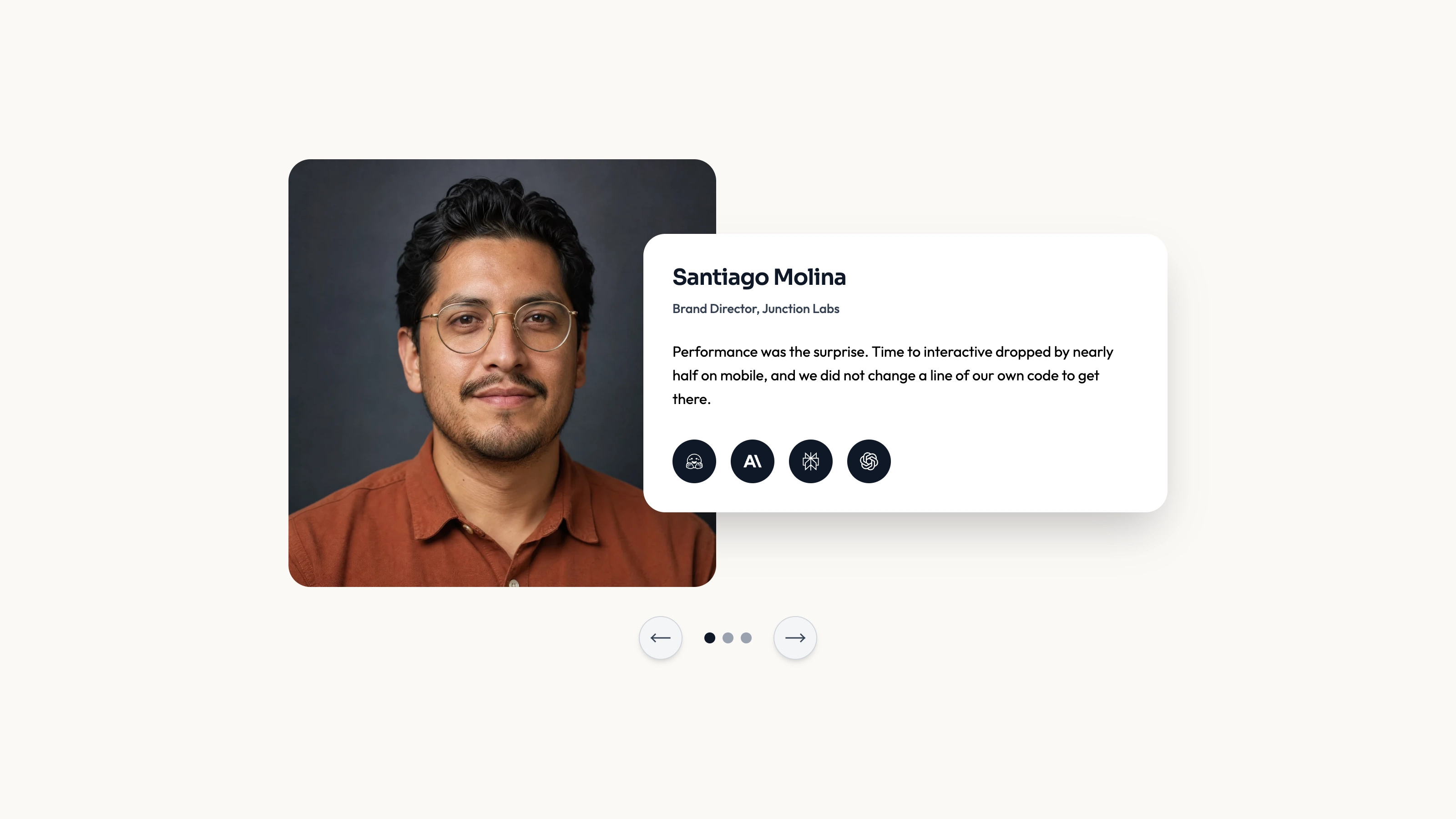
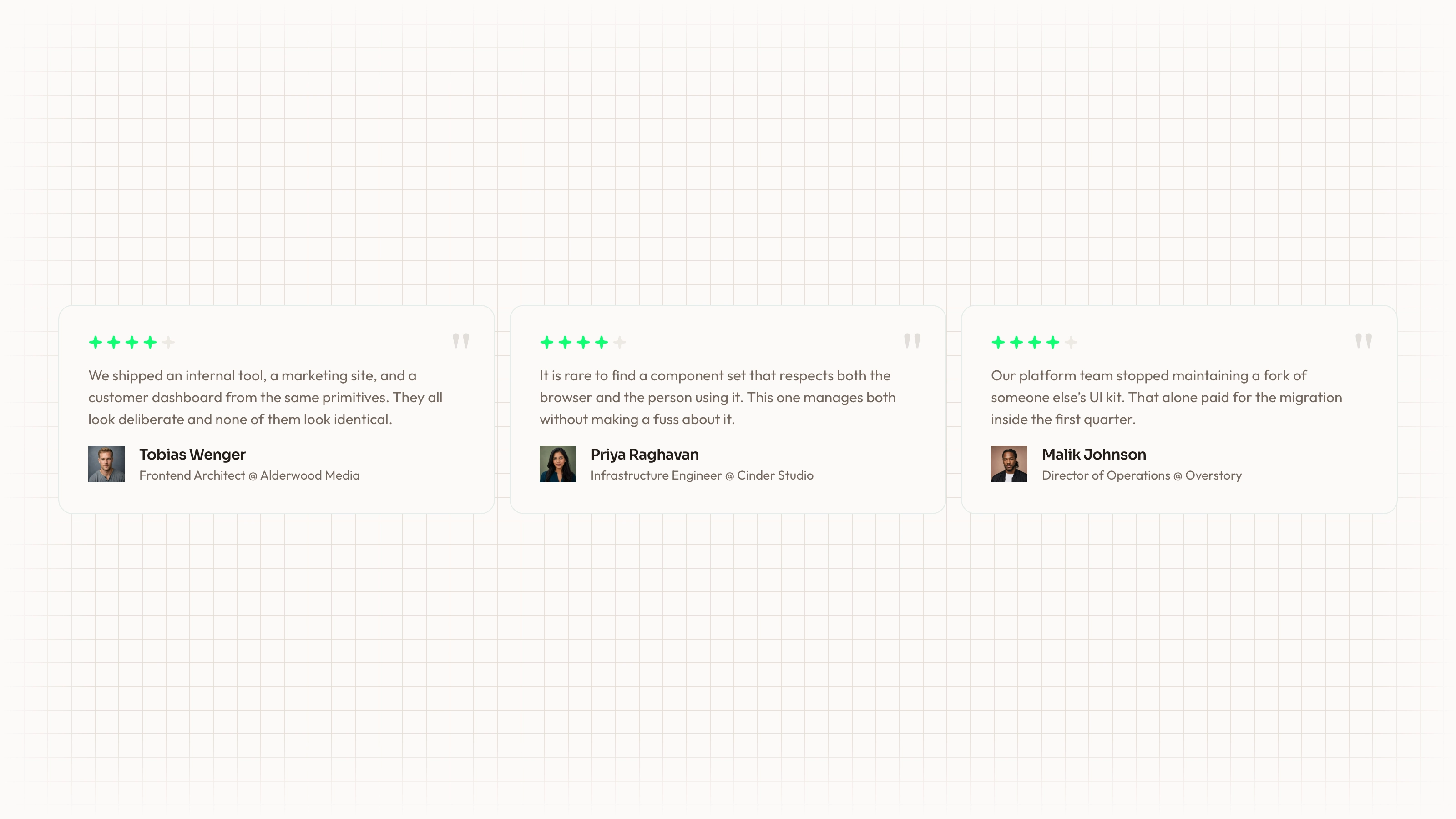
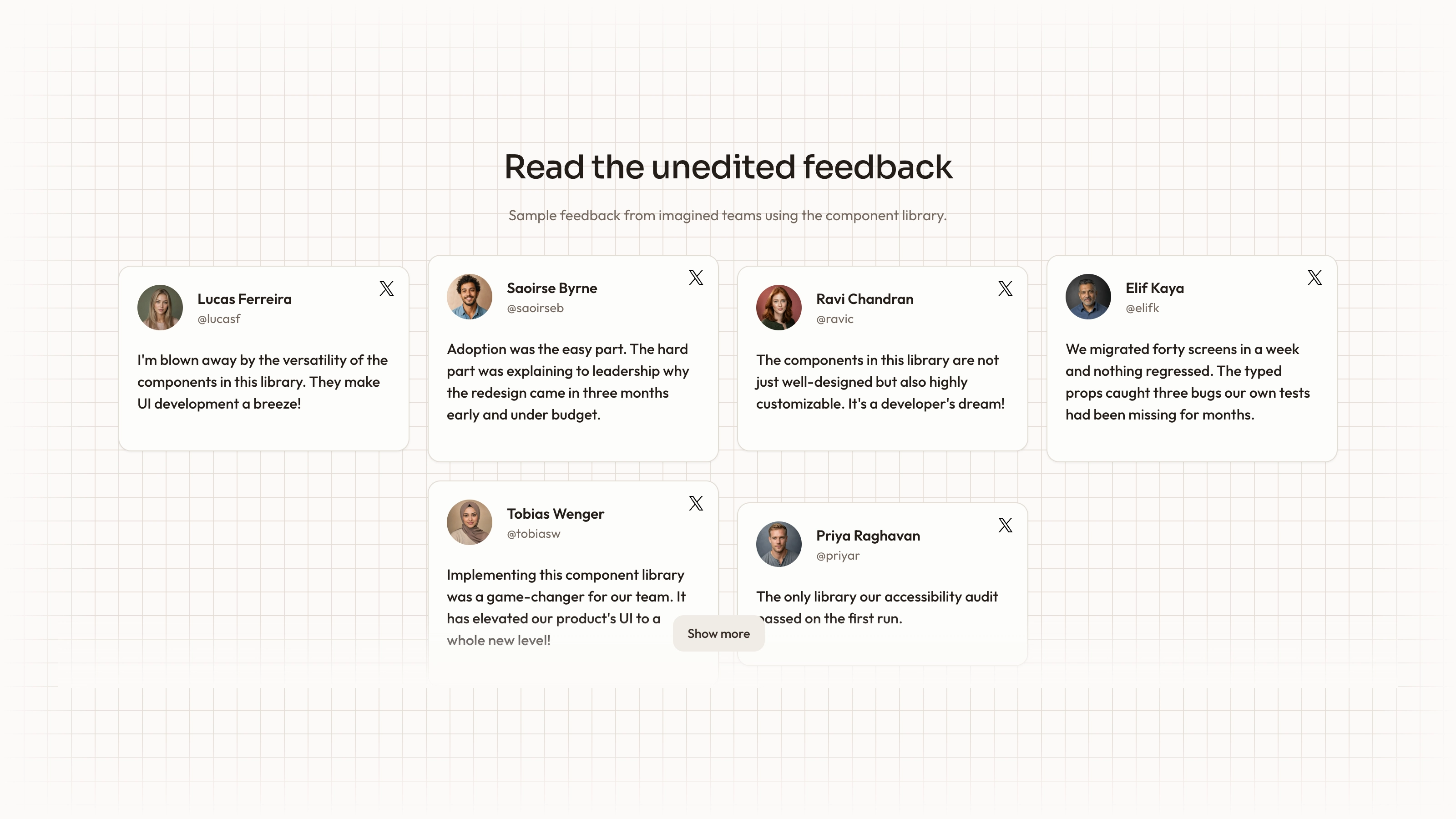
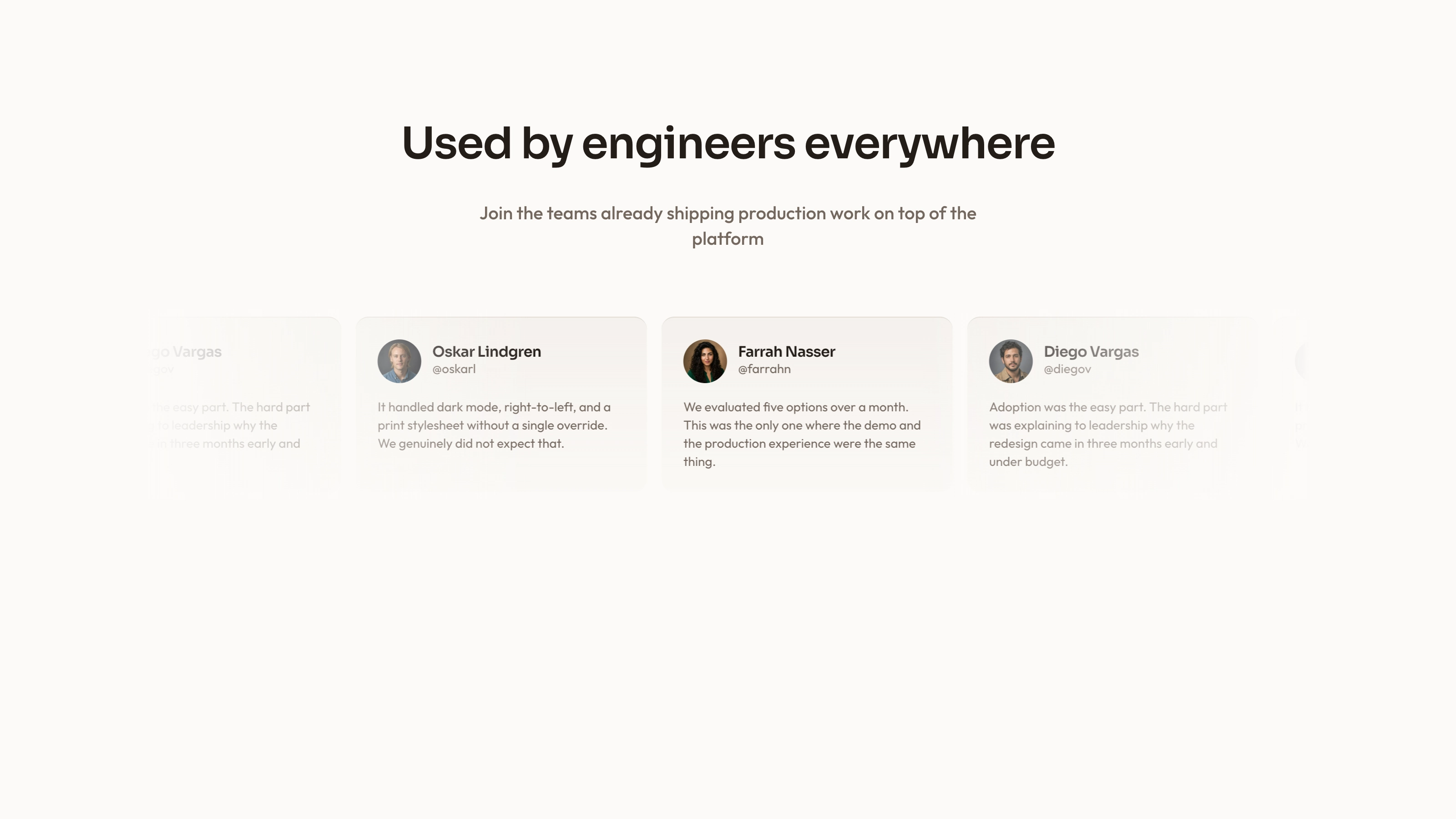
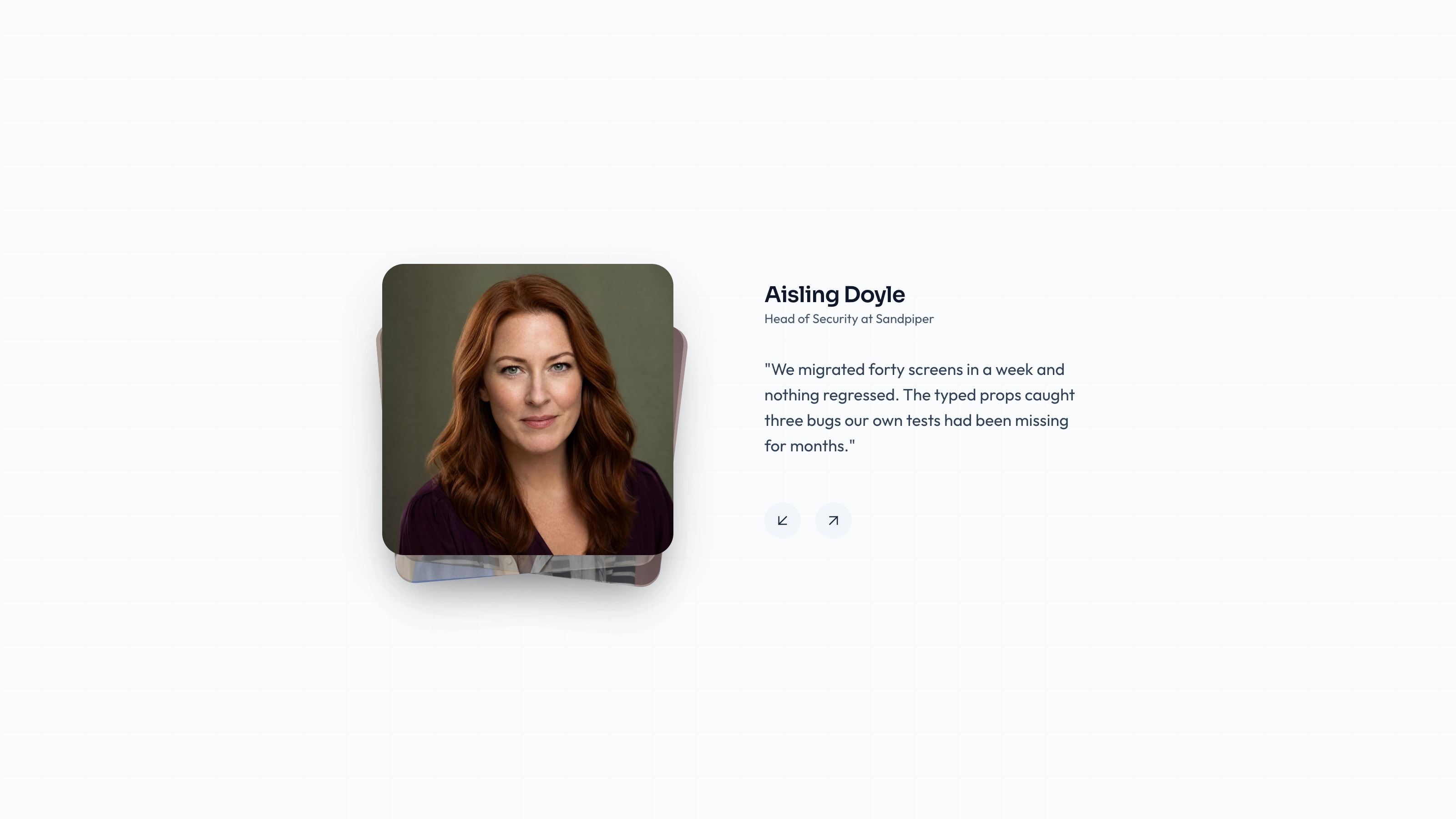
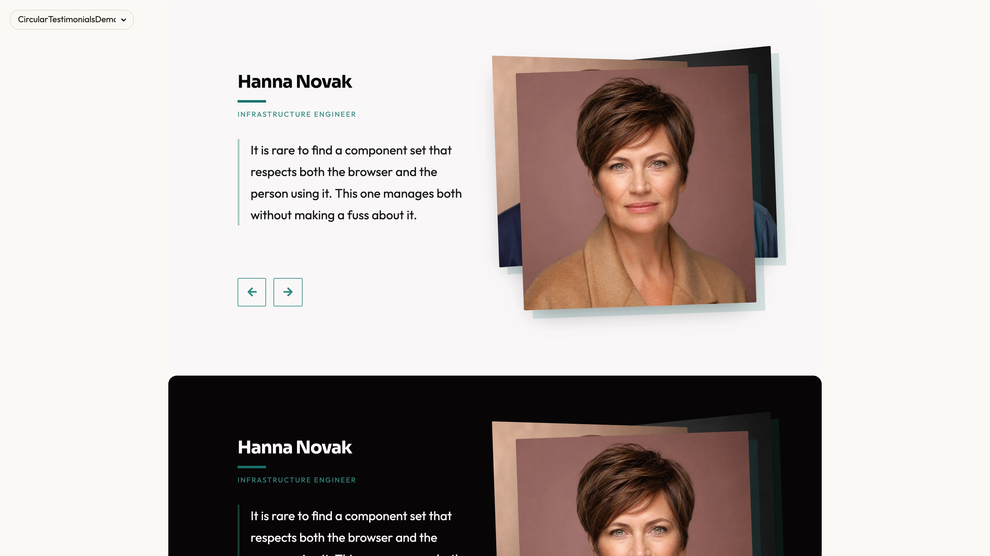
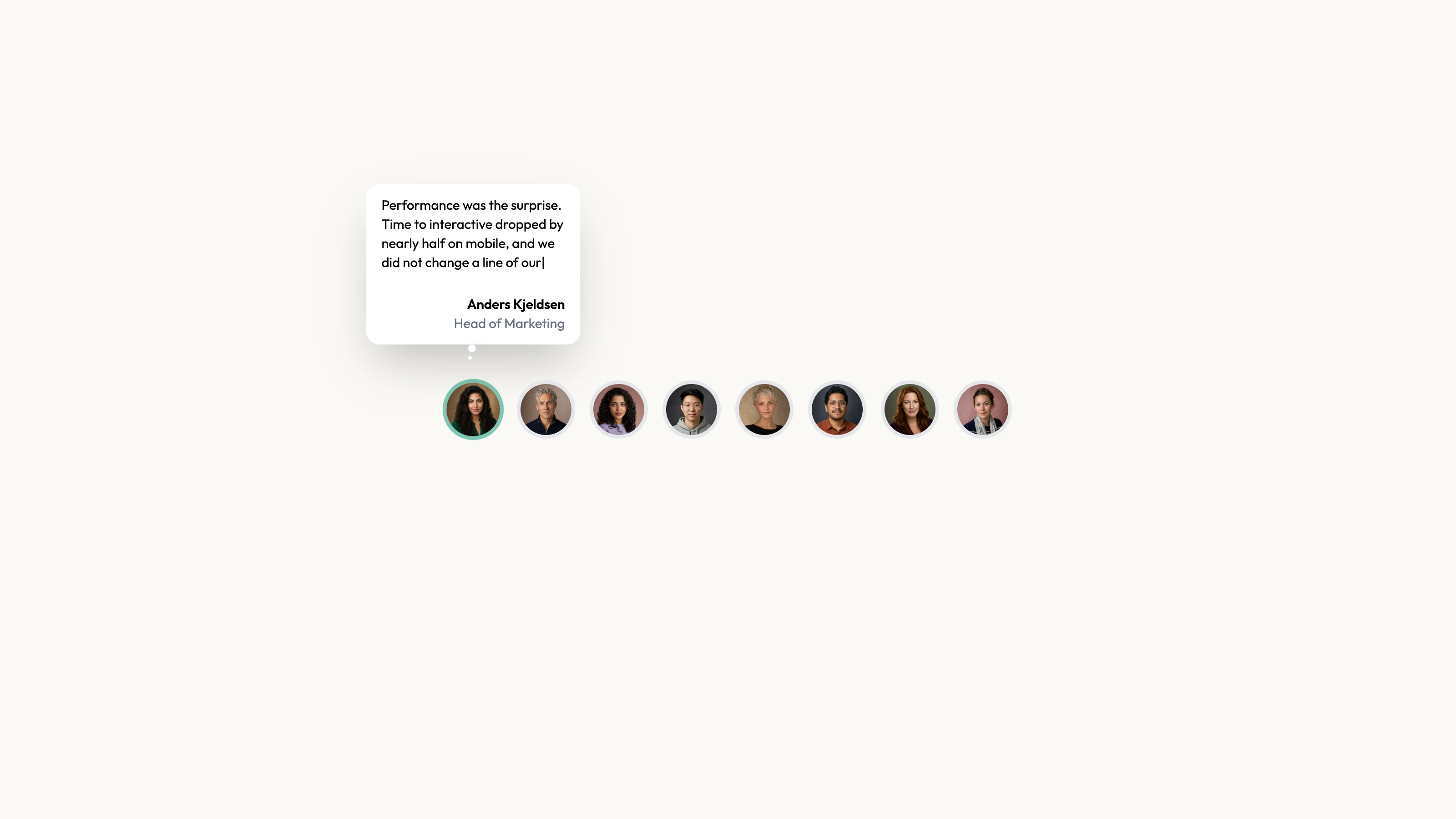
Build a visual story wall with image-led cards, profile thumbnails, names and short feedback captions over a dark gradient. The demo supplies eight entries and adjusts the CSS-column count to the window width, while each card fades upward as it enters view. This is an editable React masonry composition; its sample captions are photo-story titles rather than verified customer endorsements, and it has no role field.
What you get
A MasonryGrid React/TypeScript helper and a complete card/demo composition. Each entry contains profileImage, name, feedback and mainImage. Copy the helper and demo together to get the pictured cards; the helper alone only lays out children.
One column below 640 px, two below 1024 px, three below 1280 px and four on wider windows in the demo. Cards enter once when 20% visible, using a 0.5-second opacity/vertical reveal. Hover gently scales each card; it does not open a full story or switch quotes.
The written visual contract defines warm paper/teal light tokens, dark roles, Outfit body type, Sora headings and a 0.875rem base radius. It specifies restrained motion and inline SVG interface icons with 1.5 px square-cap strokes; actual vendor marks should be monochrome and visibly named. Reconcile fixed source styles with those references instead of assuming one token controls every element.
Imagery/icon guidance, third-party notes and a source-check script. The many avatar and fallback image paths are not backed by files in this ZIP, and no WOFF 2 fonts are bundled. Resolve React, framer-motion, cn and host theme/utility styling.
Before you choose
Treat each card as a coherent story unit: the main image, profile, name and caption should agree. Review mobile and assistive reading order before adding more cards; a dense wall is useful only if its stories remain understandable.
Good fit
A community or customer-story page with concise captions and meaningful images that can carry a masonry wall.
A project needing an existing profile/name/caption/image relationship and editable responsive column logic.
A team willing to maintain source and replace demonstration content with accurate, appropriately attributed visual stories.
Not for
A role-based quote catalogue, review verification, image collection service or click-through gallery behavior already implemented.
A dependency-free/versioned block or automatic compatibility with a mature design system.
Navigation, forms, authentication or checkout, or evidence that the example photo-event captions describe actual customer experiences with your product.
How to use
You say/testimonial-portrait-tiles Add the Portrait Tile Testimonials section to the landing page for [product name]. Use the quotes, names and portraits I provide; do not invent testimonials. Follow the existing page framework and styling.
Read the host repository and copy both MasonryGrid and the card/demo code into its conventions. Resolve React hooks, framer-motion and cn with the appropriate client boundary. Other stacks require a real port; a standalone HTML output is suitable only for an explicit standalone request.
Replace all eight illustrative entries with accurate names, feedback and image relationships. The sample feedback is largely event/photo-story wording and the component has no role field. Add roles deliberately if your testimonial design requires them, rather than assuming generic source copy guarantees they are displayed.
Supply main and profile images locally, keeping named people paired accurately. The sample avatar filenames often differ from the names and captions. Follow portrait/abstract/photo slot rules, distinct delivery-sized WebP assets and local fonts. Replace or guard the onError fallback paths too; both fallback images are also absent from the archive.
Apply the written token/type/icon contract and inspect the gradient-backed overlay against every main image. The helper’s gap prop changes horizontal column gaps, but card wrappers retain a fixed mb-4 vertical spacing; adjust both if a consistent custom gap is required. CSS columns also establish a column-flow reading order, not row-major cards.
Run node scripts/check-blocks.mjs TARGET, build and review the initial-to-mounted column change, phone reading order, full captions, image failures and reduced-motion behavior. Test actual window widths; there is no container-width observer or built-in static motion alternative. The checker cannot establish asset existence, attribution, responsive usability or runtime network isolation.
Requirements and costs
You bring
Not collected yet
Dependencies
Not collected yet
Outside costs
Not collected yet
Publisher testing
v1.0.1 — Claude Code / Claude Desktop / Cowork / Codex / ChatGPT
FAQ
React/TypeScript with framer-motion, cn and utility styling. The demo handles resize-driven column state; ports to other frameworks require adaptation, not just copying a standalone file.
The inspected source uses local arrays and image paths without a story/review API. Images, fallbacks and fonts are absent from the ZIP. Supply local files and inspect requests in the finished host page.
Yes. Update mainImage and profileImage together with accurate names/captions and fallback behavior. Use portraits for real people and appropriate photos for story scenes, following the guide’s special-slot rules where applicable.
No. Entries contain name and feedback but no role field. Add that content and layout deliberately if attribution needs more context.
The current card only scales on hover. No link, lightbox or click-to-open behavior is implemented.
User reviews
—0 reviews
Select a star to share your experience.
No reviews yet. Ratings appear once readers share real experiences.