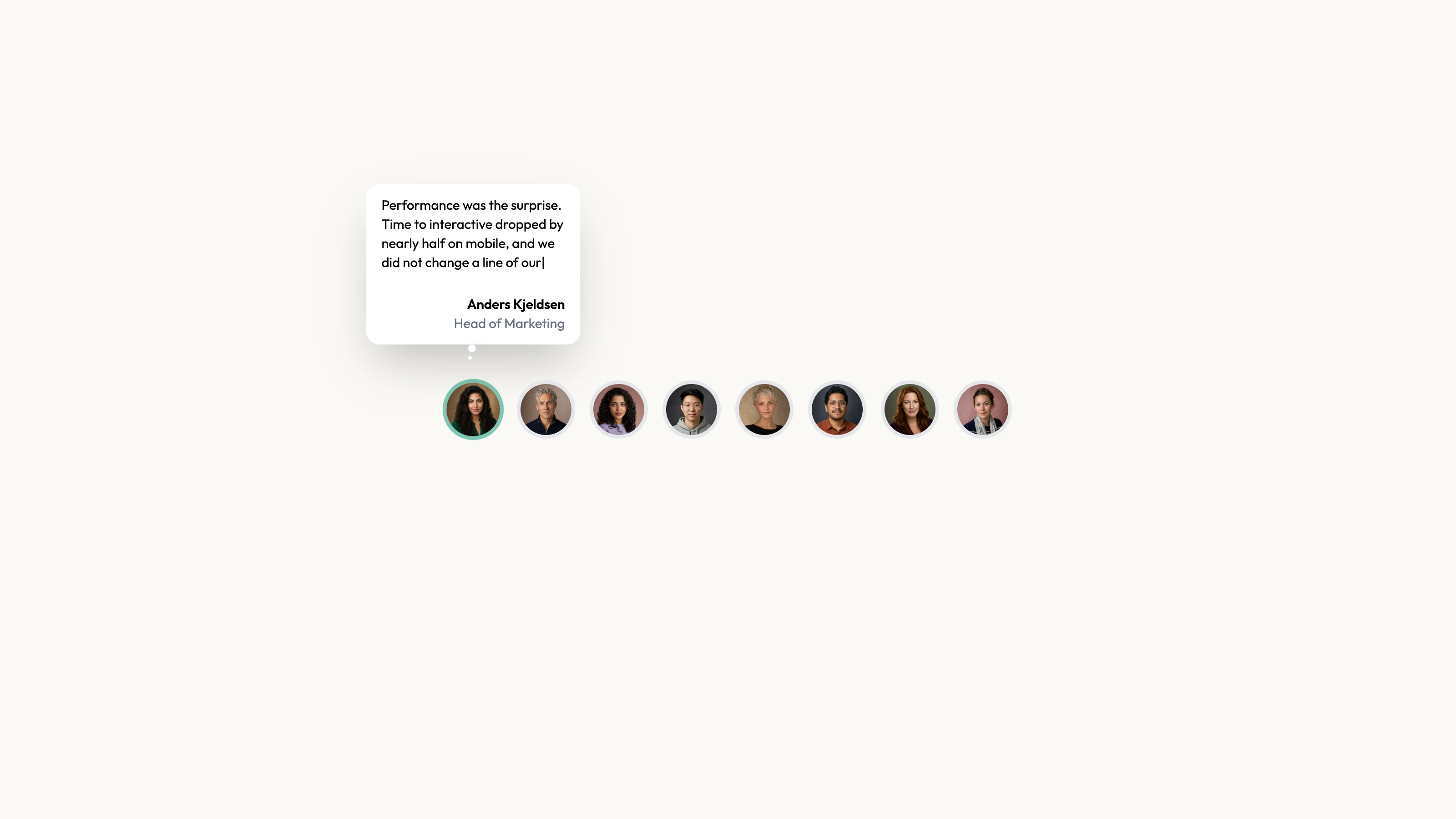
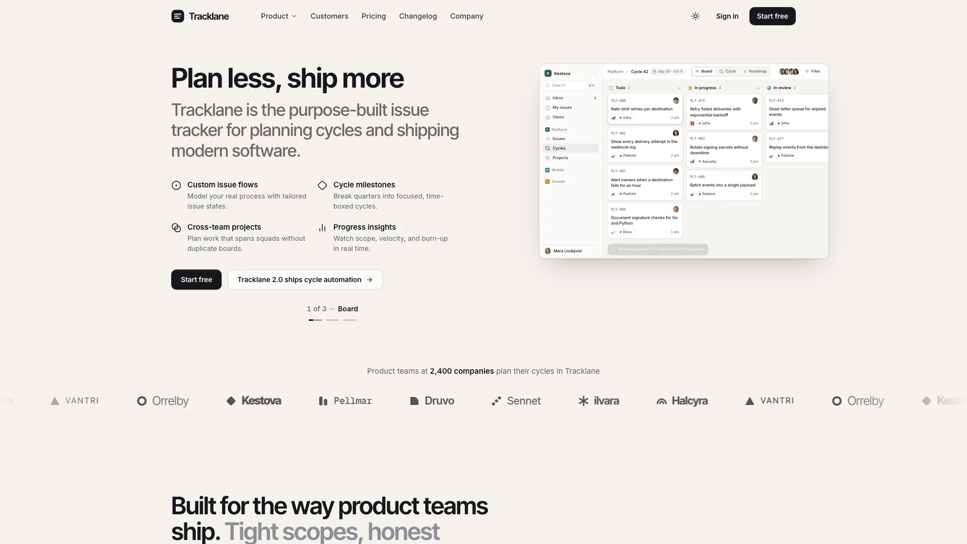
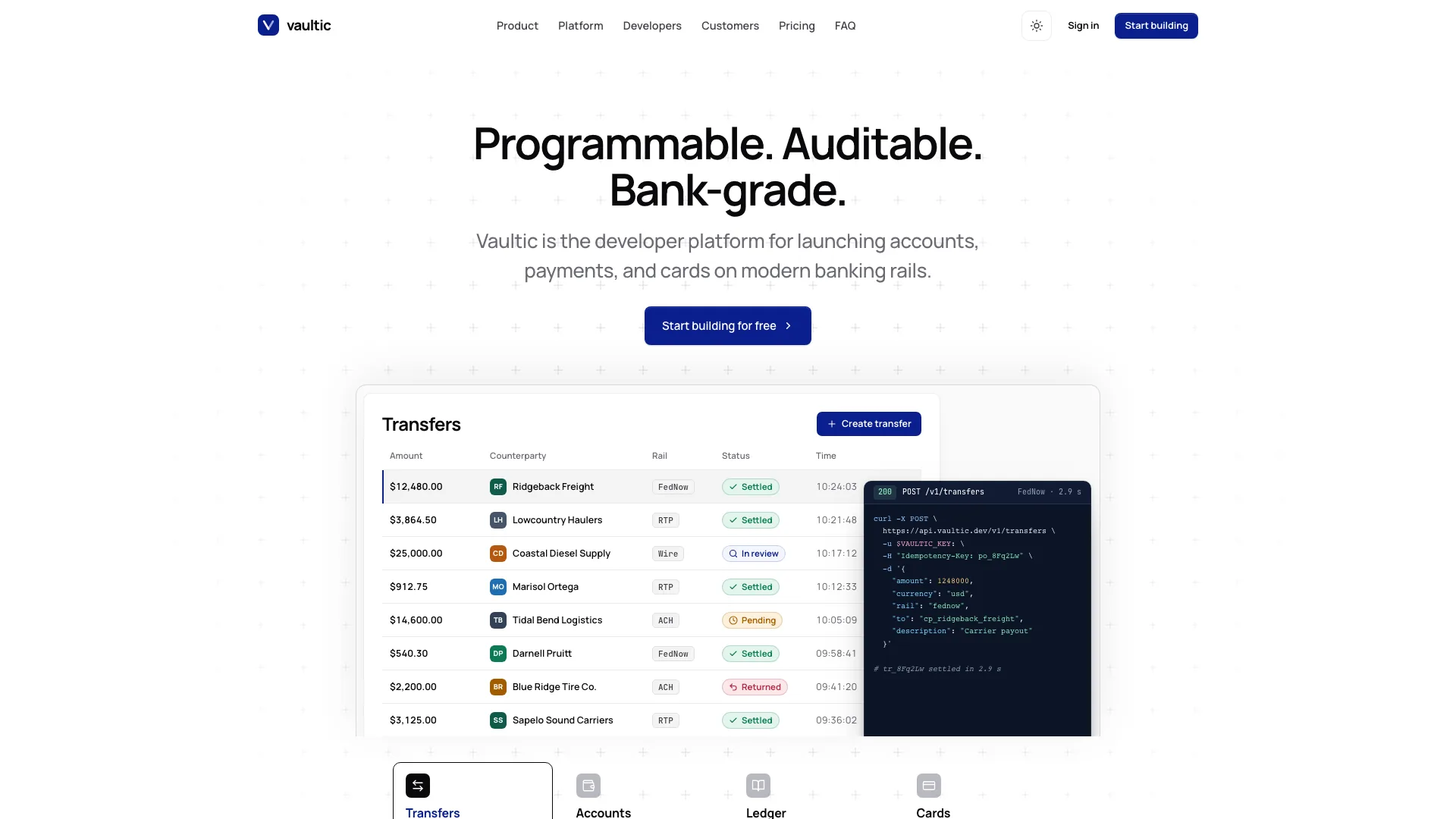
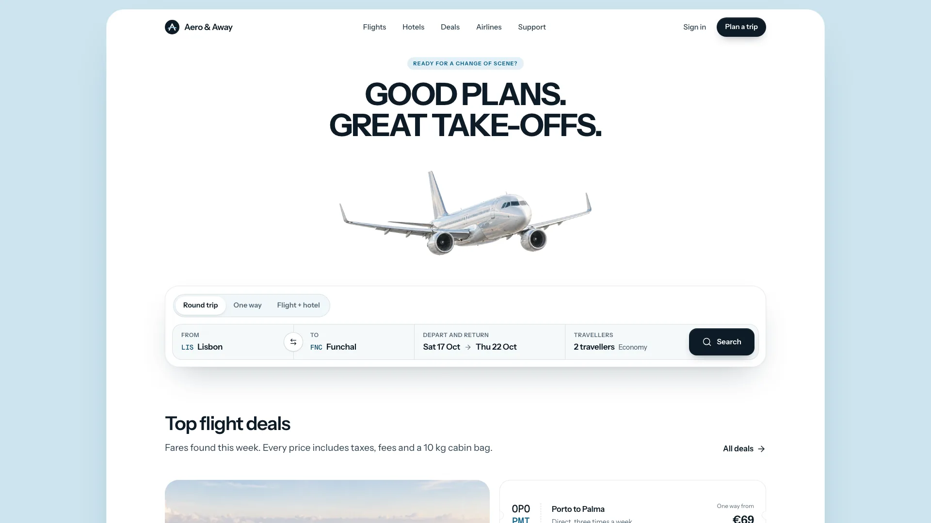
Give one customer statement a calm, centered reading area. Single Card places a quotation beneath an optional company mark, followed by the speaker’s name, position and optional portrait. It is a focused source component for one selected piece of evidence, not an automatically rotating collection.
What you get
A React/TypeScript Testimonial component and demo with quote, authorName, authorPosition, optional companyLogo/authorImage and highlightedText. It is a static centered single statement, with no rotation or review collection. Copy and maintain source in your own project rather than installing a versioned block package.
A centered composition with constrained reading width and a small attribution area. Theme, icon and imagery references describe the palette, type scale, corner treatments and source asset conventions to inspect before integrating it.
Editable source, local-path portrait/organization-mark examples, theme/icon/imagery guidance and a source checker. Actual portrait, mark and WOFF 2 font binaries are absent. React, Next Image, cn and host utility/theme styling are integration requirements; example identities do not establish a real customer relationship.
The written visual contract defines warm paper/teal light tokens, dark roles, Outfit body type, Sora headings and a 0.875rem base radius. Icons are specified as inline SVG with 1.5 px square-cap strokes, with real vendor marks monochrome and visibly named. Reconcile fixed source values and all component states with those references instead of assuming one token handles every style.
Before you choose
Prefer a statement that is useful without exaggerated emphasis. If readers need substantial context to understand the result, add a linked case study rather than selecting a few favorable words that change its scope.
Good fit
One approved statement addresses an important buying question well enough to stand on its own rather than needing a review wall.
You want the quote and its speaker to remain visible together, with a company mark only where that relationship is accurate and permitted.
You prefer a quiet static section and source-level control to a managed widget or an additional testimonial dependency.
Not for
Gathering reviews, switching between records or verifying a company’s endorsement. The component presents the single statement supplied to it.
A whole application: contact forms, account flows, navigation and checkout need their own implementation.
A turnkey versioned npm product or an automatic match to every established design system. The source’s styles and dependencies require deliberate integration.
Passing arbitrary public-submission HTML into the quote field without reviewing rendering and sanitization. The inspected component constructs HTML for highlighting; content handling must suit the actual source of the words.
How to use
You say/testimonial-single-card Add the Single Testimonial Card section to the landing page for [product name]. Use the quotes, names and portraits I provide; do not invent testimonials. Follow the existing page framework and styling.
Inspect the host framework, client/image conventions and styling, then copy component/demo and resolve React, Next Image and cn. Another stack needs a real image/markup port; standalone HTML is appropriate only for a specifically standalone deliverable.
Supply the exact approved quotation, speaker name and role, and optional permitted portrait and company mark. Replace all example identities together. Choose highlightedText only when that exact phrase is present and emphasis will not change the meaning. The demo’s highlightedText is Webtics, which does not occur in its supplied quote, so it produces no emphasis. String replacement affects only the first exact match. The displayed author and avatar filename also differ; replace them as one accurate record.
The written visual contract defines warm paper/teal light tokens, dark roles, Outfit body type, Sora headings and a 0.875rem base radius. Icons are specified as inline SVG with 1.5 px square-cap strokes, with real vendor marks monochrome and visibly named. Reconcile fixed source values and all component states with those references instead of assuming one token handles every style. Supply actual local portrait, organization mark and fonts; paths in the archive do not include their files. Use portrait material for the speaker and accurate permitted marks for the organization, not an unrelated abstract image simply because the logo uses object-contain. Follow other slot rules where appropriate and size WebP delivery assets deliberately.
Review the quote-rendering path for your content source. Keep trusted editorial copy distinct from raw submissions and test literal punctuation and any markup. Check optional-logo and optional-portrait states as well as the fully populated example. The raw-HTML quote path performs no sanitization, even when highlightedText is absent; keep content trusted or add appropriate safe rendering in the host. This editorial revision records the condition and does not claim to fix component code.
Run the package’s output checks and inspect phone and desktop layouts. Confirm readable line length, focus where relevant, portrait alternatives, logo legibility and attribution. Verify actual host requests separately before describing an integrated page as offline.
Requirements and costs
You bring
Not collected yet
Dependencies
Not collected yet
Outside costs
Not collected yet
Publisher testing
v1.0.1 — Claude Code / Claude Desktop / Cowork / Codex / ChatGPT
FAQ
The package asks for adaptation to the detected project, but the supplied implementation uses React and Next.js image components. Another stack needs a real port of markup, image handling and styling. A single-file version is suitable when the request is specifically for a standalone page.
No hosted review platform is implemented. Content is passed to the component, but actual image/mark/font files are absent from this ZIP. Supply them locally and inspect the completed host page rather than treating the local-asset policy as network verification.
Yes. Use approved assets associated with the actual statement, preserve their aspect and identity, and follow the imagery guide. For any added invert or blend-mode slot, use the guide’s abstract-image treatment rather than substituting ordinary photography blindly.
highlightedText wraps the first exact matching substring with strong markup; a nonmatching value does nothing. Emphasis must preserve the approved meaning. The component renders the quote as raw HTML without sanitization, so use trusted content or deliberately implement safe rendering for other sources.
No. A supplied logo is not evidence of a partnership. Describe only the approved relationship and avoid turning an individual quotation into a broader company endorsement.
User reviews
—0 reviews
Select a star to share your experience.
No reviews yet. Ratings appear once readers share real experiences.