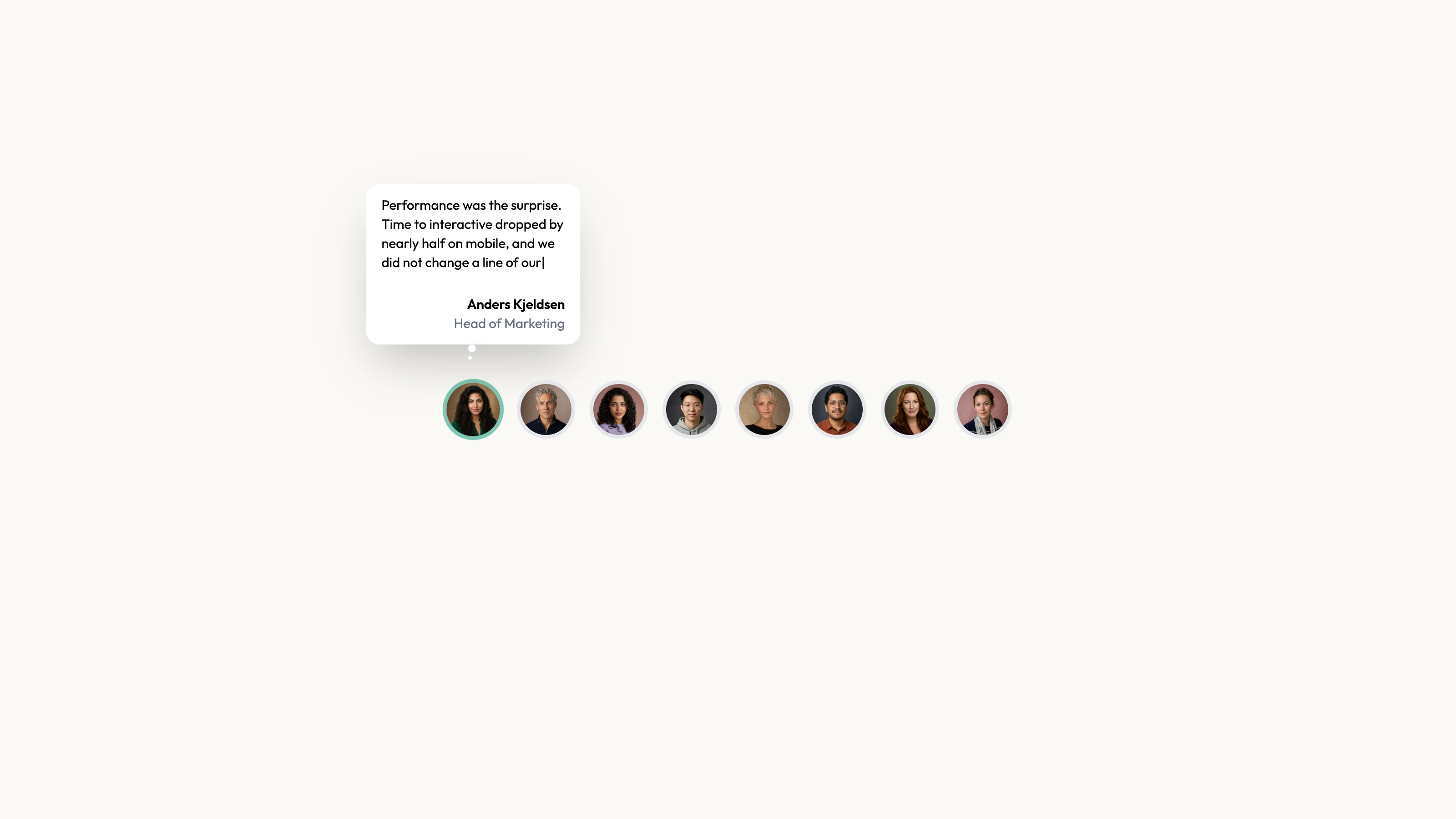
Pair one readable quote with a layered photo stack that changes with the selected customer. The React component cycles automatically every five seconds by default and also offers previous/next buttons and global arrow-key navigation. The current restyle uses rectangular photos with a slight overall tilt, an offset teal shadow and outlined controls; its CircularTestimonials name does not mean the images are circular.
What you get
A CircularTestimonials React/TypeScript component and light/dark usage examples using three supplied quote/name/designation/src records. Props include autoplay, color values and font sizes. Copy and maintain the source in your application rather than treating it as a versioned block package.
An active photo with previous/next neighbors positioned behind it, plus animated name/role/quote content. Words enter with a short blur stagger; buttons wrap through the data. Default autoplay runs on a five-second interval, and manual next/previous stops the current interval.
The written visual contract defines warm paper/teal light tokens, dark roles, Outfit body type, Sora headings and a 0.875rem base radius. It specifies restrained motion and inline SVG interface icons with 1.5 px square-cap strokes; actual vendor marks should be monochrome and visibly named. Reconcile fixed source styles with those references instead of assuming one token controls every element.
Imagery/icon guidance, third-party notes and a source checker. The referenced portraits and local fonts are absent. React, framer-motion, react-icons/fa and host styling/styled-jsx support are needed; other style systems require adaptation.
Before you choose
Let the reader finish a quote before advancing, and keep manual controls predictable. Verify the relationship between the active photo and attribution at every transition; a dramatic photo stack should never obscure whose experience is being described.
Good fit
A product or service with a few approved quotes and portraits that deserve more focus than a dense wall.
A page needing an existing photo/name/role/quote relationship with manual navigation and optional autoplay.
A team willing to maintain source and reconcile the layered motion, theme and accessibility behavior with its application.
Not for
Review collection, identity verification, score aggregation or evidence that demonstration performance claims are real.
A dependency-free/versioned block or automatic visual compatibility with a mature design system.
Navigation, forms, authentication, checkout or a fully scoped multi-carousel keyboard/pause system already supplied.
How to use
You say/testimonial-tilted-stack Add the Tilted Photo Testimonials section to the landing page for [product name]. Use the quotes, names and portraits I provide; do not invent testimonials. Follow the existing page framework and styling.
Inspect the host stack and copy component/demo into its conventions. Resolve React, framer-motion and react-icons/fa, plus styled-jsx or port its CSS deliberately. Other frameworks require an actual implementation port; standalone HTML is an explicit optional adaptation.
Supply a nonempty testimonials array with approved quote, name, designation and matching local src. The example is designed around three records; check smaller or larger sets rather than relying on the neighbor-stack comments as a guarantee. Replace demonstration performance claims and mismatched sample avatar paths.
Provide accurate local portraits/fonts and follow portrait/abstract/photo slot rules for any added media. Preserve name/role/quote/image pairings and inspect both large-image crop and full quote. Choose concise quotes so the word reveal and reading time remain useful.
Set autoplay=false if readers should control pacing. The source binds left/right keys on window, so scope that behavior appropriately when embedding multiple widgets or nearby controls. It does not implement a dedicated focus/hover pause or reduced-motion preference branch. Check manual navigation after autoplay, including interval stop behavior.
Apply the token/icon contract and review the late CSS overrides: several color/font-size/arrow props are superseded by !important rules, and the photos are rectangular despite earlier circular comments. Run node scripts/check-blocks.mjs TARGET, build and test buttons, key scope, light/dark contrast, small-screen stack overflow and actual quote legibility. The checker cannot validate those interactions or the truth of a quote.
Requirements and costs
You bring
Not collected yet
Dependencies
Not collected yet
Outside costs
Not collected yet
Publisher testing
v1.0.1 — Claude Code / Claude Desktop / Cowork / Codex / ChatGPT
FAQ
React/TypeScript with framer-motion, react-icons/fa and embedded styled-jsx. Resolve those in the host project or adapt the styles/components; other-framework ports are not prebuilt.
The inspected source uses supplied records and local portrait paths, without a testimonial API. Portrait/font files are not bundled. Provide local assets and check actual host-page requests.
Yes. Use matching local portraits for the quote authors and inspect the layered crop. Follow the guide’s other slot rules only for suitable added imagery; the example’s name/path pairs are placeholders.
You can set autoplay=false. Manual navigation clears the running interval, but a visible pause control and a broader focus/hover/reduced-motion policy are not implemented and need deliberate integration.
The final restyle contains !important overrides for certain labels and controls. Reconcile those rules with the prop values instead of assuming every exposed option controls the final appearance.
User reviews
—0 reviews
Select a star to share your experience.
No reviews yet. Ratings appear once readers share real experiences.