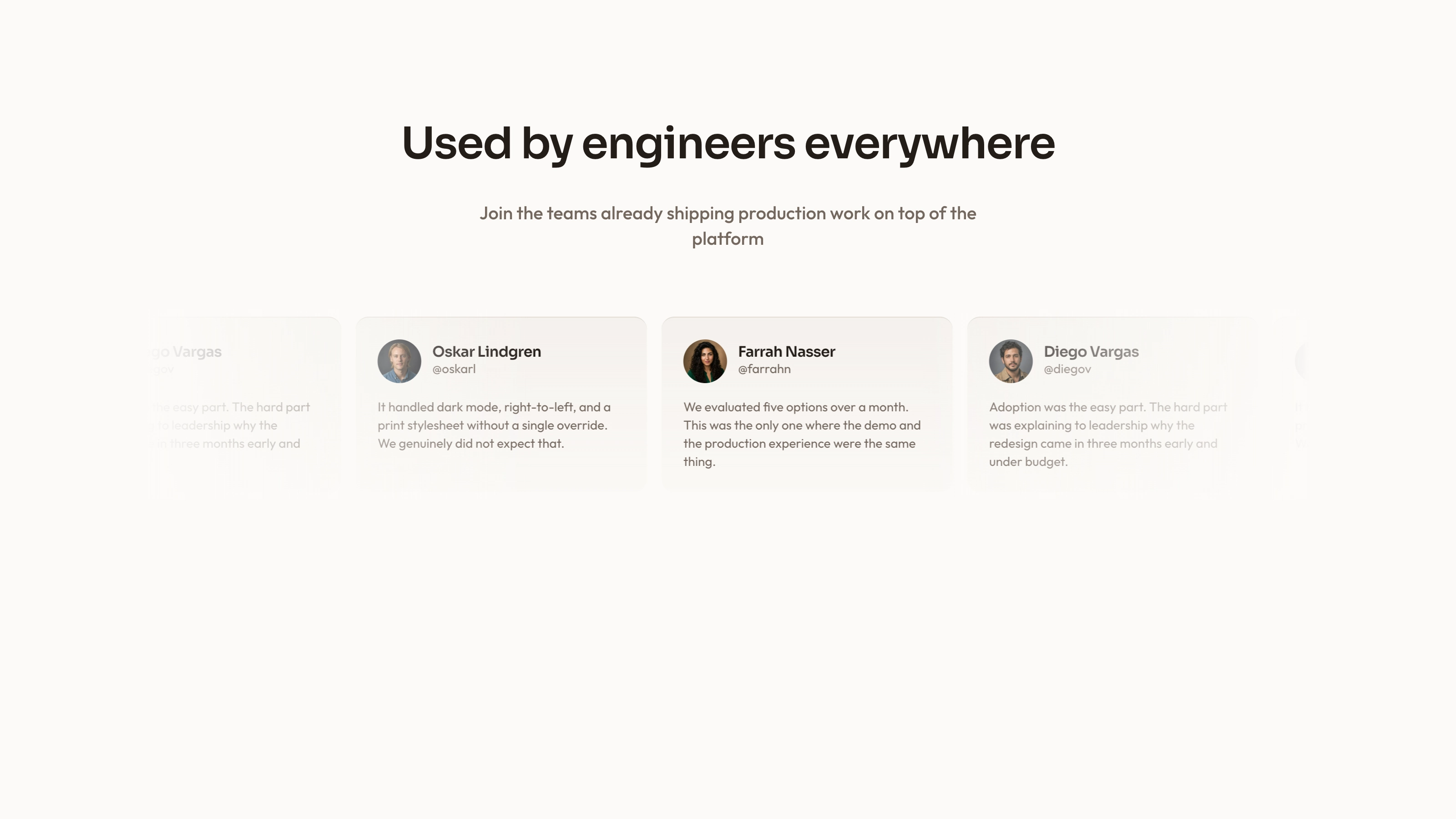
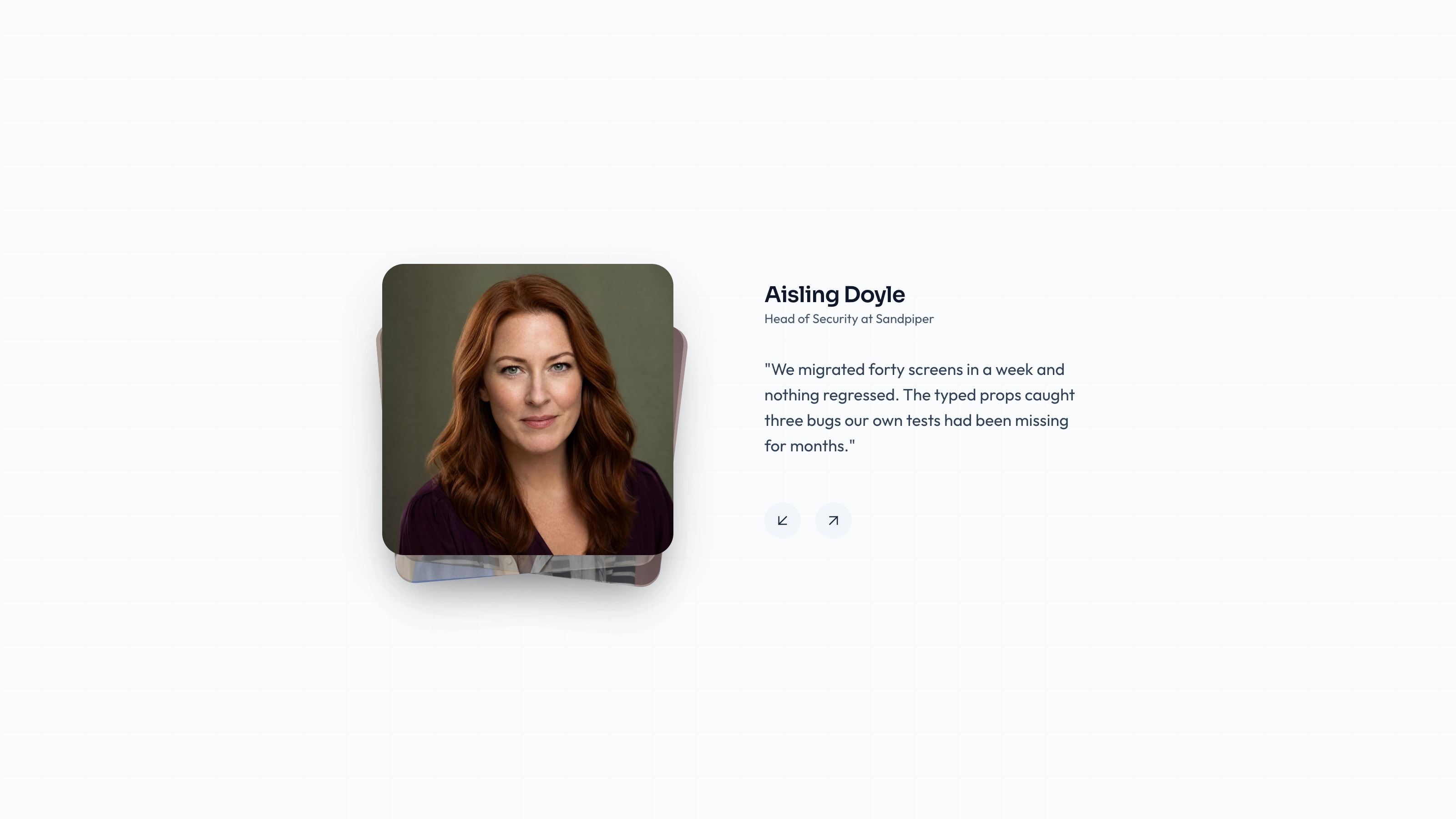
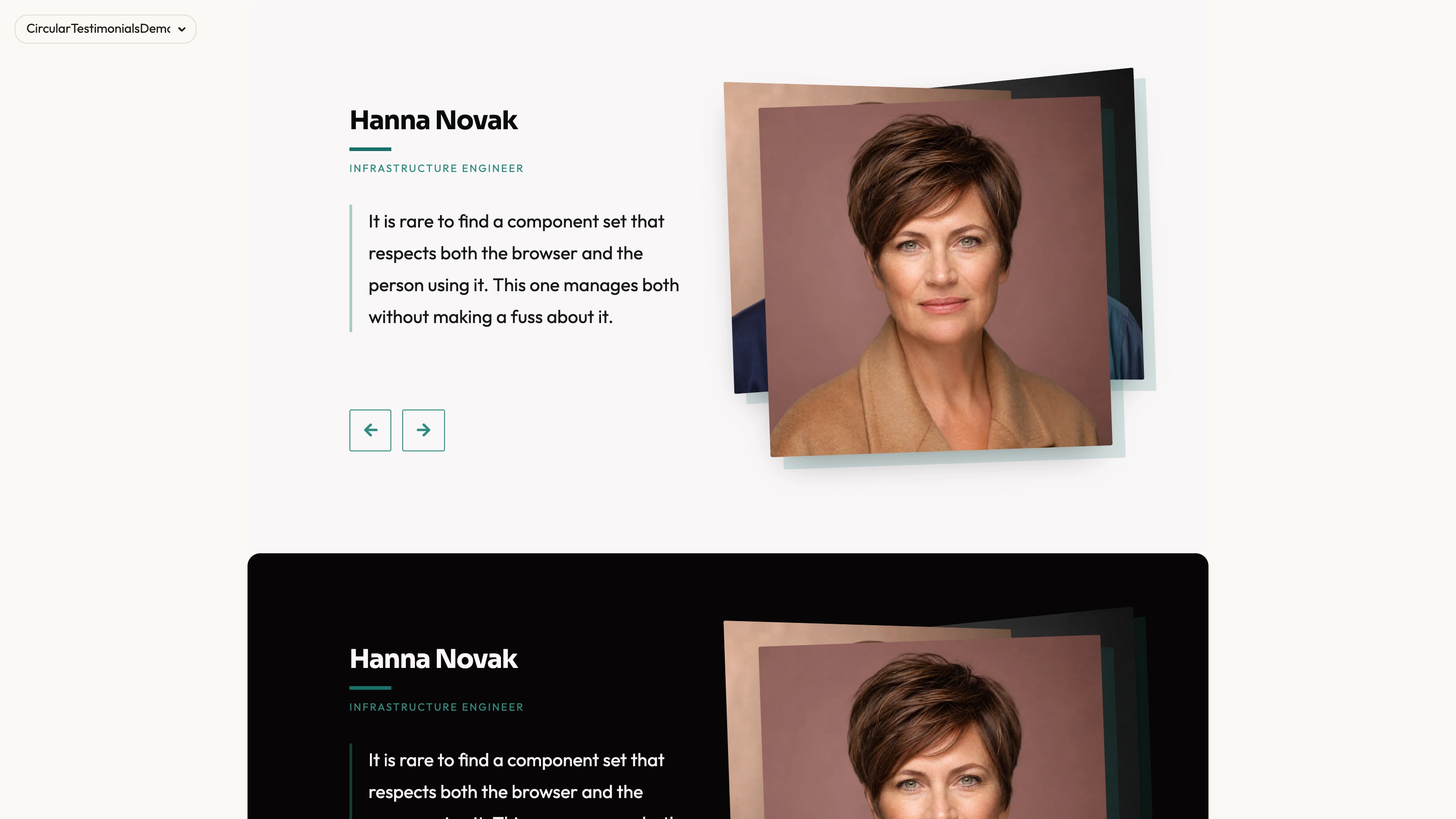
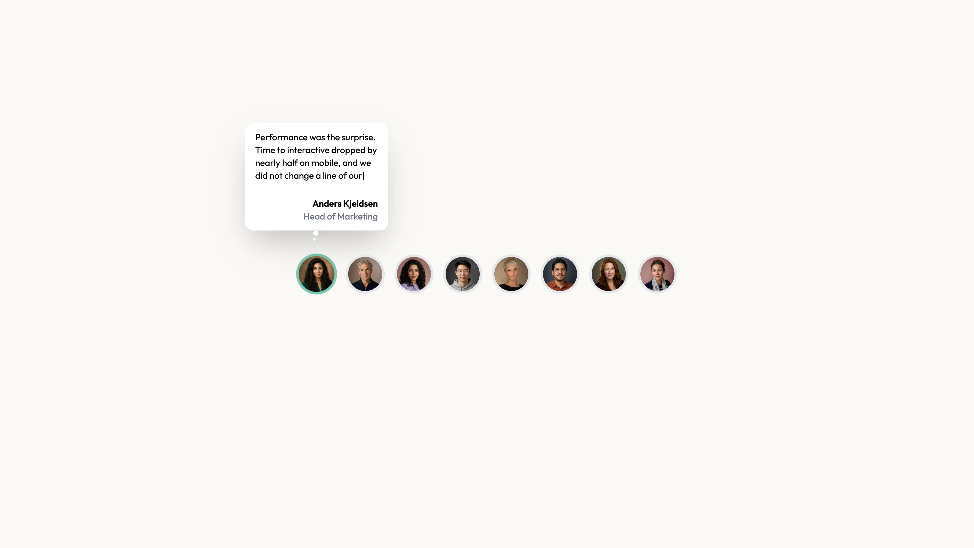
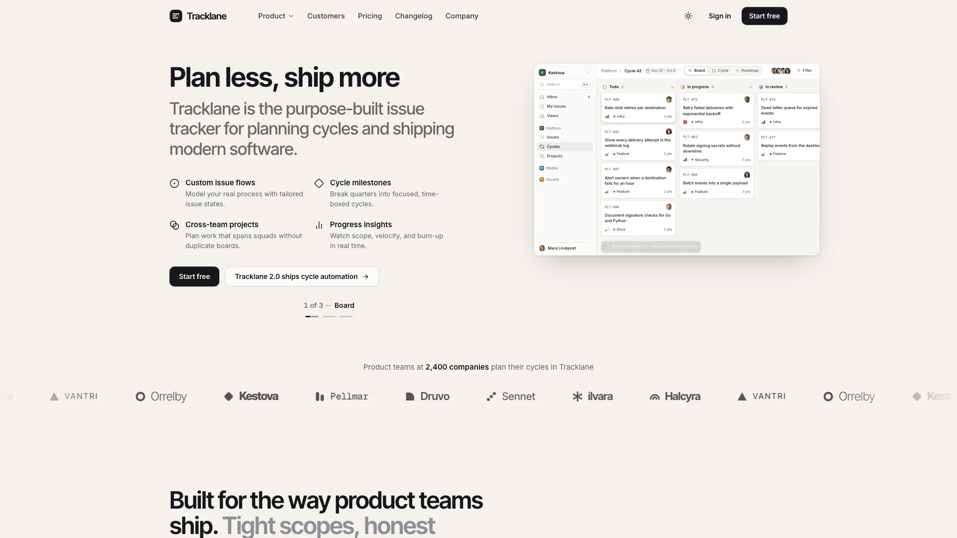
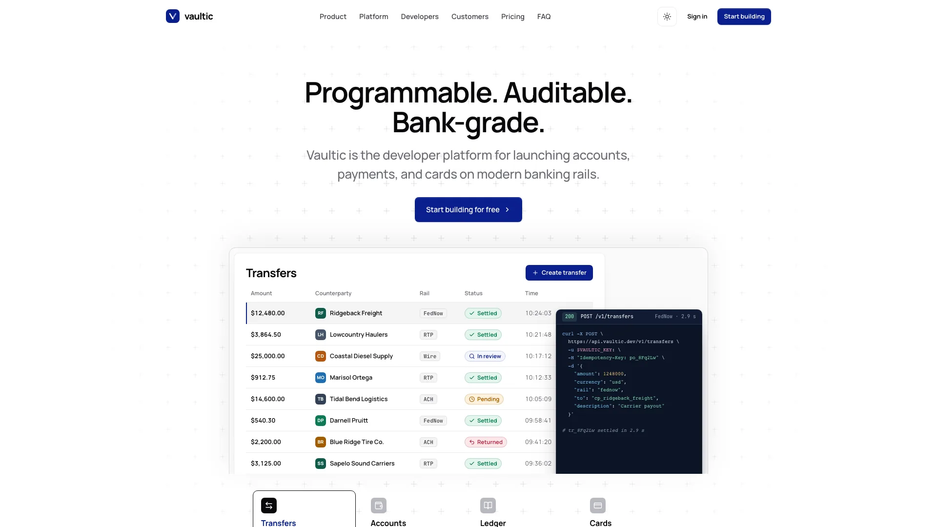
Build a curated social-proof section from editable source, with each portrait, name, handle and statement kept together in a readable card. Social Feed shows a limited selection first and lets visitors reveal the rest. It is a presentation of records you supply, not an account connection that fetches or verifies social posts.
What you get
A React/TypeScript Testimonials section and twelve-record usage example, with image, name, username, text and social destination fields. Props also accept title, description, maxDisplayed and className. Copy and maintain the source in your host project; the API uses usernames rather than separate job-role fields.
Six records initially by default, a Show more button when additional records exist and a separate source-opening button on each card. Show more reveals the already supplied remainder once, without pagination, network loading or a collapse control. The initial longer collection is also clipped to 720 px with a faded bottom.
The written visual contract defines warm paper/teal light tokens, dark roles, Outfit body type, Sora headings and a 0.875rem base radius. It specifies restrained motion and inline SVG interface icons with 1.5 px square-cap strokes, plus visibly named monochrome vendor marks. Reconcile fixed source values and all visual states with those references during integration.
Editable section, Button/Card and assorted UI source, visual guidance and a source checker. No actual portraits, font binaries or app runtime ship in this ZIP. Resolve React, Next Image, cn, Radix Slot, class-variance-authority and host styling for the section’s imported components; extra unused UI files are not a review ingestion system.
Before you choose
Choose this layout when source context and compact browsing matter more than animation. Review one card end to end: the words, person, portrait and destination should describe the same approved statement. Keep a visible distinction between customer evidence and fictional demonstration content.
Good fit
You have customer statements or permitted social excerpts and want a compact initial set that visitors can expand instead of seeing every record immediately.
You want the portrait and attribution to travel with the quote, with a checked link to its original context where available.
You prefer source you can adapt to your existing application over a hosted testimonial widget, and can own its styling, dependencies and future maintenance.
Not for
Automatic collection of posts, account synchronization, moderation or verification of a speaker’s identity. The component renders the array passed into it.
An entire application: navigation, account access, forms and checkout are separate work. Source-link buttons do not implement any of those flows.
Adopting the bundled visual treatment unchanged when it conflicts with an established design system. Review the theme and map it deliberately rather than assuming the section will match any surrounding UI.
A guaranteed zero-request page after arbitrary integration. Assets should stay local, but the source buttons intentionally open supplied external URLs and the host application may have its own network behavior.
How to use
You say/testimonial-social-feed Add the Social Feed Testimonials section to the landing page for [product name]. Use the quotes, names and portraits I provide; do not invent testimonials. Follow the existing page framework and styling.
Give your assistant the target page and repository context. It should inspect package dependencies, framework configuration, existing components and styling before choosing the integration. The bundled source is React/Next-oriented; another framework needs an actual port. A standalone self-contained file is an option for a separate demo, not a reason to replace an existing app’s conventions.
Prepare approved quote records and replace the demonstration text, names, usernames and images together. Check each social URL against the displayed author and wording. Keep source excerpts faithful, and describe the collection as curated if you have selected or shortened statements. Every sample social value points to an avatar file, not a post. Replace it with the actual approved source or remove/adapt the source action; otherwise the X-style button merely opens that image. Many sample person/portrait filenames differ as well.
The written visual contract defines warm paper/teal light tokens, dark roles, Outfit body type, Sora headings and a 0.875rem base radius. It specifies restrained motion and inline SVG interface icons with 1.5 px square-cap strokes, plus visibly named monochrome vendor marks. Reconcile fixed source values and all visual states with those references during integration. Supply actual local portraits and fonts, since the archive contains paths rather than those files. Preserve accurate name/username/quote/image pairing, use suitable local WebP sizes and apply abstract-image rules only to appropriate added invert/blend/contain slots.
Set maxDisplayed for the amount readers should see initially. Test both a shorter collection and one exceeding that limit: show-more visibility, clipped-card bounds and the expanded result should agree. Check source buttons in the actual browser context, including popup restrictions and accessible names. The current source button lacks an accessible name. Review new-window behavior and source-link semantics deliberately; a username, platform icon and image path do not establish authentic post attribution.
Run the supplied block check on the generated output and perform a separate browser review. Inspect phone wrapping, long names and quotes, keyboard focus, source-link destinations and contrast. A static check cannot establish that the interaction works or that the quoted testimony is genuine.
Requirements and costs
You bring
Not collected yet
Dependencies
Not collected yet
Outside costs
Not collected yet
Publisher testing
v1.0.3 — Claude Code / Claude Desktop / Cowork / Codex / ChatGPT
FAQ
The distributed source uses React components and Next.js image handling. In an existing repository, the instructions call for reading the project and adapting the block to its framework, imports and styling. That adaptation is implementation work, not a claim that the React file runs unchanged in every stack. A self-contained HTML version is appropriate when the requested deliverable is a standalone page.
No review-service API is implemented. Local files are the intended asset policy, but actual images/fonts are absent from the archive. Source buttons open supplied URLs with window.open; sample URLs are avatar images rather than posts. Supply accurate sources and inspect actual host requests separately.
Yes. Replace a portrait, author details, quote and source link as one coherent record. Follow the imagery guide for portrait and blend-mode slots, and preserve the meaning of approved testimony when shortening it. Layout sizes still need testing with the actual replacement copy; a short sample does not establish that a long quote will fit.
No. The supplied testimonial array determines the collection. A live feed, ingestion process or moderation workflow would require separate implementation.
It reveals the rest of the existing testimonial array and removes the initial clipping/fade and button. There is no download, pagination or collapse control; the twelve-entry sample starts with six supplied records.
User reviews
—0 reviews
Select a star to share your experience.
No reviews yet. Ratings appear once readers share real experiences.